Welcome to this lesson on Principal Component Analysis (PCA), a powerful technique widely applied in data analysis and machine learning to reduce high-dimensional data into lower dimensions, effectively simplifying the dataset while still retaining the relevant information. In this lesson, we'll look at how we can prepare our data, how to apply PCA using R, how to understand the percentage of variance explained by each principal component (explained variance ratio), and finally, how to visualize the results of our PCA.
Before moving forward, let's first apply what we've learned to a dataset to standardize the data:
An informative aspect of PCA is the explained variance ratio, which signals the proportion of the data's variance falling along the direction of each principal component. This information is key, as it tells us how much information we would lose if we ignored the less important dimensions and kept only the ones contributing most to the variance.
You can view the explained variance ratio using the summary() function:
The importance matrix has three rows:
- Standard deviation: The standard deviation of each principal component (
pca_result$sdev). - Proportion of Variance: The fraction of the total variance explained by each principal component.
- Cumulative Proportion: The cumulative variance explained up to each principal component.
To extract the proportion of variance explained by the first two principal components:
The output will be similar to:
This means that the first principal component explains about 84% of the variance, while the second principal component explains about 16% of the variance. In this case, the first principal component is the most important one, as it captures the majority of the variance in the data.
Finally, let's visualize our PCA results via a scatter plot using ggplot2. Such a visualization can be incredibly insightful when dealing with high-dimensional data, letting us see the structure of our data in lower-dimensional space.
Output:
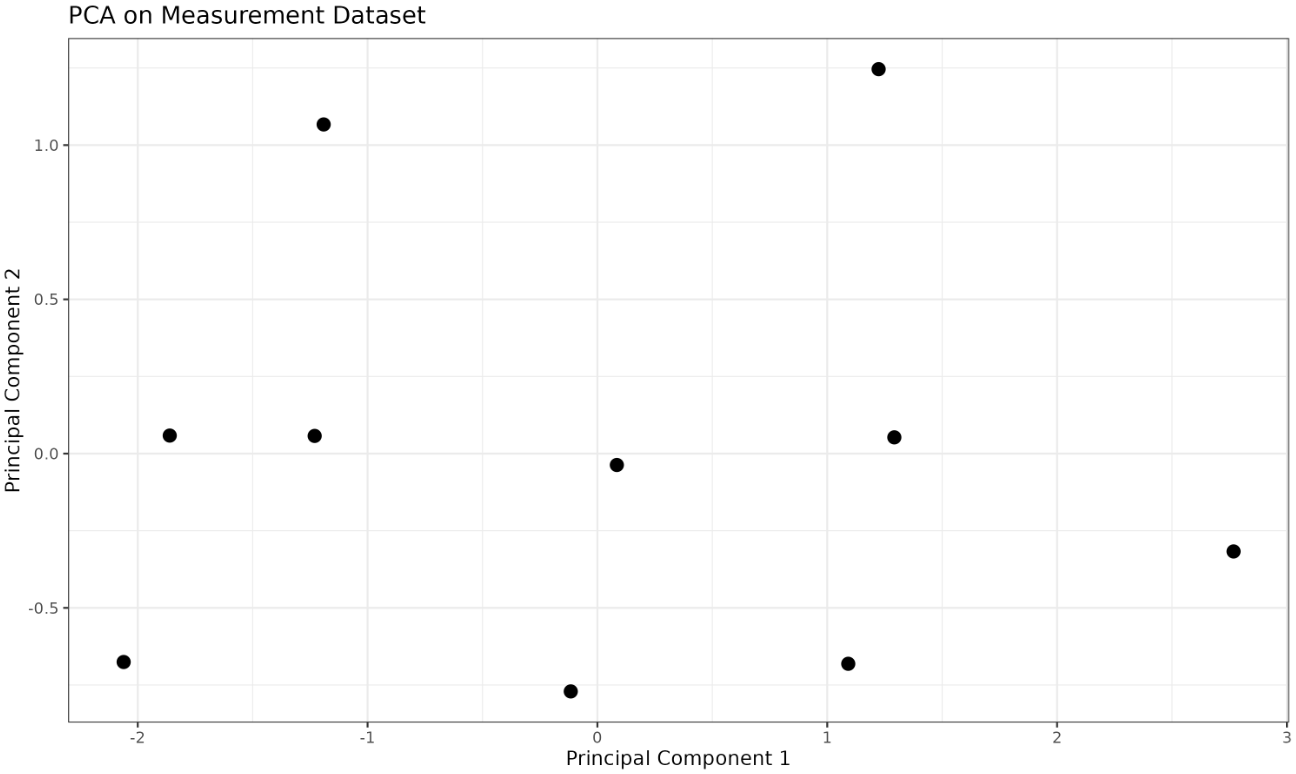
You will see a scatter plot showing the data projected onto the first two principal components.
Congratulations! You've learned how to prepare data for PCA, how to perform PCA with R using the prcomp() function, how to interpret the explained variance ratio, and how to visualize PCA results using ggplot2. Try experimenting with different datasets and choosing different numbers of principal components to see how these choices affect the explained variance and the resulting plots. Happy coding!
