Introduction and Overview

Welcome to our exploration of Interpreting Principal Component Analysis (PCA) Results and its application in Machine Learning. Today, we will first generate a synthetic dataset with features inherently influenced by various built-in factors. Next, we will computationally implement PCA and explore variable interactions. We will then compare the performance of models trained using the original features and the principal components derived from PCA. Let's dive right in!

Benefits of Integrating PCA-reduced data into ML models

Incorporating PCA-reduced data into Machine Learning models can significantly enhance our model's efficiency and lessen the issue of overfitting. PCA aids in reducing dimensionality without losing much information. This feature becomes increasingly useful when we deal with real-life datasets that have numerous attributes or features.

Synthetic Dataset Generation

Our first step is to create a synthetic dataset, which consists of several numeric features that naturally influence each other. The purpose of including these dependencies is to later determine if PCA can detect these implicit relationships among the features.

Note: In this example, the feature monthly_calls is generated as monthly_calls <- 100 + 2 * tenure + 0.5 * data_usage, which is a nearly exact linear combination of tenure and data_usage (with no added noise). This makes the dataset less realistic, but it helps illustrate how PCA can identify and handle such linear dependencies.

set.seed(42) # Set random seed for reproducibility

# Number of samples
n_samples <- 1000

# Generate features
tenure <- round(rnorm(n_samples, mean = 24, sd = 6))  # Average tenure of 24 months
monthly_charges <- rnorm(n_samples, mean = 70, sd = 12)  # Average monthly charge of $70
data_usage <- rnorm(n_samples, mean = 20, sd = 5)  # Average data usage of 20 GB
monthly_calls <- 100 + 2 * tenure + 0.5 * data_usage  # More calls with higher tenure and data usage (deterministic)
customer_satisfaction <- sample(1:10, n_samples, replace = TRUE)  # Satisfaction scores from 1 to 10

# Derived correlated features
total_charges <- monthly_charges * tenure
age_of_account <- tenure + rnorm(n_samples, mean = 0, sd = 1)  # Very similar to tenure

# Binary target variable 'Churn' - arbitrary function influenced by different factors
churn <- as.integer((tenure < 12) | (monthly_charges > 100) | (data_usage > 30) | (customer_satisfaction < 4))

Now, let's put our data into a data frame:

# Create Data Frame
df <- data.frame(
  Monthly_Charges = monthly_charges,
  Total_Charges = total_charges,
  Tenure = tenure,
  Data_Usage = data_usage,
  Monthly_Calls = monthly_calls,
  Age_of_Account = age_of_account,
  Customer_Satisfaction = customer_satisfaction,
  Churn = churn
)

# Separate data and target variable for Logistic Regression
data <- df
target <- data$Churn
data$Churn <- NULL

This portion of the code generates random variables to simulate typical customer usage data. This includes usage facts such as monthly_charges, monthly_calls, and data_usage, and a binary variable churn that is influenced by these features. All this data is assembled together in a data frame.

Preparation for PCA and Data Split

Before we can proceed to PCA, it's necessary to scale our features using standardization. Additionally, we also need to perform a train-test split of our data.

# Standardize the features
data_scaled <- scale(data)

# Split the data into training and test sets (80/20 split)
set.seed(42)
train_indices <- sample(seq_len(nrow(data_scaled)), size = 0.8 * nrow(data_scaled))
X_train <- data_scaled[train_indices, ]
X_test <- data_scaled[-train_indices, ]
y_train <- target[train_indices]
y_test <- target[-train_indices]

Note: Here, scaling is performed on the entire dataset before splitting into training and test sets. In a real-world scenario, it is best practice to fit the scaler on the training data only and then apply it to the test data to avoid data leakage. For simplicity in this example, we scale the whole dataset first.

Data scaling is necessary for PCA because it is a variance-maximizing exercise. It projects your original data onto directions that maximize the variance. Thus, we need to scale our data so that each feature has unit variance.

Applying PCA
Visualizing PCA Results

When interpreting PCA, two key metrics help us understand how much information (variance) each principal component captures from the original data:

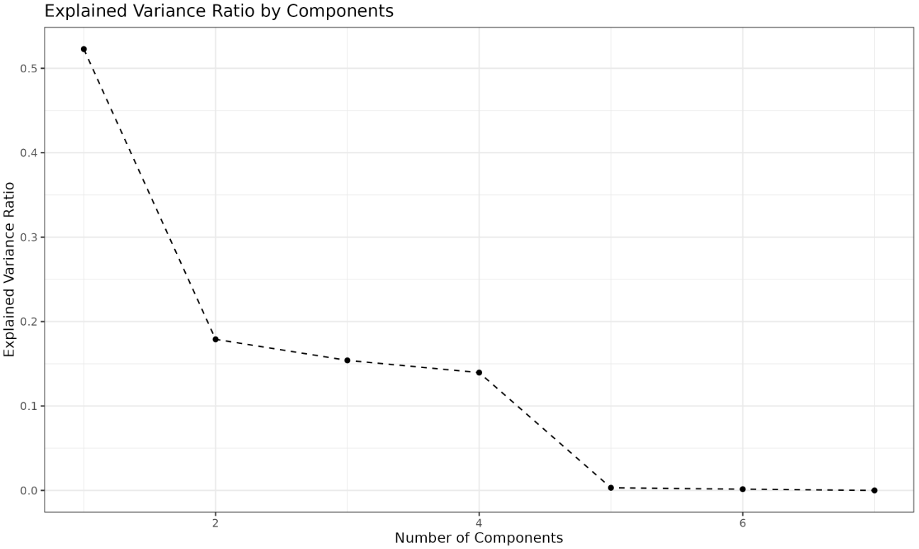
  • Explained Variance Ratio: This shows the proportion of the dataset’s total variance that is explained by each individual principal component. It helps us see which components carry the most information and is typically visualized using a scree plot.
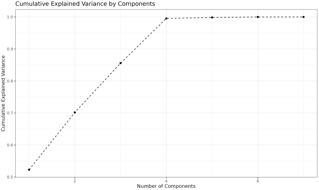
  • Cumulative Explained Variance: This is the running total of the explained variance as we add more principal components. It helps us determine how many components are needed to capture a desired amount of the total variance (for example, 95%).

In practice, we look at both the explained variance ratio and the cumulative explained variance to decide how many principal components to retain. Below, we will visualize both metrics using separate plots.

1. Scree Plot: Explained Variance Ratio by Component

The scree plot displays how much variance each principal component explains. Each point on the plot represents a principal component, and its height shows the proportion of the total variance captured by that component. Typically, the first few components explain most of the variance, and the remaining components contribute less. The "elbow" point—where the plot starts to flatten—indicates that adding more components beyond this point yields diminishing returns in terms of explained variance. This helps you decide how many components are worth keeping.

library(ggplot2)

# Prepare data for scree plot
scree_data <- data.frame(
  Component = 1:length(explained_variance),
  ExplainedVariance = explained_variance
)

# Scree plot
ggplot(scree_data, aes(x = Component, y = ExplainedVariance)) +
  geom_point() +
  geom_line(linetype = "dashed") +
  ggtitle("Explained Variance Ratio by Components") +
  xlab("Number of Components") +
  ylab("Explained Variance Ratio") +
  theme_bw()

Output:

2. Cumulative Explained Variance Plot

The cumulative explained variance plot shows the total variance explained as you add more principal components. Each point represents the sum of the explained variances up to that component. This plot helps you determine the minimum number of components needed to reach a desired threshold of total variance (such as 95%). For example, if the curve crosses 0.95 at the fourth component, you know that the first four components together explain at least 95% of the variance in your data. This is a practical way to balance dimensionality reduction with information retention.

# Prepare data for cumulative explained variance plot
cumulative_data <- data.frame(
  Component = 1:length(explained_variance),
  CumulativeVariance = cumsum(explained_variance)
)

# Cumulative explained variance plot
ggplot(cumulative_data, aes(x = Component, y = CumulativeVariance)) +
  geom_point() +
  geom_line(linetype = "dashed") +
  ggtitle("Cumulative Explained Variance by Components") +
  xlab("Number of Components") +
  ylab("Cumulative Explained Variance") +
  theme_bw()

Output:

Deciding on the number of components to retain

Now, let's use the cumulative explained variance to decide on the number of principal components to retain.

# Cumulative variance explained
cumulative_variance <- cumsum(explained_variance)

# Decide n_components based on 95% threshold
n_components <- which(cumulative_variance >= 0.95)[1]

cat("Number of components to retain for at least 95% variance:", n_components, "\n") # Prints 4

This part of the code calculates the number of principal components needed to retain at least 95% of the original data's variance.

Model Training and Evaluation with and without PCA

Finally, we will train logistic regression models on both sets of data and compare them.

# Transform the data with PCA
X_train_pca <- pca$x[, 1:n_components]
X_test_pca <- predict(pca, newdata = X_test)[, 1:n_components]

# Train a logistic regression model with PCA
model_pca <- glm(y_train ~ ., data = as.data.frame(X_train_pca), family = binomial)

# Predict the test set
prob_pred_pca <- predict(model_pca, newdata = as.data.frame(X_test_pca), type = "response")
y_pred_pca <- ifelse(prob_pred_pca > 0.5, 1, 0)

# Evaluate the model with PCA
accuracy_pca <- mean(y_pred_pca == y_test)
cat(sprintf("Accuracy with PCA: %.2f\n", accuracy_pca)) # Example: 0.94

The accuracy of a model trained on PCA-transformed data is computed.

# Train a logistic regression model without PCA
model_orig <- glm(y_train ~ ., data = as.data.frame(X_train), family = binomial)
prob_pred_orig <- predict(model_orig, newdata = as.data.frame(X_test), type = "response")
y_pred_orig <- ifelse(prob_pred_orig > 0.5, 1, 0)
accuracy_orig <- mean(y_pred_orig == y_test)
cat(sprintf("Accuracy without PCA: %.2f\n", accuracy_orig)) # Example: 0.93

The accuracy of a model trained on the original data without PCA transformation is also calculated for comparison. Notice that both models may have the same accuracy score, indicating that PCA did not affect the model's performance but reduced the number of features, thereby simplifying the model.

Conclusion

We have successfully covered creating a synthetic dataset, preparing the data, implementing PCA, visualizing both the explained variance ratio and cumulative explained variance, determining the number of principal components to retain, and comparing the accuracies of models trained with and without PCA. In the next lesson, we'll delve deeper into PCA and other dimensionality reduction techniques. Happy learning!

Sign up
Join the 1M+ learners on CodeSignal
Be a part of our community of 1M+ users who develop and demonstrate their skills on CodeSignal