Welcome to this lesson on "Visualizing Clusters in R using the Iris Dataset". Previously, we introduced unsupervised learning, focusing on clustering and the K-means clustering algorithm. In this unit, we will visualize the clusters resulting from the K-means algorithm using R’s ggplot2 package. The goal of this lesson is to illustrate the implementation of the K-means clustering algorithm and to demonstrate how to visualize the results using ggplot2, utilizing the classic Iris dataset as an example.
In this lesson, we will use R’s built-in iris dataset. The Iris dataset is a well-known dataset in pattern recognition, consisting of 150 samples from three species of Iris flowers (Iris setosa, Iris virginica, and Iris versicolor), with four features measured for each sample: the length and width of the sepals and petals.
To access the dataset in R, simply use the iris data frame, which is available by default:
Example output of head(iris):
The iris data frame contains five columns: four numeric features (Sepal.Length, Sepal.Width, Petal.Length, Petal.Width) and one categorical column (Species). For clustering, we will use only the numeric features.
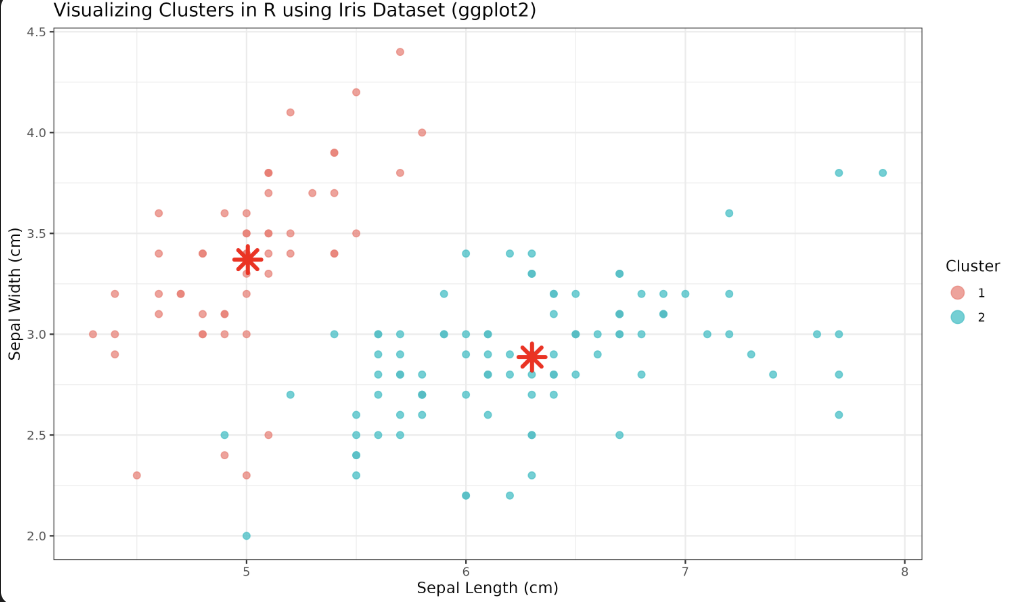
Let’s apply the K-means algorithm using R’s built-in kmeans() function and visualize the results using the ggplot2 package. We will focus on plotting the first two features (Sepal.Length and Sepal.Width) for visualization.
Note: Although the Iris dataset contains three species, in this example we use
centers = 2in the K-means algorithm. This is to illustrate how the algorithm groups the data when the number of clusters does not match the number of true species. In practice, you might experiment with different values forcenters(such as 3) to see how the clustering changes.
First, we prepare the data and perform K-means clustering:
Now, let’s visualize the clusters using ggplot2:
Here’s an explanation of the parameters and functions used in the ggplot2 visualization:
-
ggplot(iris, aes(x = Sepal.Length, y = Sepal.Width, color = Cluster))— Initializes the plot, mapping Sepal Length and Sepal Width to the x and y axes, and coloring points by their cluster assignment. -
geom_point(size = 2, alpha = 0.7)— Plots the data points as semi-transparent circles. -
geom_point(data = centers, ...)— Adds the cluster centers to the plot. Theshape = 8parameter uses a star shape,size = 5increases their size, andcolor = "red"makes them stand out. -
labs()— Sets the plot title, axis labels, and legend title. -
theme_minimal()— Applies a clean, minimalistic theme to the plot. -
guides(color = guide_legend(override.aes = list(size = 4)))— Makes the legend points larger for better visibility.
Congratulations! In this lesson, you have successfully implemented K-means clustering and visualized clusters using R with the Iris dataset and ggplot2. Practice exercises following this lesson will help you reinforce these skills. Continue practicing and expanding your knowledge of machine learning and data visualization in R. Keep up the great work!