Welcome! In this lesson, we will explore the Density-Based Spatial Clustering of Applications with Noise (DBSCAN) algorithm. Using R and its powerful packages, we will implement DBSCAN and visualize its results with ggplot2. DBSCAN is a popular clustering algorithm that can identify clusters of varying shapes and sizes, as well as detect outliers (noise) in your data. In this lesson, we’ll use a synthetic "two moons" dataset, which is a classic example for demonstrating the strengths of density-based clustering. Let’s dive in and see how DBSCAN works in R!
To get started, we need to load a few essential R packages. The dbscan package provides the DBSCAN algorithm implementation, ggplot2 is used for data visualization, MASS helps with data generation, and scales is used for color palettes.
To showcase DBSCAN’s ability to find clusters of arbitrary shapes, we’ll generate a "two moons" dataset. This dataset consists of two interleaving half circles, which are not well separated by traditional clustering algorithms like k-means.
Here, we generate two moon-shaped clusters by sampling points along two half circles and adding a bit of noise for realism.
It’s a good practice to standardize features before clustering, especially when features are on different scales.
With our data ready, we can now apply the DBSCAN algorithm using the dbscan package. DBSCAN in R requires two main parameters: eps (the neighborhood radius) and minPts (the minimum number of points required to form a dense region).
The cluster assignments are stored in db$cluster. In DBSCAN, points labeled as 0 are considered noise (outliers). To count the number of clusters (excluding noise):
Let’s visualize the clustering results using ggplot2. Each cluster will be shown in a different color, and noise points will be colored black. We’ll also use different point sizes and transparency to distinguish noise from cluster members.
In this plot, each point represents a data sample. Points belonging to a cluster are colored uniquely, while noise points (cluster 0) are shown in black. The legend helps distinguish between clusters and noise, and the point size/transparency further highlights noise points.
Here is an example of the plot you should see after running the visualization code above:
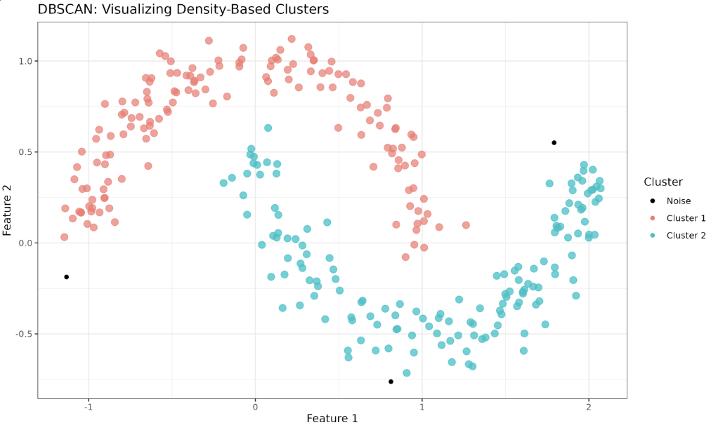
In this plot, each cluster is shown in a different color, and noise points (cluster 0) are displayed in black. The two moon-shaped clusters are clearly identified, demonstrating DBSCAN’s ability to find clusters of arbitrary shapes and to detect outliers.
Congratulations on successfully implementing the DBSCAN algorithm in R and visualizing the resulting clusters on a challenging "two moons" dataset! Practice is essential for mastering these concepts, so be sure to try out the upcoming exercises to reinforce your understanding. Good luck!
