Reading the Brand Iceberg
Reading the Brand Iceberg
In the last unit you landed on a definition you can carry anywhere: a brand is the total impression created by every interaction someone has with your business, and the logo is only the smallest visible piece. That's the principle. Now you need a mental model that makes it usable, something you can sketch on a whiteboard the next time a stakeholder wants to "fix the brand" by changing what's on the screen. That model is the Brand Iceberg, and learning to read it is what keeps you working on the right layer.
Above and Below the Waterline
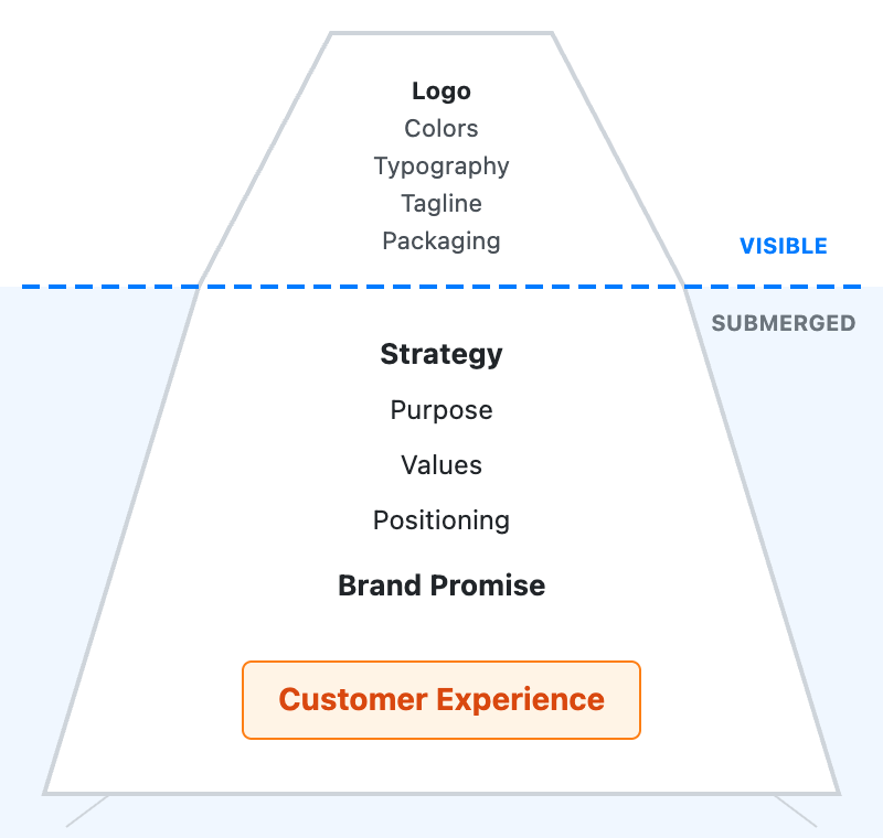
Picture an iceberg. The small part above the water is everything people can see: your logo, your color palette, your typography, your tagline, your packaging. These are your visible brand assets, the things a designer ships and a stakeholder points at. Below the waterline sits the much larger mass that holds the whole thing up: your strategy, your purpose (the reason you exist beyond making money), your values, your positioning (the specific space you want to own in a customer's mind), your brand promise (what you commit to delivering every time), and the actual customer experience.
The trap is that the visible tip is where attention naturally goes, because it's the only part anyone can literally see. But the submerged mass is what gives the brand its weight and direction. As a Digital Marketing Manager, your instinct will often be to reach for the tip, because that's what you can change in a sprint. The skill is catching yourself.
- Jake: Engagement's slipping, so I want a fresh logo and new colors by next month.
- Victoria: That's the part of the brand we can see. But the logo is the tip of an iceberg. The real mass sits underwater: our promise, and the experience people actually get.
- Jake: So the new colors won't move the number?
- Victoria: They might get noticed for a week. But if onboarding still confuses people, we've just repainted the tip. The thing dragging engagement lives below the line.
- Jake: So fix the underwater part first, then dress the top.
Notice that Victoria doesn't reject the logo work. She reorders it. The visible layer still matters, but it can't carry weight the foundation isn't providing.
What Truly Differentiates Lives Below the Surface
Here's why the submerged part matters so much: it's where your real difference lives. Anything above the waterline is easy to copy. A competitor can study your color palette, mimic your typography, and brief a designer to produce a logo with the same feel within a week. Surface assets are visible precisely because they're exposed, and what's exposed is replicable.
What sits below the waterline is far harder to imitate. A competitor can't quickly copy years of trustworthy customer experience, a genuinely held set of values, or a promise you've kept consistently enough that people rely on it. Think about the brands you personally pay more for. You're rarely loyal to their font. You're loyal because they reliably deliver something, because they stand for something you recognize, because the experience feels like them every time. That reliability is a below-the-waterline asset, and it's the thing competitors struggle to take from you.
So when you're trying to understand why customers stay or leave, train your eye to go straight underwater. A churn problem almost never lives in the logo. It lives in a promise that the experience quietly breaks, or a positioning that no longer matches what people actually need.
Telling Assets Apart from Drivers
Putting this to work means getting fast at one sorting move: when something lands on your desk labeled "the brand," ask whether it's a surface asset or a deeper driver. A new tagline, a packaging refresh, a logo tweak: those are assets, the visible tip. Your strategy, your values, the promise you're making, and the experience you actually deliver: those are the drivers, and they should always come first.
The practical rule is simple. A visible asset should be designed in service of a below-the-waterline driver, never the other way around. If you choose colors before you've decided what you promise customers and how you want to be positioned, you're decorating a foundation you haven't poured yet. So the next time someone hands you a creative request to "make the brand feel more X," your first question isn't "which font?" It's "what are we promising, and is the experience keeping that promise?" Answer that, and the surface choices get easier, because they finally have something to express.
The single takeaway: the visible assets are how a brand is recognized, but the submerged drivers (strategy, values, promise, and experience) are what actually differentiate it and keep it afloat. Next you'll get to test that distinction in a few ways: a quick sorting exercise to spot at a glance which elements sit above the waterline and which sit below, then an iceberg audit you could genuinely use to diagnose a churn problem, and finally a live coaching conversation where you hold the line with a designer eager to start with color. Start practicing the move now: whenever you hear "let's change the look," quietly ask yourself what's underwater first.
