Welcome to understanding data distributions! Last time we compared groups, but knowing the average isn't always enough. Sometimes the "shape" of your data tells a completely different story.
Engagement Message
Can you name one way relying only on averages could mislead a business?
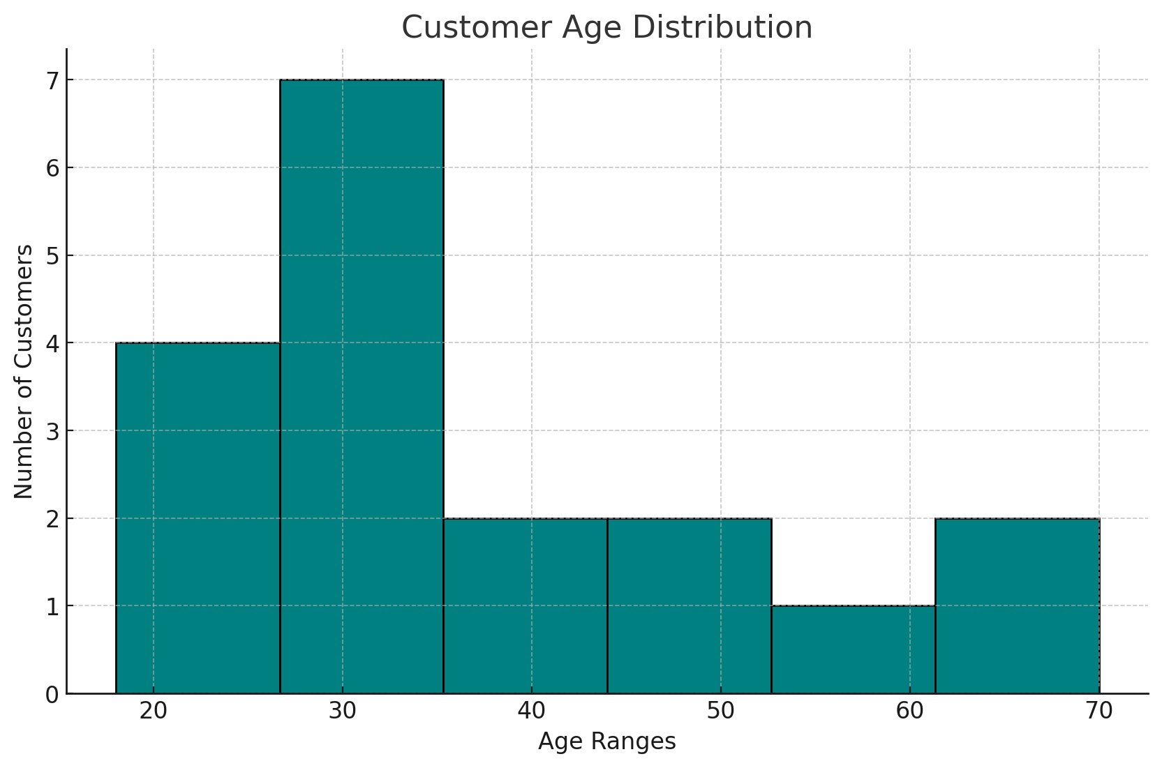
Let's start with histograms - charts that show how your data is distributed. Think of them as frequency maps showing where most of your values cluster.
A histogram of customer ages might show most customers are 25-35, with fewer at the extremes.
[Include this image. Do not include this text]
Engagement Message
What would a histogram of your company's daily sales look like?
Here's where it gets interesting: data can be spread out in different ways. Some distributions are symmetrical (balanced on both sides), while others are skewed (lopsided).
Skewed data means your average might not represent typical customers at all.
Engagement Message
Can you think of business data that might be heavily skewed?
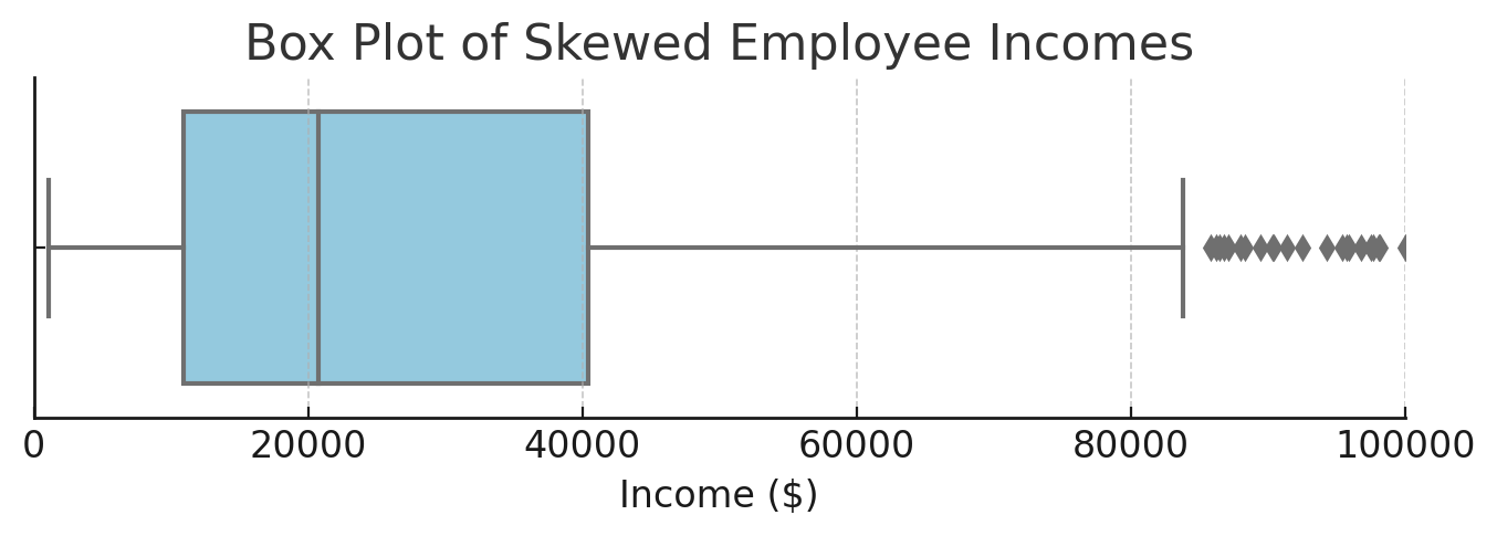
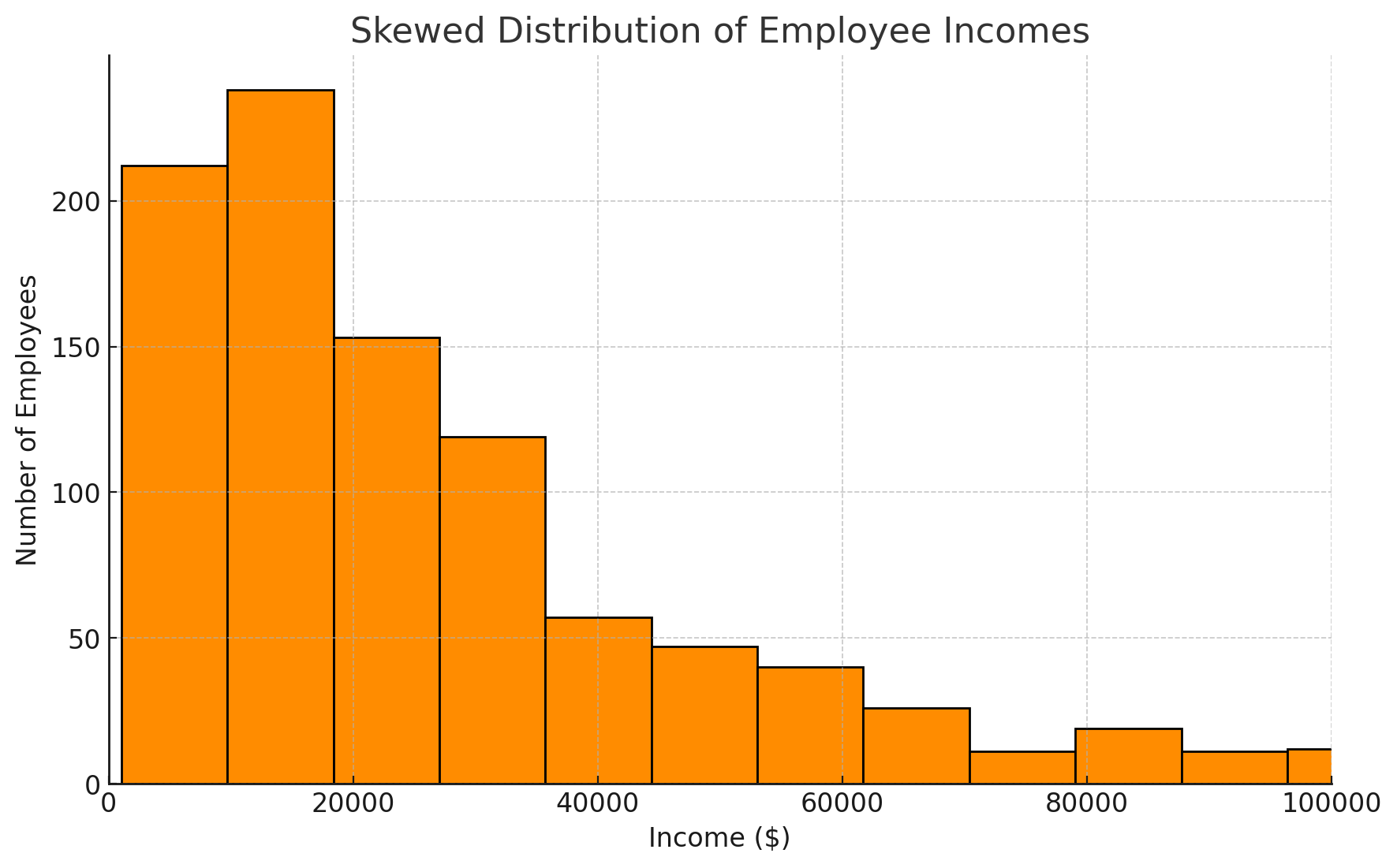
Income is a classic example of skewed data. Most employees earn moderate salaries, but a few executives earn much more, pulling the average up.
The "typical" employee earns less than the average salary because of this skew.
[Include this image. Do not include this text]
Engagement Message
Why might using average income mislead you about employee compensation?
Box plots are another powerful tool. They show you the middle 50% of your data (the box) plus outliers (the dots beyond the whiskers).
Box plots quickly reveal if your data is spread out or tightly clustered.