Welcome to discovering relationships in your data! Last time we explored data distributions, but what about connections between different variables?
Correlation helps you spot when two business metrics move together in predictable ways.
Engagement Message
Can you think of two business metrics that might be related to each other?
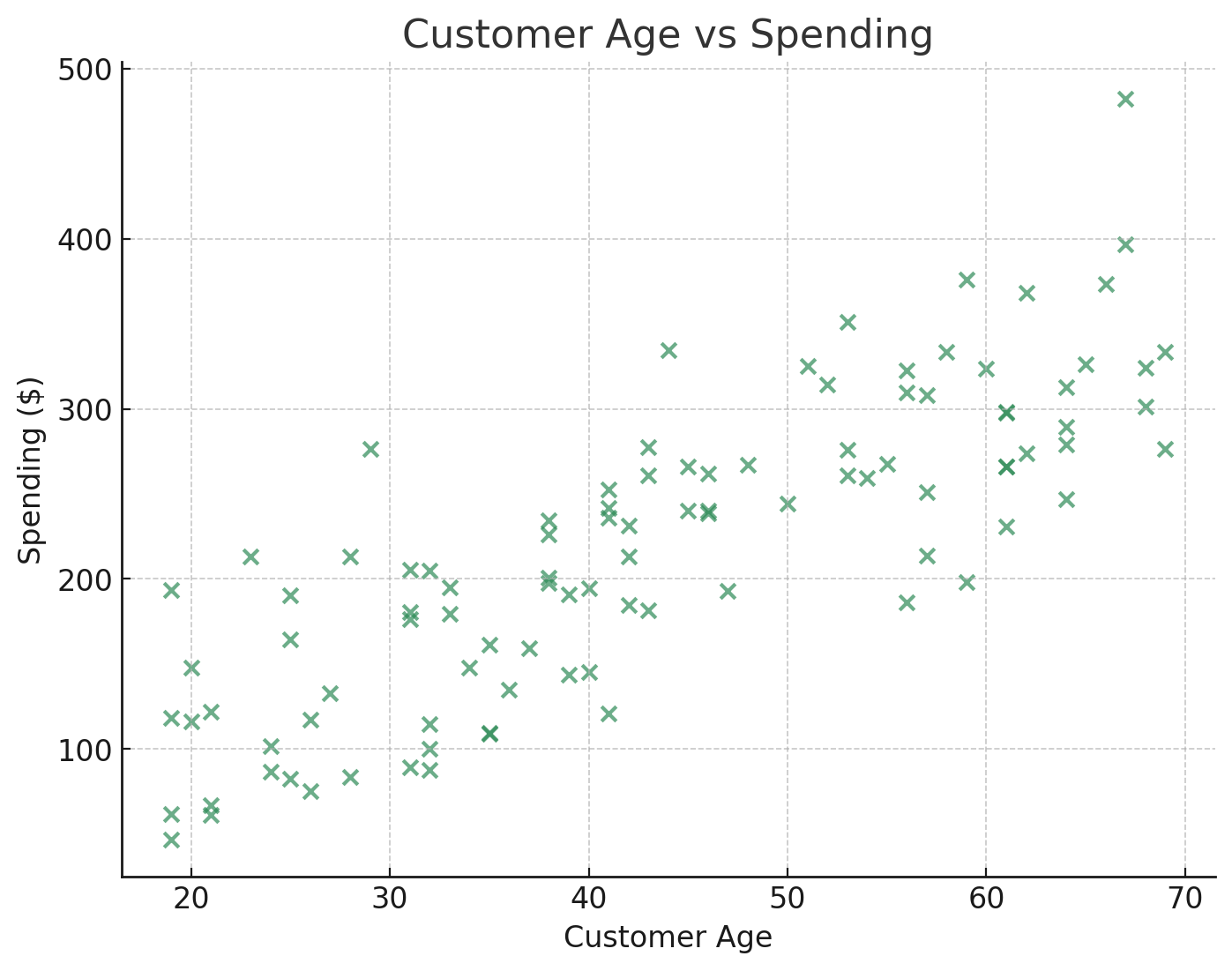
A scatter plot shows relationships by plotting two variables against each other. Each dot represents one data point with values for both variables.
For example, plot customer age (x-axis) against spending (y-axis) to see if older customers spend more.
[Include this image. Do not include this text]
Engagement Message
What pattern would you expect to see if age and spending were related?
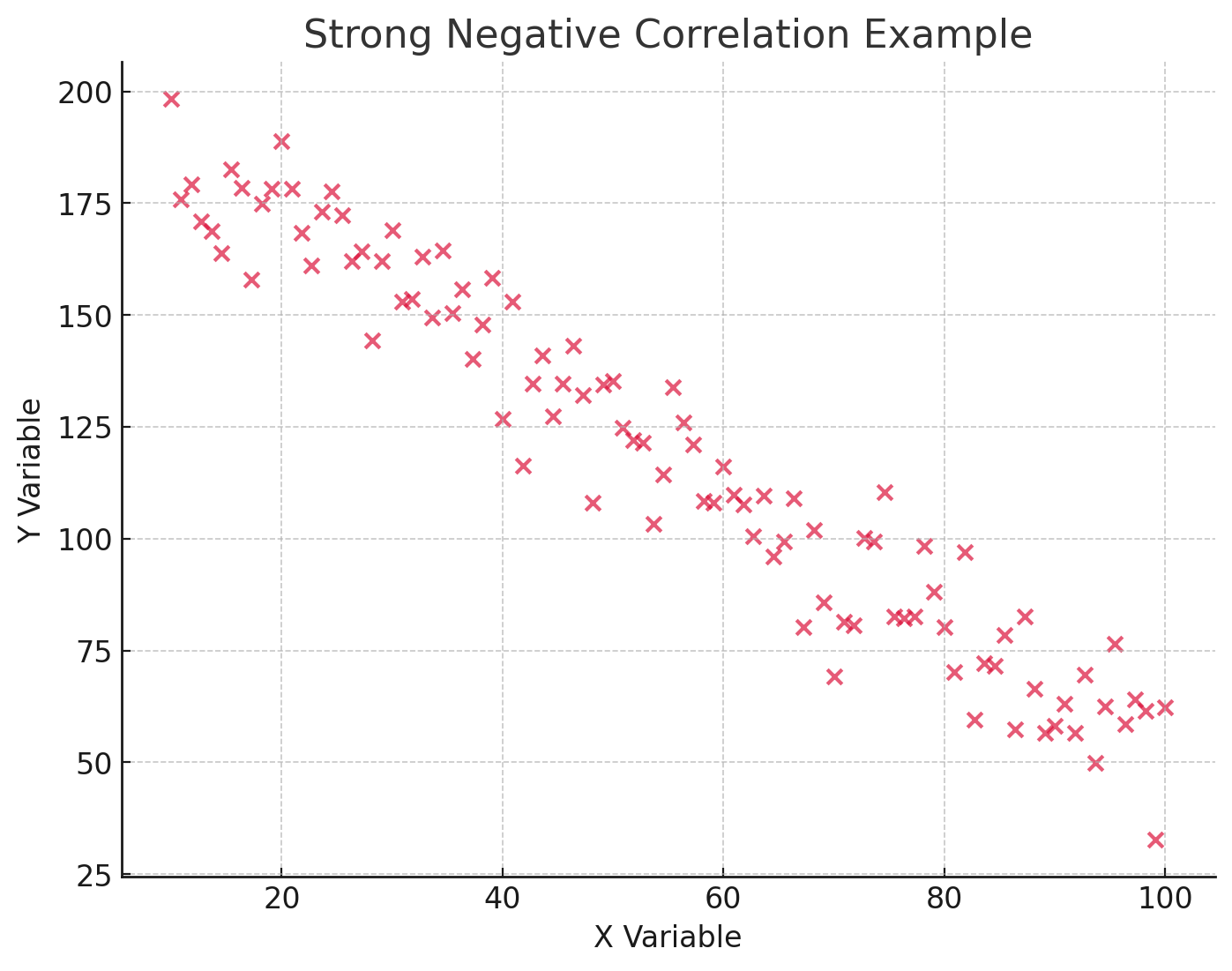
When dots in a scatter plot form a clear pattern, you've found correlation! If dots trend upward (more of X = more of Y), that's positive correlation.
If dots trend downward (more of X = less of Y), that's negative correlation.
[Include this image. Do not include this text]
Engagement Message
Can you give an example of two business metrics that might have negative correlation?
Correlation coefficients measure relationship strength with numbers between -1 and +1. Values near +1 mean strong positive correlation, near -1 mean strong negative correlation.
Values near 0 mean no meaningful relationship exists between the variables.
Engagement Message
What would a correlation coefficient of 0.8 tell you about two variables?
Here's the crucial warning: correlation does not equal causation! Just because two metrics move together doesn't mean one causes the other.
