Strategic Color Typography
Selecting Strategic Color and Typography
In the last unit you learned to see color and typography as two of the four components that carry a brand before anyone reads a word. Now you'll make the actual calls. The discipline here is simple to state and hard to hold: every color and font choice has to earn its place by serving the strategy, not your eye. Let's start with why color is never just decoration.
How Color Carries Meaning, and How That Meaning Moves
Color is the fastest-acting element in your system. A viewer registers it before shape or word, and each hue pulls a cluster of associations. Blue tends to read as trust, calm, and reliability, which is why so many banks and SaaS tools lean on it. Red signals energy and urgency, great for a flash sale, risky for a brand that wants to feel dependable. Green carries growth, health, and nature, while deep blacks and charcoals suggest premium and sophistication.
But here is the part that trips up marketers running international campaigns: those associations are not universal. They shift with culture and context. White reads as clean and pure across much of the West but signals mourning in parts of East Asia. Red means stop or danger in one market and luck and prosperity in another. Even within one culture, context reshapes meaning: red on a food brand whets the appetite, while red on a banking dashboard reads as an error. So the useful question is never "what does this color mean?" It is "what does this color mean to this buyer, in this market, in this context?"
Choosing Palette and Fonts for Strategy, Not Taste
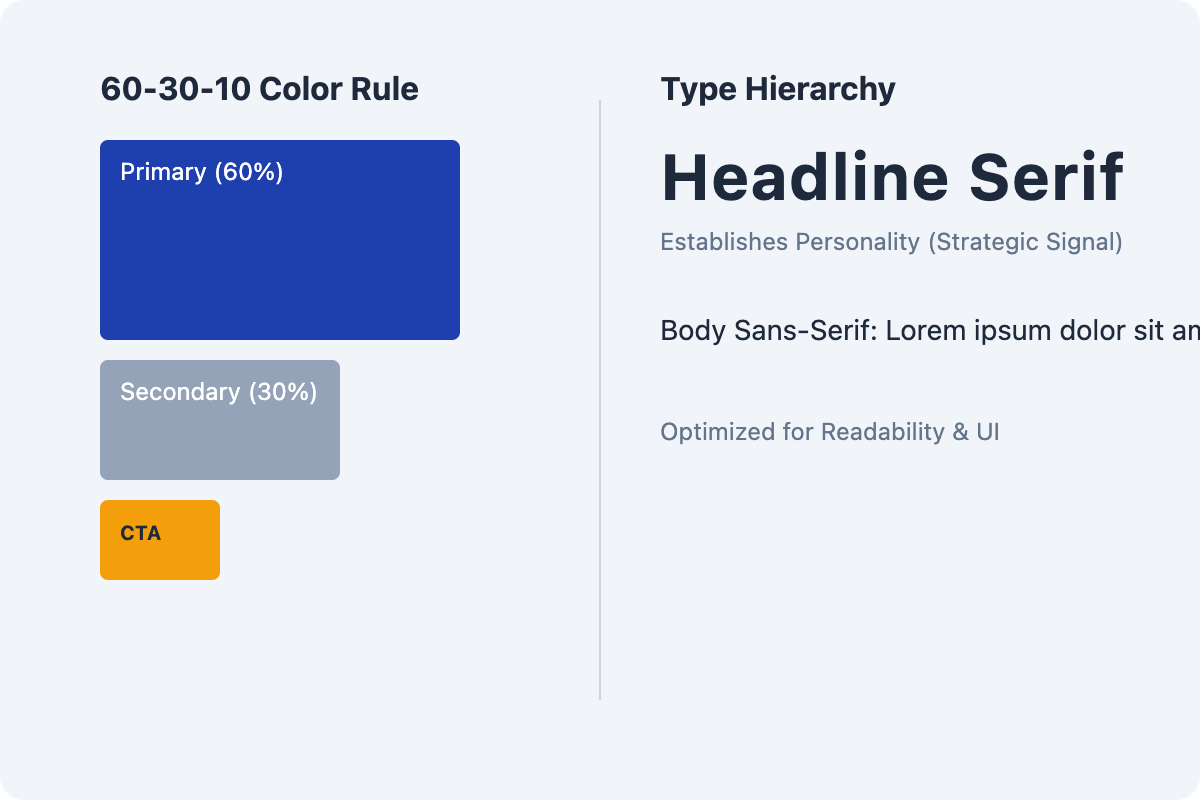 A complete palette has three roles: a primary color that owns the brand, one or two secondary colors that support it, and an accent reserved for what you want clicked or noticed. To maintain visual balance, designers often apply the 60-30-10 rule: the primary color covers roughly 60% of the brand's visual space, the secondary covers 30%, and the accent takes the final 10% to create focus. Typography works the same way, with a primary typeface for headlines and a secondary for body text, chosen as a pair that share a personality. Serifs tend to feel established and trustworthy; clean sans-serifs feel modern and approachable. The pairing sends a signal before a single line is read.
The trap at this stage is taste. Every stakeholder has a favorite color and a font they have "always wanted to use," and the meeting drifts into "I just like this one." Your job is to anchor every choice to the brand personality you already defined, and to say the rationale out loud.
- Ryan: I'm pushing the deep teal as primary. It just looks fresh.
- Natalie: "Fresh" is taste. What does teal do for our buyer?
- Ryan: Fair. It reads calm and capable, which matches the reliable, hassle-free personality we landed on.
- Natalie: That I can defend to the board. Same test on the headline font: what does it signal, not whether we like it?
- Ryan: The geometric sans reads clean and competent, no fuss. That's the personality, not just my preference.
Notice the move: each choice gets restated as "what it signals to the buyer," because that is the only rationale that survives scrutiny.
Pressure-Testing for Readability and Cross-Cultural Fit
A choice can be perfectly on-strategy and still fail in the wild, so run it through two filters before anything ships. The first is readability. Your assets live at twelve pixels in a phone feed, in an email preview pane, on a product box at arm's length. Test the font at small sizes and on real devices, and confirm text-to-background contrast clears accessibility standards so the message stays legible to everyone, including low-vision readers. A gorgeous display font that turns to mud below a certain size is simply the wrong choice.
The second filter is cross-cultural appropriateness. If you sell internationally, check that your palette carries no unintended meaning in a target market, and confirm your typefaces actually support the characters, accents, and scripts your audiences use. A font missing proper diacritics will quietly break your brand across half your markets.
The single takeaway: color and type are strategic instruments, so choose each for what it signals to your specific buyer, then prove it survives a small screen and a foreign market. Next you'll run a quick self-check matching colors to the association they carry in a given context, then build a palette-and-font recommendation you could hand straight to a brand team, and finally defend those choices in a live conversation where someone's personal favorite is on the line. For today, try this: take one color in your current brand and write the single sentence explaining what it signals to your buyer. If you can't, it's taste, not strategy.
