Protecting Brand Identity Standards
Protecting Logo and Brand Voice Standards
You've made the strategic calls on color and typography. Now you have to protect them, because the moment those assets leave your hands, dozens of people start using them in ways you'll never personally approve. Standards are how you stay consistent at scale without being in every review. This unit covers the two sets of standards that get bent most often, your logo and your voice, and how to write them so they actually hold.
Specifying Logo Usage Standards
Your logo is the most-handled asset you own. It lands on a favicon, a social avatar, an email header, a sponsor wall, and a shipping box, often resized and repositioned by someone in a hurry. So the Logo Usage Checklist locks down three things:
- Minimum size: the smallest dimension at which the logo stays legible, which stops it from turning to mush as a 16-pixel favicon or a tiny footer mark.
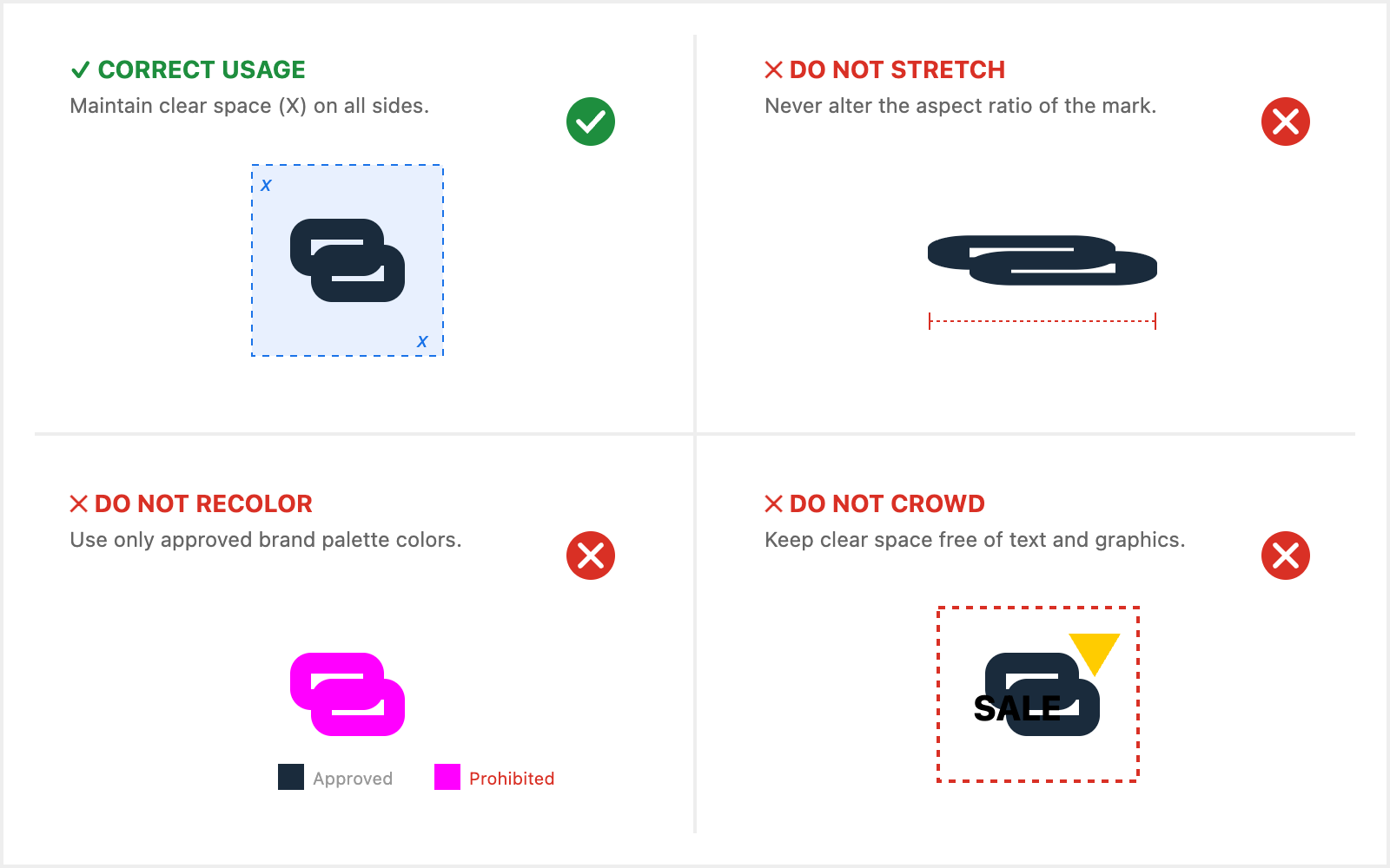
- Clear space: a protected margin around the logo, usually defined in terms of the logo's own height, so nothing crowds it against a button, a caption, or the edge of a banner ad.
- Prohibited treatments, or the explicit "don'ts": don't stretch it, don't recolor it, don't add a drop shadow, don't drop it onto a busy photo where it disappears.
The discipline here is to show, not describe. A line that says "use the logo correctly" prevents nothing. A panel that shows the stretched version, the recolored version, and the crowded version with a red X over each tells a rushed teammate exactly what to avoid before they ship it.
Documenting Brand Voice Standards
Your voice needs the same rigor, and it's harder because words feel subjective. The Brand Voice Guidelines pin down three layers. Tone is the emotional register, reassuring and clear rather than hype-y, say. Vocabulary is the concrete list of words you use and words you avoid, so "effortless setup" is in and "game-changing" is out. Messaging principles are the rules of emphasis, like leading with the customer outcome before the spec. The failure mode is writing all three as adjectives, and adjectives don't travel.
- Milo: The guideline just says "friendly but professional." I wrote three versions and I still can't tell which one is on-brand.
- Chris: Right, "friendly but professional" is an adjective, not a rule. What does that support reply actually need to do?
- Milo: Reassure them the fix is simple, then give them the next step?
- Chris: Then write that down as the rule, and pin a do and a don't beside it. Do: "Happy to help, here's the one step that sorts it." Don't: "Per our policy, kindly be advised."
- Milo: So the example does the teaching, not the adjective.
Notice the move: every standard gets paired with a concrete do and don't, because a side-by-side example is something a writer can copy, while a label is something they have to guess at.
Applying Standards Across Touchpoints
A standard only matters where it's applied, and your brand shows up in places that feel unrelated. The same logo and voice rules have to govern the website, a social post, the packaging, and a customer-service reply, even though different people own each one. That's the whole point: a customer who reads a warm landing page and then gets a cold, templated support email experiences two different brands. So when you review work, name the specific standard at stake rather than reacting on taste. The logo crammed against the box edge is a clear-space violation; the shrunk avatar is a minimum-size violation; the "revolutionary lighting experience" headline breaks the vocabulary rule; the stiff support reply misses the reassuring tone. Tying each correction to a named rule is what turns a one-off fix into a lesson the person carries forward.
The takeaway: standards protect the brand only when they're concrete enough to apply without you in the room. Next you'll spot logo misuses against the specific standard each one breaks, then draft a voice reference your team could actually write from, then apply both sets of standards live across a batch of real assets. Start practicing the core habit now: when something looks off, don't say "that's not quite us," name the exact rule it breaks.
