Designing the Visual System
Welcome to the Course
As a Digital Marketing Manager, you've probably shipped a logo refresh, briefed a designer, and watched a campaign go live across five channels. Now you're taking formal ownership of the brand itself, which means owning how it looks and sounds everywhere, not just how it looks in one hero asset. This course turns the brand strategy you've defined into a tangible identity system and a guidelines document that keeps every touchpoint consistent.
By the end of this course, you'll be able to:
- Distinguish the components of a complete visual identity system beyond the logo
- Select a strategic color palette and font pairing that communicate brand personality, not personal taste
- Specify logo usage standards and document a usable brand voice
- Structure a brand guidelines manual that ties visual, verbal, and strategic decisions together
- Coach teammates and vendors to apply those guidelines consistently
This first unit starts where most people stop: it widens your view from the logo to the full visual system and teaches you to judge whether that system actually serves the strategy beneath it.
The Visual System Beyond the Logo
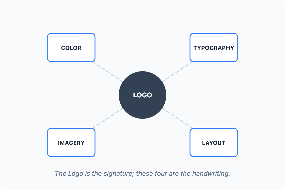
When a stakeholder says "the brand looks great," they usually mean the logo. But a logo is one element in a visual identity system made of four working parts, and the first two are the ones people notice instantly.
The color palette is your primary, secondary, and accent colors, plus the rules for how they're used. Typography is the typefaces, weights, and hierarchy that carry your words and set a tone before anyone reads them.
The other two organize everything else on the surface. Imagery is the photography, illustration, and graphic style, including treatment choices like saturation, crop, and lighting. Layout is the grid, spacing, and proportion that arrange everything on a page or post.
The logo is the signature, but these four are the handwriting. A customer rarely sees your logo in isolation; they see a homepage, an ad, an email, a shipping box. Each of those is built from color, type, imagery, and layout decisions. Treat those four as the real surface area of your brand, and the logo becomes one note in a larger chord rather than the whole song.
How the Elements Build Recognition and Cohesion
Here's where it gets practical. Two things make a visual system work, and they're easy to confuse. Recognition is repetition over time: a customer sees the same palette, type pairing, and imagery style enough that they know it's you before they read a word. Cohesion is the parts feeling like one family in a single moment, so an Instagram post and a landing page look like they came from the same company. Recognition is built across touchpoints; cohesion is built within them. You need both, and the logo alone delivers neither.
- Victoria: Our Instagram and our site both look fine on their own, but side by side they feel like two different companies.
- Chris: Right. Each post is polished, but nothing connects them. Same logo isn't enough.
- Victoria: So what's the actual fix?
- Chris: Pick the repeating signals. One type pairing, one palette, one imagery treatment, used everywhere. Recognition comes from seeing the same cues again and again, not from one strong asset.
Notice that Chris doesn't reach for a new logo or a flashier design. He looks for the repeated signals, because that repetition is what cohesion and recognition are actually made of.
Evaluating the System Against the Strategy
A visual system can be perfectly consistent and still be wrong. That's the trap. If every surface looks cohesive but the look signals "playful and loud" while your strategy is "reliable and hassle-free," you've built a beautiful contradiction. So the evaluation question isn't only "does this hold together?" It's "does this express what we decided to stand for?" Run each element back to the strategy: does the palette signal the personality you chose, does the imagery match the promise, does the layout feel the way your positioning should feel? Where a visual choice and the strategy disagree, the strategy wins.
The single takeaway: a visual system is color, type, imagery, and layout working together to make a brand recognizable, cohesive, and true to its strategy, and the logo is only the tip of it. Next, you'll do a quick pattern-spotting exercise sorting real design examples into those four components, then put it to work analyzing where a real brand's surfaces reinforce or fight each other, before you take that analysis into a live conversation. For now, try this lens on your own brand today: open two channels side by side and name which of the four elements is holding them together and which is pulling them apart.
