Welcome back to Analyzing Data with Histograms! We are now on lesson three of four, and you have already built a solid foundation. In the first lesson, we learned to read individual bars by examining bins, frequencies, and heights. In the second, we stepped back and classified the overall shape of a distribution — symmetric, skewed, uniform, or bimodal. With those skills in hand, it is time to zoom back in and explore the finer details that live inside a histogram. This lesson focuses on three important features: clusters, gaps, and peaks. Learning to spot them will help us uncover stories that shape alone does not fully reveal.
From Shape to Specific Features
Classifying a histogram's shape gives us a useful high-level summary, but it does not tell the whole story. Two histograms can share the same overall shape and still look quite different in their finer details. For instance, two right-skewed histograms might have very different patterns in where the data bunches up or where it drops to zero.
Think of it this way: describing shape is like saying a mountain range runs east to west. That is helpful, but a hiker also wants to know where the tallest summit is, whether there is a flat stretch in the middle, or if a deep valley separates two ridges. In the same spirit, we are now going to identify three specific features — clusters, gaps, and peaks — that add detail and depth to our reading of a histogram.
Clusters
Gaps
Peaks
Combining Features for a Richer Picture
Conclusion and Next Steps
In this lesson, we learned to spot three key features inside a histogram: clusters that reveal where data values concentrate, gaps that highlight intervals with few or no observations, and peaks that mark the highest-frequency bins. More importantly, we practiced connecting each feature to a real-world explanation — turning a visual pattern into a meaningful insight.
These feature-spotting skills complete our toolkit for reading histograms in detail. Up next is a set of hands-on exercises where you will examine histograms from everyday scenarios — bus arrivals, commute distances, and restaurant tips — and identify clusters, gaps, and peaks on your own. Time to see what the data is really telling us!
Be a part of our community of 1M+ users who develop and demonstrate their skills on CodeSignal
A cluster is a group of adjacent bars that are noticeably taller than the bars around them. It tells us that many data values are concentrated in that range of intervals. When we spot a cluster, we describe it by stating the interval it covers.
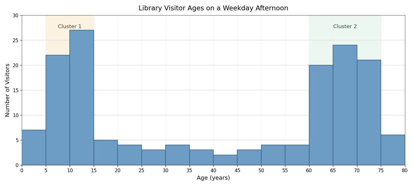
For example, imagine a histogram showing the ages of visitors to a public library on a weekday afternoon. We might see a cluster of tall bars from 5 to 15 years, representing children arriving after school, and another cluster from 60 to 75 years, representing retirees with free time. The bars between those two regions might be much shorter. Each cluster points to a subgroup that is especially well represented in the data, and asking why a cluster appears often leads to a meaningful explanation.
A gap is a bin, or a stretch of consecutive bins, with zero or very low frequency. It signals that few or no data values fall in that interval. Gaps stand out visually because one or more bars are missing or barely visible between taller neighbors.
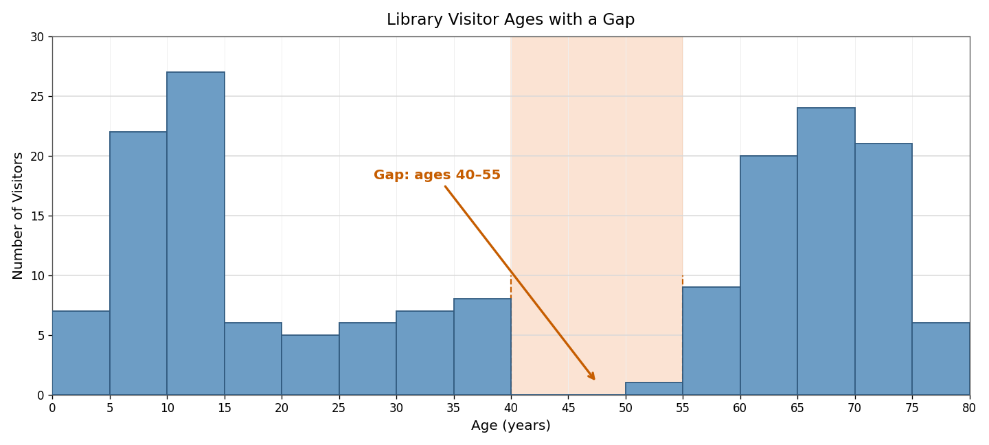
Returning to our library example, suppose the bars for ages 40 to 55 are nearly empty. That gap suggests middle-aged adults are largely absent during weekday afternoons — likely because they are at work. Gaps can also appear at the extremes of a distribution or between two separate clusters. Whenever we notice a gap, it is worth asking what real-world factor might explain the absence of data in that range.
A peak is the tallest bar, or a small group of the tallest bars, in the histogram. It identifies the interval with the highest frequency, meaning more data points fall there than in any other bin. In the previous lesson, we noted how the number of peaks helps classify shape — one peak for unimodal distributions, two for bimodal. Here, our focus shifts to pinpointing which specific interval forms the peak and interpreting what that tells us about the data.
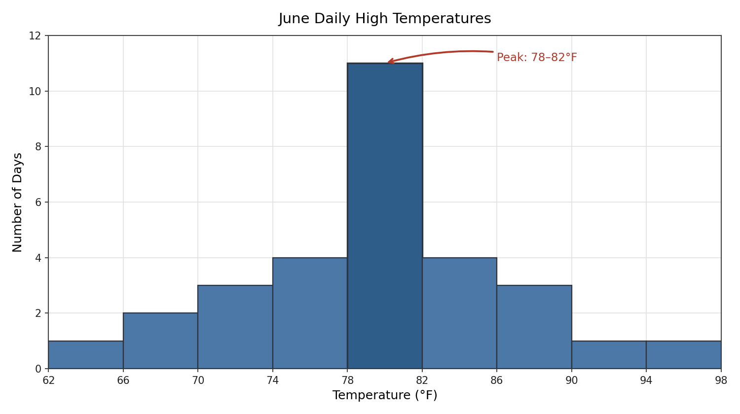
For instance, in a histogram of daily high temperatures recorded in a city during June, the peak might sit in the 78–82°F bin. That means temperatures in that narrow range occurred more often than in any other interval, giving us a quick sense of the most common outcome in the dataset.
In practice, clusters, gaps, and peaks often appear in the same histogram, and examining them together tells us far more than any single feature alone. A simple three-step checklist keeps the process organized:
Scan for peaks. Which bin or bins are the tallest? Note the interval and its frequency.
Look for clusters. Are there groups of consecutive tall bars? Identify the range each cluster covers.
Check for gaps. Are there bins with zero or near-zero frequency? Note where they fall relative to the clusters and peaks.
After identifying each feature, ask one key question: What might explain this pattern? The answer connects the visual detail to the real-world context behind the data.
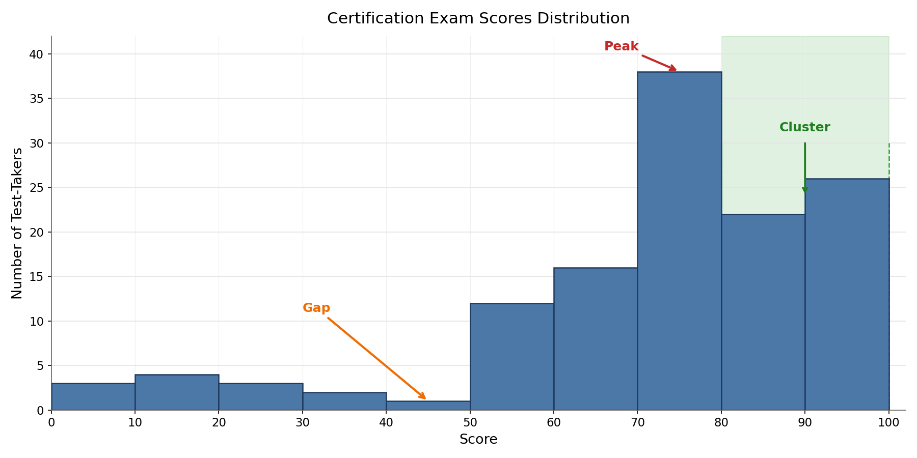
Consider a histogram of scores on a certification exam. It might show a peak around 70–80, a cluster of tall bars from 80–100 representing well-prepared test-takers, and a gap near 40–50 where almost no one scores. Together, these features suggest that most candidates are reasonably prepared, a strong subgroup excels, and very few people land in the low-middle range. No single feature tells that whole story — it emerges only when we read all three together.