Welcome back to Analyzing Data with Histograms! In our previous lesson, we learned how to read a histogram by identifying bins, frequencies, and bar heights, and we practiced pulling specific counts from the display. Those skills let us zoom in on individual bars, but a histogram has a bigger story to tell. In this second lesson of four, we will step back and look at the overall shape of a distribution — learning to classify it and understanding what that shape reveals about how data values are concentrated.
Reading individual bar heights is a bit like examining each tree in a forest. It gives us useful detail, but we also want to know what the forest looks like as a whole. When we look at a histogram, the outline formed by the tops of all the bars creates a silhouette, and that silhouette carries meaning.
Are the bars roughly balanced on both sides, or do they trail off in one direction? Is there a single peak or more than one? Answering these questions lets us summarize an entire dataset in plain language, without computing a single number. There are five common shapes we will explore: approximately symmetric, skewed right, skewed left, uniform, and bimodal. Let's take each one in turn.
A distribution is approximately symmetric when the left half of the histogram is roughly a mirror image of the right half. The tallest bars sit near the center, and the heights decrease at about the same rate on both sides. Picture a bell or a hill: the peak is in the middle, and both sides slope down evenly.
Don't look for perfection. If one bar is slightly higher than its mirror image, but the overall "hill" shape is there, still classify it as approximately symmetric.
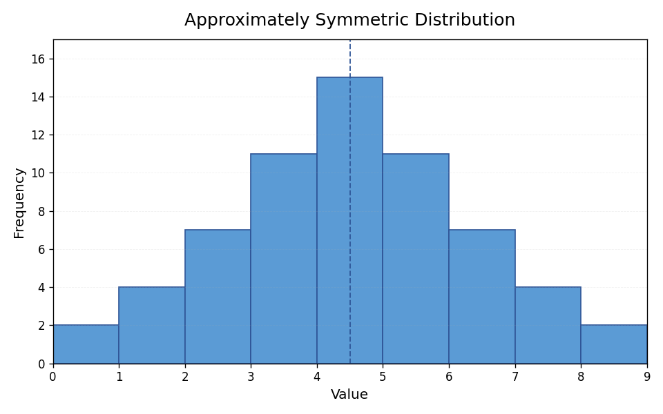
When a distribution is symmetric, it tells us that data values are concentrated around the center and become less common as we move equally in either direction. A classic real-world example is the heights of adult women in a large population. Most heights cluster near the average, with roughly equal numbers of people who are much shorter or much taller.
In a symmetric distribution, the mean and the median tend to sit close together, right near the center. As you may recall from the first course in this path, this agreement between the two measures is one clue that a distribution is balanced.
Not all distributions are balanced. A skewed right (also called positively skewed) distribution has a peak on the left side and a long tail stretching to the right. Most data values are concentrated at the lower end, but a few unusually large values pull the tail out to the right.
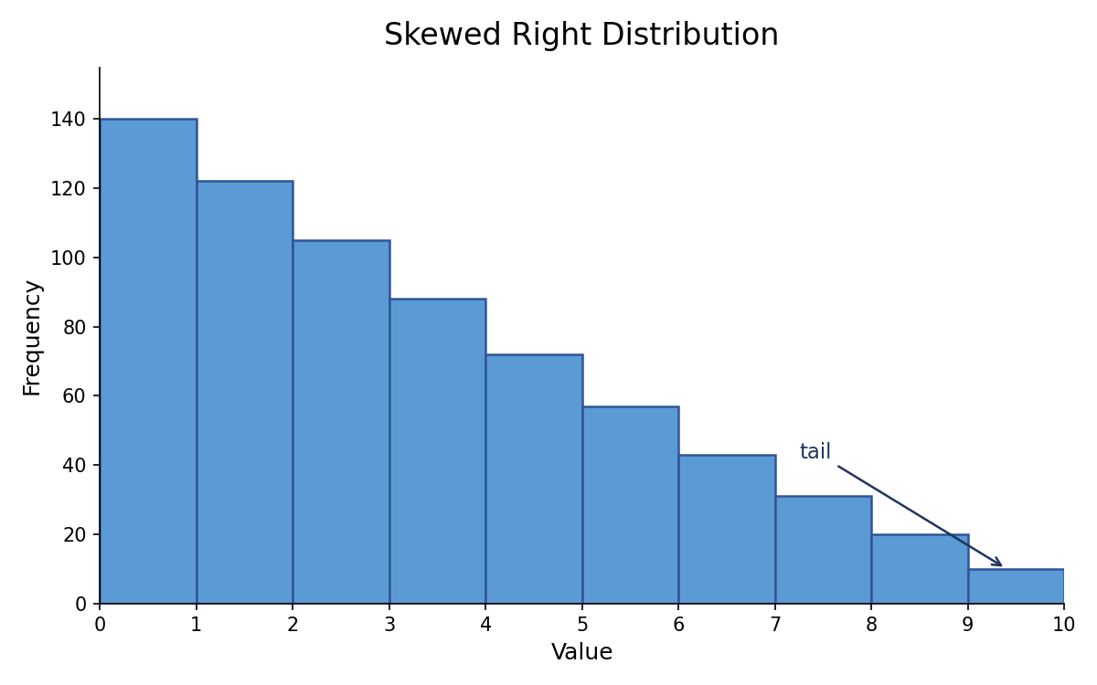
A familiar example is annual household income. The majority of households earn in a moderate range, but a small number of very high earners stretch the distribution far to the right. Because those few large values raise the average, the mean is typically pulled higher than the median in a right-skewed distribution.
Here is a helpful way to remember the name: the distribution is called skewed right because the tail points to the right, not because most of the data is on the right. The bulk of the data actually sits on the left, near the peak.
A skewed left (also called negatively skewed) distribution is the mirror image of skewed right. The peak is on the right side, and a long tail extends to the left. Most values are concentrated at the higher end, with a few unusually low values pulling the tail leftward.
Think about scores on a relatively easy exam. Most students do well and score near the top, but a handful of low scores stretch the tail to the left. Because those few small values drag the average down, the mean is typically pulled lower than the median.
The same naming rule applies: the tail points to the left, which is why we call it skewed left, even though the majority of data clusters on the right side of the histogram.
A uniform distribution looks quite different from the shapes we have discussed so far. Instead of one clear peak, the bars are all roughly the same height across the histogram. There is no obvious center where data bunches up.
This shape tells us that data values are spread evenly across the entire range, with no interval being noticeably more common than another. A histogram example would be customer arrival times spread fairly evenly across an hour, so bins such as 0–10, 10–20, and 20–30 minutes would have similar heights. When you see a uniform distribution, the key takeaway is that no particular region of values dominates the dataset.
The table below summarizes all five shapes along with their key visual features and what they imply about the data:
| Shape | Visual Feature | Where Values Concentrate |
|---|---|---|
| Approximately symmetric | Left and right sides roughly mirror each other | Around the center, tapering evenly both ways |
| Skewed right | Tail extends to the right | Most values at the lower end |
| Skewed left | Tail extends to the left | Most values at the higher end |
| Uniform | Bars are roughly equal in height | Spread evenly across the range |
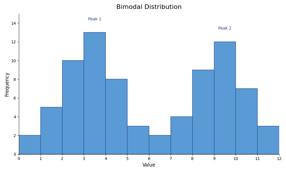
| Bimodal | Two distinct peaks with a valley between them | Around two separate centers |
When you encounter a new histogram, a simple two-question approach can guide you to the correct label:
- How many peaks are there? If there are two, the distribution is likely bimodal. If the bars are all about the same height with no clear peak, it is uniform.
- If there is one peak, is the histogram balanced? If yes, call it approximately symmetric. If one side has a longer tail, identify which direction the tail points and label it skewed right or skewed left.
In this lesson, we covered the five common distribution shapes — approximately symmetric, skewed right, skewed left, uniform, and bimodal — and learned what each one tells us about where data values are concentrated. We also picked up a practical two-question strategy for classifying any histogram we encounter.
Being able to name and interpret a distribution's shape is a skill that will support everything we do in the rest of this course, from spotting patterns to drawing real-world conclusions. Up next is a set of hands-on exercises where you will classify histograms, match shapes to their labels, and explain what those shapes mean in everyday contexts — let's put your new eye for shape to work!