Welcome to Analyzing Data with Histograms, the third course in our learning path! In the first two courses, we built a solid toolkit of numerical summaries — from measures of center like the mean and median to measures of spread like the range and IQR. Now it's time to bring data to life visually. In this first lesson, we'll learn how to read a histogram by identifying its parts, understanding what each bar represents, and pulling specific information directly from the display.
From Numbers to Pictures
A single number like the mean or IQR is great for summarizing a dataset, but it can't show us everything at once. A histogram gives us a visual snapshot of an entire distribution, making it easy to see where data points concentrate and how spread out they are. Think of it as a bridge between raw data and the bigger story that data tells.
Before we can interpret that story, though, we first need to understand how a histogram is put together. Let's start with the core building blocks.
The Anatomy of a Histogram
Reading Bar Heights
Combining Bins for Broader Questions
Conclusion and Next Steps
In this lesson, we covered the building blocks of reading a histogram. We learned that the horizontal axis shows value intervals (bins), the vertical axis shows frequency, and each bar's height tells us how many data points fall in that interval. We also practiced extracting specific counts from individual bars and combining multiple bars to answer questions about broader ranges.
These foundational skills will carry us through the rest of the course as we move on to describing shapes, spotting patterns, and drawing real-world conclusions. Up next is a set of hands-on exercises where you will read histograms, locate key intervals, and calculate totals on your own — let's put these skills to work!
Be a part of our community of 1M+ users who develop and demonstrate their skills on CodeSignal
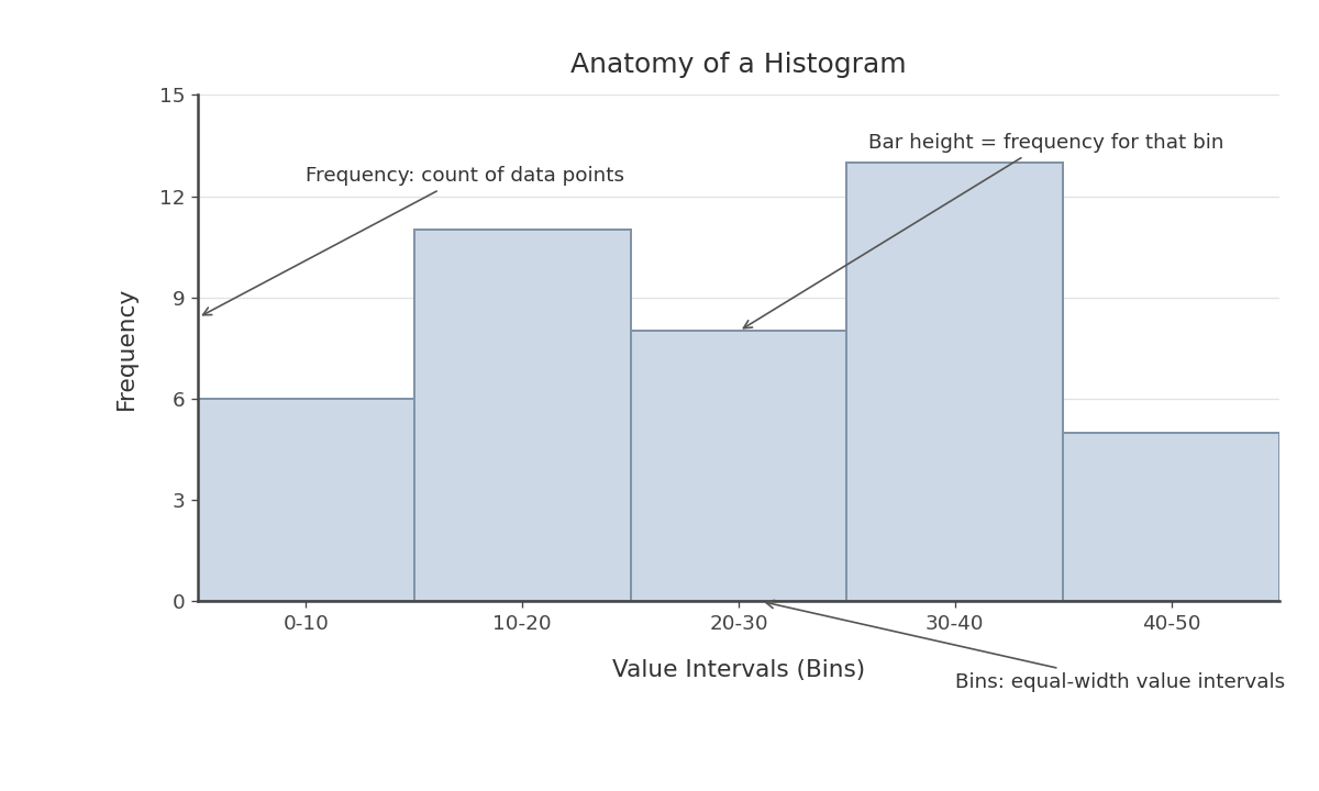
A histogram organizes data into equal-width intervals and displays how many data points fall into each one. Here are the three main components:
Horizontal axis (x-axis): Shows the range of data values divided into consecutive, equal-width intervals called bins. For example, if we are measuring commute times in minutes, the bins might be 0–10, 10–20, 20–30, and so on.
Vertical axis (y-axis): Shows frequency — the count of data points that land in each bin.
Bars: Each bar sits directly over a bin, and its height equals the frequency for that interval. Unlike a typical bar chart, the bars in a histogram touch one another because the data is continuous, with no gaps between intervals.
One small but important detail: when a value falls exactly on a bin boundary, it is typically counted in the bin that starts at that value. For example, a commute of exactly 20 minutes would belong to the 20–30 bin, not the 10–20 bin.
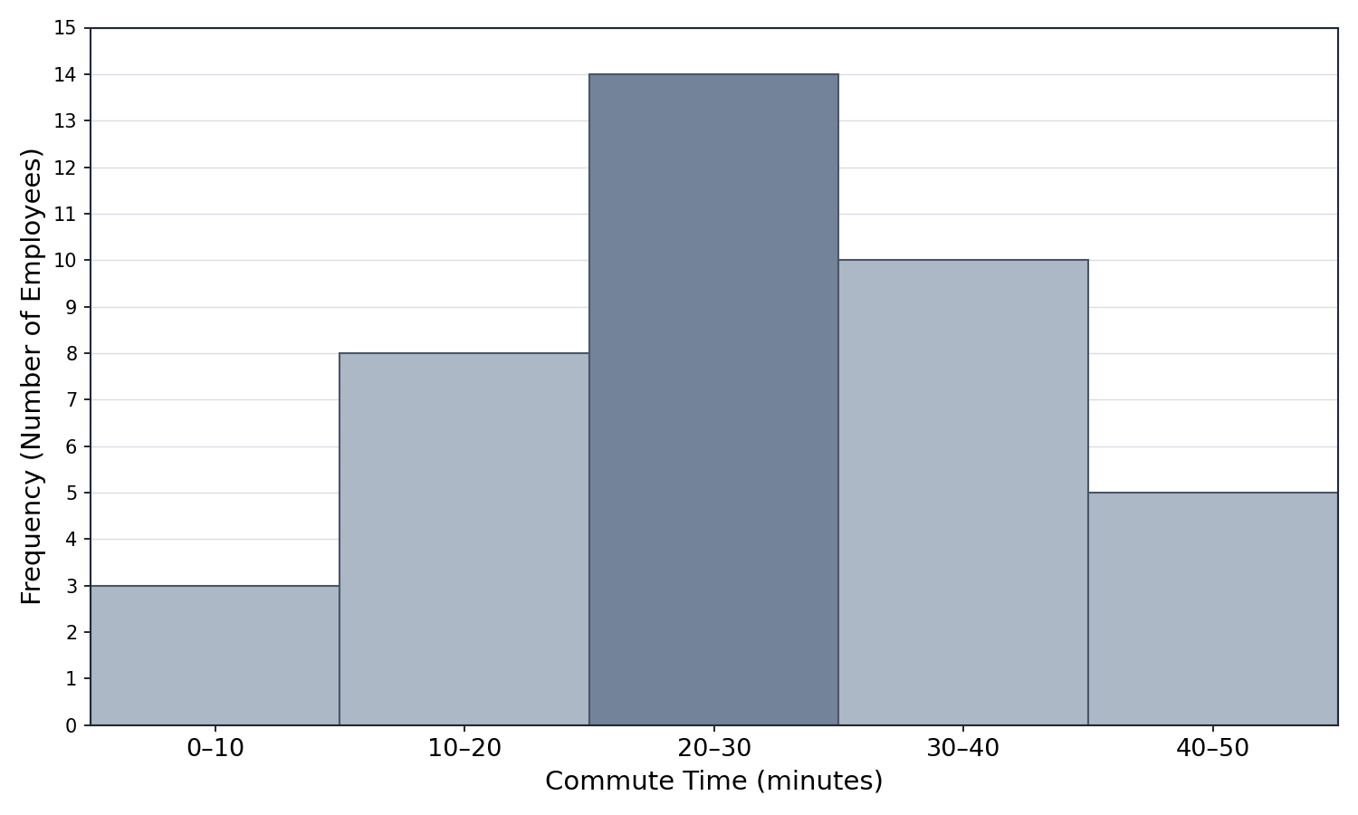
Let's practice with a concrete scenario. Imagine a company surveyed 40 employees about their one-way commute times (in minutes) and displayed the results in a histogram. The table below represents what we would read from the bars:
Bin (minutes)
Frequency
0–10
3
10–20
8
20–30
14
30–40
10
40–50
5
Each row corresponds to one bar in the histogram. The bar over the 20–30 bin is the tallest, reaching a height of 14. This tells us that 14 employees have a commute between 20 and 30 minutes, making it the most common commute range. Meanwhile, the bar over 0–10 is the shortest at 3, meaning very few employees commute under 10 minutes.
As a helpful check, we can add all the frequencies to confirm they match the total number of data points:
3+8+14+10+5=40
This matches the 40 employees surveyed, so we know we are reading the histogram correctly.
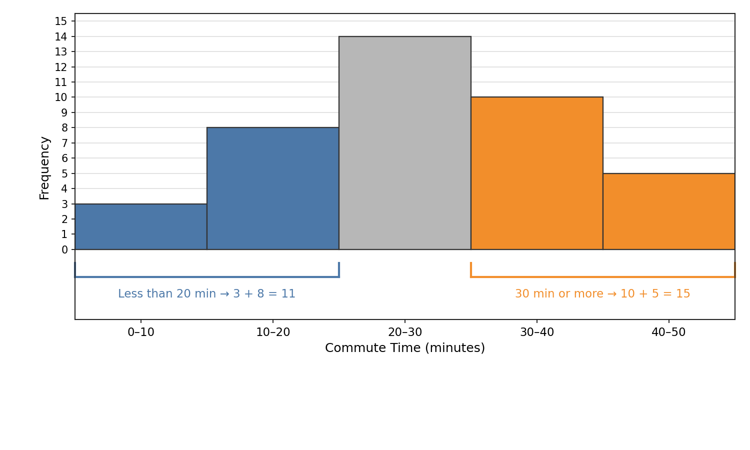
Often we want to know how many data points fall within a range that spans more than one bin. For instance, suppose we want to find how many employees commute less than 20 minutes. We identify the bins that cover that range (0–10 and 10–20) and add their frequencies:
3+8=11
So 11 out of 40 employees commute less than 20 minutes. Similarly, if we want to know how many commute 30 minutes or more, we add the 30–40 and 40–50 bins:
10+5=15
This technique of combining adjacent bars is one of the most practical skills we can develop with histograms. It lets us answer real-world questions when the range lines up with complete bins, such as "How many students scored between 70 and 90?"
In those cases, identify every full bin the range covers and add up their frequencies. If a cutoff falls inside a bin — for example, "more than 15 minutes" when one bin is 10–20 — the histogram alone does not show the exact count in that partial bin.