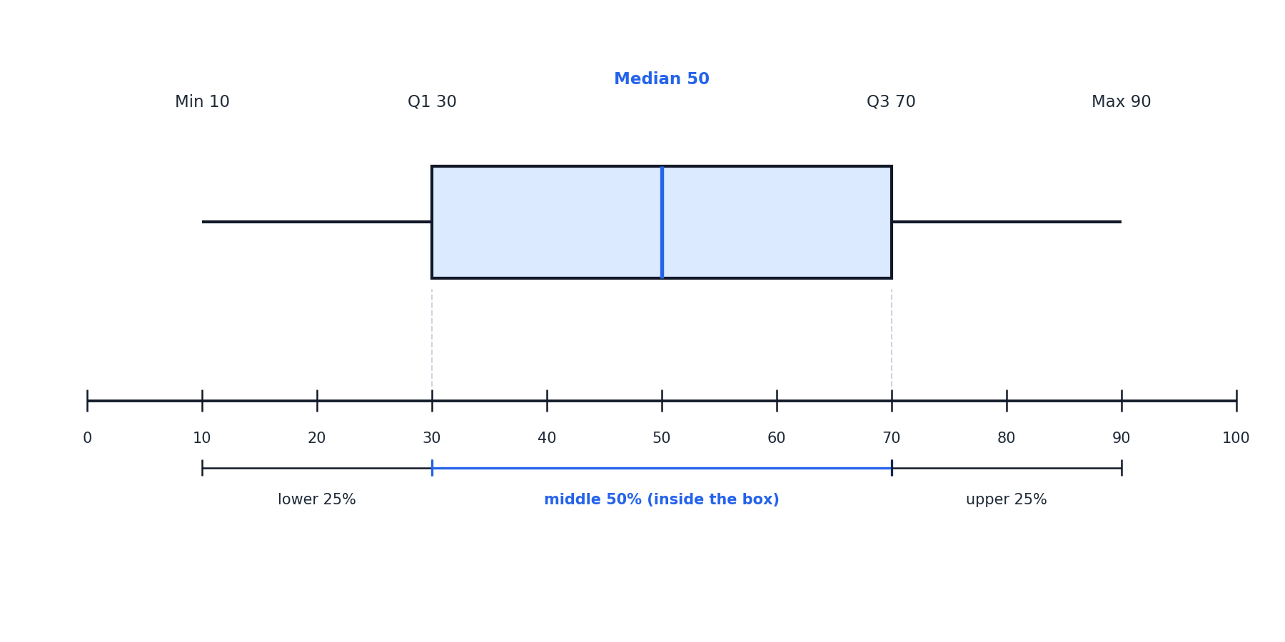
The whiskers extend from the edges of the box out to the minimum and maximum values. They represent the data that falls outside the middle 50%, with each whisker covering roughly 25% of the dataset.
Comparing the two whiskers tells us how the outer portions of the data behave. If both whiskers are about the same length, the data tails are similar on each side. If one whisker is noticeably longer than the other, the data stretches further in that direction — a quick visual clue about whether the distribution is balanced or lopsided.
Detecting Symmetry and Skew
Interpreting a Complete Example: Weekly Grocery Bills
Conclusion and Next Steps
In this lesson, we moved beyond simply reading values and learned to interpret what a box plot communicates. The box holds the middle 50% of the data and shows how tightly those values cluster. The median line marks the center. And by comparing the lengths of the whiskers and box halves, we can determine whether a distribution is approximately symmetric, skewed left, or skewed right.
Now it is time to put these interpretation skills into action. In the upcoming practice tasks, you will analyze real-world box plots, identify what each feature reveals, and write your own complete interpretations. Let's see how well you can read the story behind the graphic!
Be a part of our community of 1M+ users who develop and demonstrate their skills on CodeSignal
Welcome back to Analyzing Data with Box Plots! In the first lesson of this course, you learned how to read a box plot — locating the minimum, Q1, median, Q3, and maximum on the number line. That skill is essential, but knowing where the numbers sit is only half the story.
In this second lesson, we shift from reading to interpreting. Our focus is on what each part of the box plot actually tells us about the data. By the end, you will be able to explain what the box, the median line, and the whiskers reveal about center, spread, and the overall shape of a distribution.
Think of reading a box plot like reading the temperature on a thermometer: you get a number, but you still have to decide whether that number means "bring a jacket" or "grab sunscreen." In the same way, once we read that Q1=18 and Q3=34, we need to think about what that means for the data.
Interpreting a box plot is about translating its visual features into plain-language statements about where data values are concentrated, how spread out they are, and whether the distribution leans to one side. Let's start by looking at the most prominent feature: the box itself.
The box stretches from Q1 to Q3, so it captures exactly the middle 50% of all data values. This is one of the most important takeaways in box plot interpretation: half of the entire dataset lives inside that rectangle.
The width of the box equals the IQR (Q3−Q1). A narrow box means the middle half of the data is tightly clustered, while a wide box means those values are more spread out. Whenever someone asks, "How much do the typical values vary?" the box gives you a quick visual answer.
The line drawn inside the box marks the median, the center of the dataset. It splits the data so that roughly half the values fall on each side. When you interpret a box plot, you can point to the median line and say, "This is the typical value."
Equally important is where the median line sits within the box. If it falls near the middle of the box, the central 50% of values are fairly balanced around the center. If the median line is closer to Q1 or Q3, the data within that middle 50% are bunched toward one side — a clue about the shape of the distribution that we will explore shortly.
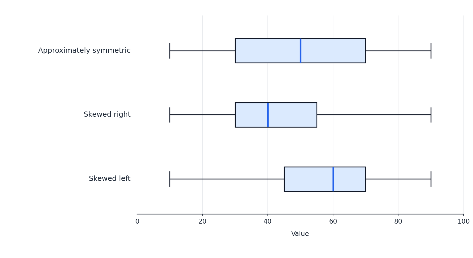
One of the most practical skills in box plot interpretation is using the relative sizes of the box segments and whiskers to judge the shape of the distribution. There are three features to compare:
Left whisker vs. right whisker — Are they roughly equal in length?
Left half of the box (from Q1 to the median) vs. right half (from the median to Q3) — Are these two sections about the same width?
Overall pattern — Do the shorter segments consistently appear on the same side?
The diagram below illustrates the three common shapes you will encounter:
What You See
Shape
What It Means
Both whiskers similar in length; median near the center of the box
Approximately symmetric
Data are fairly evenly distributed on both sides of the center
Right whisker longer; median closer to Q1
Skewed right
A tail of higher values stretches the data to the right
Left whisker longer; median closer to Q3
Skewed left
A tail of lower values stretches the data to the left
A helpful way to remember this: the skew points toward the longer tail. If the longer whisker is on the right, the distribution is skewed right, and vice versa.
Let's practice interpreting a box plot from start to finish. Imagine a box plot of weekly grocery bills (in dollars) for a sample of households, displayed along a number line from 30 to 200, with the following five-number summary:
Statistic
Value
Minimum
$35
Q1
$60
Median
$80
Q3
$110
Maximum
$190
Center: The median is $80, so a typical household spends about $80 per week on groceries.
Middle 50%: The box spans from $60 to $110, giving an IQR of:
IQR=Q3−Q1=110−60=50 dollars
This means the middle half of households spend within a $50 range.
Symmetry or skew: The left half of the box is 80−60=20 dollars wide, while the right half is 110−80=30 dollars wide. The left whisker covers 60−35=25 dollars, and the right whisker covers 190−110=80 dollars. Both the box and the whiskers are longer on the right side, so the distribution is skewed right. This tells us that while most households cluster around $60 to $110, some households have much higher bills that pull the data to the right.
Notice how each part of the box plot contributed a different piece of the story: the median gave us the center, the box showed typical spread, and the whisker comparison revealed the skew.