So far in Analyzing Data with Box Plots, you have built two essential skills: reading the five key values from a box plot and interpreting what the box, median line, and whiskers reveal about center, spread, and shape. With those tools in hand, you are ready for the third lesson in this four-part course.
This time, we focus on a feature that often catches a reader's eye first: outliers. These are data points that sit unusually far from the rest of the values, and box plots have a special way of highlighting them. By the end of this lesson, you will be able to spot outliers on a box plot, understand why they are plotted separately, and use a straightforward rule to determine whether a value qualifies as one.
In everyday language, an outlier is something that does not fit the pattern. In statistics, the idea is similar: an outlier is a data value that is much smaller or much larger than the bulk of the dataset.
Outliers matter because they can heavily influence calculations like the mean and the range, and they often signal something worth investigating. For example, if you are looking at monthly electricity bills for an apartment building and one bill is $900 when most fall between $80 and $150, that $900 figure deserves a closer look. It might be a data-entry error, or it might reflect genuinely unusual usage. Either way, identifying it is the first step toward understanding your data.
In the previous lessons, every value in the dataset — from the minimum to the maximum — was captured by the box and whiskers. When a dataset contains outliers, however, the box plot handles those extreme values differently.
Instead of stretching a whisker all the way out to an extreme value, the box plot plots each outlier as an individual dot (or small circle) beyond the whisker. The whisker then stops at the most extreme value that is not an outlier. This visual separation makes outliers easy to spot at a glance: any isolated point sitting beyond a whisker is an outlier.
That means that on a modified box plot, the whisker endpoints are not necessarily the dataset's minimum and maximum values.
Consider the example below. Notice how most of the data is captured by the box and whiskers, but two points on the right are plotted individually. Those two dots are the outliers.
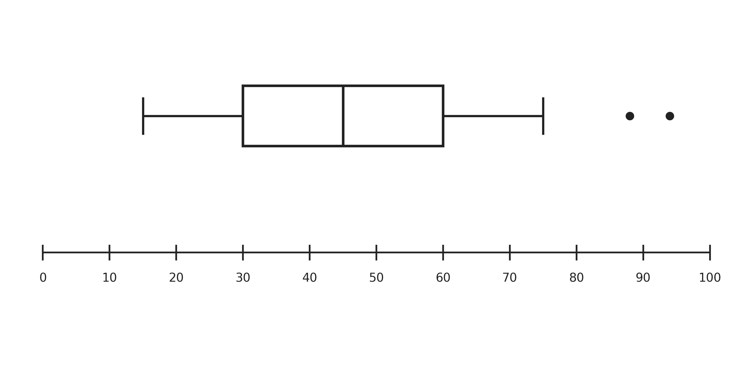
This design choice keeps the box and whiskers focused on the main body of the data, while still making sure extreme values are visible rather than hidden.
In this lesson, you learned that box plots highlight unusual data points by plotting them as separate dots beyond the whiskers, and you practiced the 1.5 × IQR rule that determines whether a value earns that outlier label. The process boils down to four steps: compute the IQR, multiply by 1.5, find the lower and upper fences, and compare each data point to those fences.
Now it is time to put the rule to work yourself. In the practice exercises ahead, you will calculate fences from scratch, read outlier values directly from box plots, and decide whether specific data points qualify as outliers in real-world scenarios. Let's jump in!
