Welcome back to Analyzing Data with Box Plots! You have reached the fourth and final lesson of the course, and this is where everything comes together. Over the previous three lessons, you built the skills to read five-number summaries, interpret what the box and whiskers reveal about center, spread, and shape, and identify outliers using the 1.5 × IQR rule. Now we put all of those skills to work for what is arguably the most practical use of box plots: comparing groups side by side.
In this lesson, you will learn how to place two or more box plots on the same scale and draw clear, evidence-based conclusions about how groups differ. We will walk through each comparison dimension — medians, IQRs, overall spread, skew, and outlier patterns — so that by the end, you have a reliable framework for analyzing any pair of distributions.
Why Compare with Box Plots?
In real life, we rarely look at a single group in isolation. A manager might want to know whether Shipping Service A delivers faster than Shipping Service B. A researcher might compare sleep durations on weekdays versus weekends. A city planner might examine commute times across two neighborhoods.
Side-by-side box plots are ideal for these comparisons because they line up key summary features on a shared number line. Instead of comparing long lists of numbers or separate tables of statistics, you can visually scan the plots and spot differences in seconds. Every skill you have built so far in this course feeds directly into this final step.
Anatomy of a Side-by-Side Display
A side-by-side display places two or more box plots on the same axis so their positions are directly comparable. Each plot still shows the familiar five-number summary — minimum, Q1, median, Q3, and maximum — along with any outlier dots. The only addition is a category axis that labels each group.
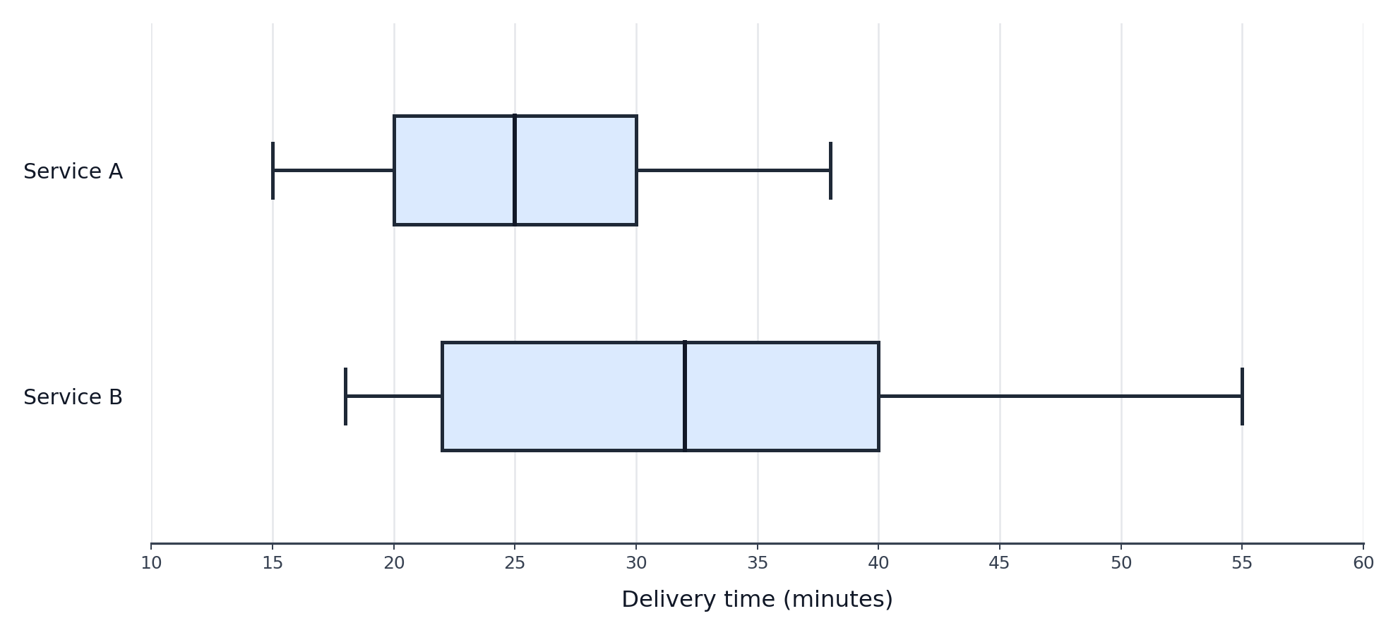
Consider the example below. Two box plots share a horizontal axis running from 10 to 60 minutes. The top plot represents Service A delivery times and the bottom represents Service B. Because both plots use the same scale, differences in center, spread, and extremes are easy to see at a glance.
Comparing Medians
Comparing the IQR
Comparing Overall Spread
While the IQR focuses on the middle 50%, the overall spread looks at how far the data stretches from end to end. You can get a quick sense of this by examining how far each plot's whiskers extend. A group whose whiskers reach much further has a wider range of non-outlier values.
Keep in mind that outlier dots sit beyond the whiskers, so the total range of all data points may be even larger than the whisker-to-whisker span. Comparing overall spread alongside the IQR gives a fuller picture: two groups might have similar boxes but very different whisker lengths, or vice versa.
Comparing Skew and Shape
Comparing Outlier Patterns
Finally, look for the isolated dots beyond the whiskers. As we covered in Lesson 3, these flag values that fall outside the 1.5 × IQR fences. When comparing groups, pay attention to three things:
Which groups have outliers? One group might have none while another has several.
On which side do the outliers appear? High-end outliers suggest occasional extreme highs; low-end outliers suggest occasional extreme lows.
How far from the whisker are they? A dot barely beyond the whisker is less dramatic than one that sits far away.
These differences can shift the overall story. If two shipping services have similar medians and IQRs but one has multiple high-end outliers, that service occasionally produces very late deliveries — something that could matter a great deal to customers.
Structured Comparison: Weekday vs. Weekend Sleep
Conclusion and Next Steps
In this lesson, you combined every skill from the course — reading values, interpreting shape, and spotting outliers — into a unified framework for comparing distributions with side-by-side box plots. The key is to work through each dimension systematically: medians for center, IQR and whisker length for spread, box and whisker balance for skew, and isolated dots for outliers.
You have now completed all four lessons in Analyzing Data with Box Plots. The upcoming exercises will present side-by-side box plots from real-world scenarios and ask you to extract values, match comparison statements to the correct groups, and write your own structured comparisons. Let's finish the course strong!
Be a part of our community of 1M+ users who develop and demonstrate their skills on CodeSignal
With both plots on the same scale, the first feature to check is the median line inside each box. This tells us where the center of each group falls, answering the question: Which group has a higher typical value?
Locate the vertical line inside each box and read its position on the shared number line. If Service A's median is at 25 minutes and Service B's median is at 32 minutes, Service A has a lower typical delivery time. The difference, 32−25=7 minutes, gives a concrete measure of how far apart the centers are.
Next, turn your attention to the width of each box. As you learned earlier in the learning path, the interquartile range captures the spread of the middle 50% of the data:
IQR=Q3−Q1
On a box plot, the IQR is simply the length of the box. A wider box means more variability among the middle half of the values; a narrower box means those values are tightly clustered.
To compare, compute the IQR for each group. If Service A has Q1=20 and Q3=30, then IQRA=10. If Service B has Q1=22 and Q3=40, then IQRB=18. Service B's larger IQR tells us its delivery times are less consistent in the middle range — an important finding whenever reliability matters.
In Lesson 2, you learned that the relative lengths of the box segments and whiskers reveal skewness. The same logic applies when comparing groups:
If the median line sits near the center of the box and both whiskers are roughly equal, the distribution is approximately symmetric.
If the median line is closer to Q1 and the right whisker is longer, the distribution is skewed right (toward higher values).
If the median line is closer to Q3 and the left whisker is longer, the distribution is skewed left (toward lower values).
When two groups show different skew patterns, that difference is worth highlighting. For instance, one city's commute times might be roughly symmetric while another city's are skewed right, suggesting a long tail of unusually lengthy commutes in the second city.
When you sit down with a pair of side-by-side box plots, working through a short checklist ensures nothing is missed:
Medians — Which group has the higher or lower center?
IQR — Which group has a wider box, indicating more variability in the middle 50%?
Overall spread — Which group spans a larger total range?
Skew — Is either distribution noticeably skewed, and do they differ in direction?
Outliers — Does either group have outlier dots, and what do they suggest?
Let's apply this checklist to a concrete scenario. Suppose we are comparing nightly sleep durations (in hours) for weekdays versus weekends using these values:
Feature
Weekdays
Weekends
Minimum
4.5
5.0
Q1
6.0
7.0
Median
7.0
8.5
Q3
7.5
9.5
Maximum
9.0
11.0
Outliers
one dot at 4.5
none
Starting with medians, the weekend value (8.5 h) is higher than the weekday value (7.0 h), so people tend to sleep longer on weekends. For the IQR, weekdays give 7.5−6.0=1.5 h while weekends give 9.5−7.0=2.5 h, meaning weekend sleep varies more in the middle range. The total range for weekdays is 9.0−4.5=4.5 h compared to 11.0−5.0=6.0 h for weekends, confirming wider overall variability on weekends.
Looking at shape, the weekday distribution appears fairly balanced, while the weekend box has more room below the median, hinting at slight left skew. For outliers, weekdays have one low dot at 4.5 h — someone got very little sleep — while weekends have none.
Pulling it all together, a brief conclusion might read: Weekend sleep durations tend to be longer and more variable than weekday durations, and the weekday data includes at least one unusually short night of sleep. Notice how every claim connects back to a specific box plot feature — that is the hallmark of a strong, evidence-based comparison.