Telling Similar Distributions Apart
Introduction
Welcome back to Which Distribution Is It? In the previous lesson — the first in this course — you built a diagnostic toolkit of four targeted questions that help narrow any variable down to its most likely distribution family. Those questions work well when each answer is clear-cut. But what happens when two families look alike, or when the diagnostic answers feel ambiguous? That is exactly what this second lesson addresses. We will zoom in on three commonly confused pairs of distributions and learn the specific features that tell them apart.
When Distributions Overlap in Appearance
Each distribution family has a characteristic shape: flat for uniform, bell-shaped for normal, and so on. The challenge is that real data is messy, and some families can produce shapes that resemble each other. A normal distribution with a very large spread might look almost flat. A skewed distribution with mild asymmetry might look nearly bell-shaped. And a binomial distribution with many trials can appear almost identical to a normal curve.
When two distributions look similar, the diagnostic questions from the previous lesson get us most of the way, but we also need a sharper eye for the single distinguishing feature that separates one family from the other. In each of the sections that follow, we will identify that deciding feature for one commonly confused pair, starting from the easiest comparison and working toward the trickiest.
Uniform vs. Normal: Flat or Peaked?
At first glance, uniform and normal distributions might not seem easy to confuse. But when a normal distribution has a very large spread relative to the range we are viewing, its bell can appear nearly flat. Likewise, a bar chart of a roughly uniform variable with only a few categories can look bumpy enough to suggest a peak. The deciding feature is straightforward: does the distribution have a single clear peak, or is it essentially level across all outcomes?
A uniform distribution gives every outcome the same likelihood, so its graph stays at roughly the same height from left to right. A normal distribution always has a distinct peak at the center, with heights that taper off symmetrically on both sides. If you can spot a central value where the graph is tallest and watch it decline on either side, you are looking at a normal curve — not a uniform one.
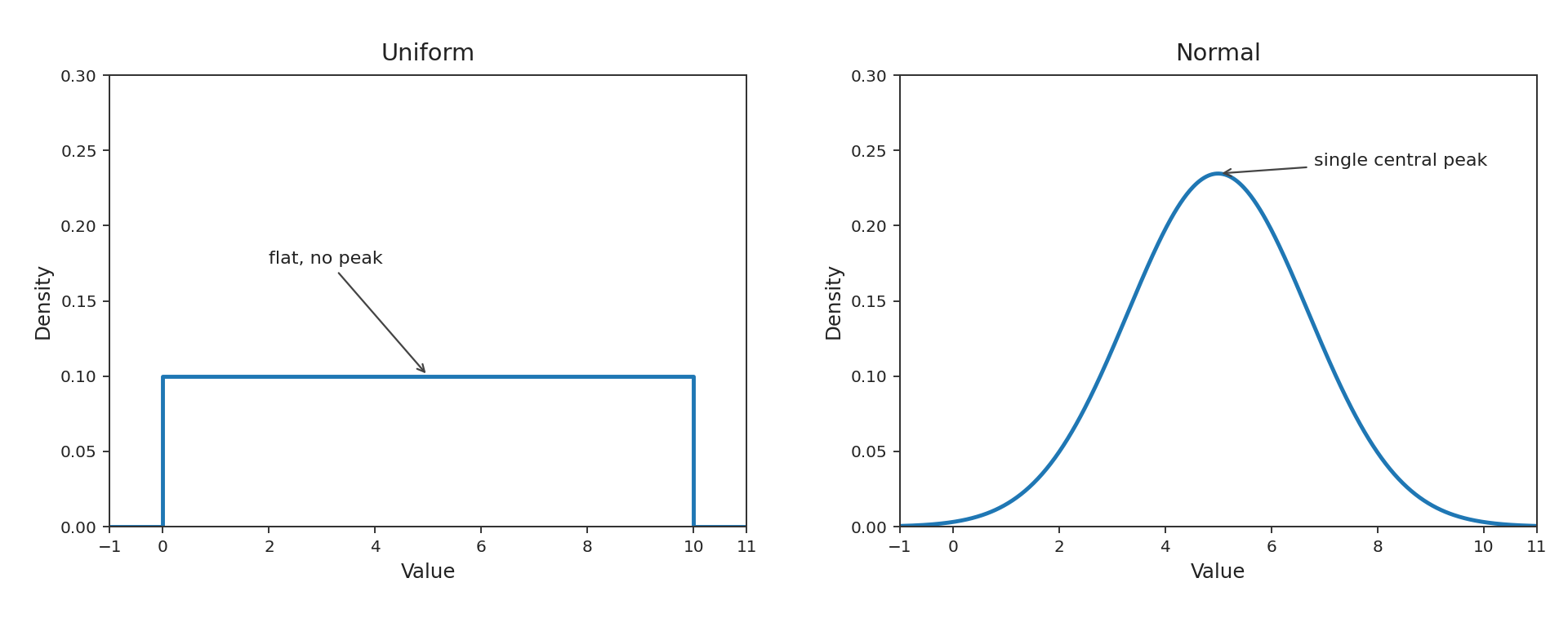
| Feature | Uniform | Normal |
|---|---|---|
| Peak | None (flat) | Single central peak |
| Height pattern | Constant across outcomes | Highest at center, falls toward edges |
| Process clue | All outcomes equally likely | Many small influences add together |
Normal vs. Skewed: Check the Tails
This is the pair that learners confuse most often. Both normal and skewed distributions can be unimodal — meaning they have a single peak — and both can look like a "hill." The deciding feature here is symmetry: are the two tails roughly mirror images of each other, or does one tail stretch noticeably farther?
In a normal distribution, the left tail and the right tail fall off at the same rate. If you folded the curve at its center, the two halves would nearly overlap. In a skewed distribution, one tail is longer. For right skew, the right tail extends further — often because there is a natural floor on the left (like zero for income) but no firm ceiling on the right. For left skew, the pattern reverses.
A helpful mental test: look at where the median (the middle value) sits relative to the peak. In a normal distribution, the median and the peak coincide. In a skewed distribution, the long tail pulls the median away from the peak. If those two landmarks do not line up, skew is likely present.
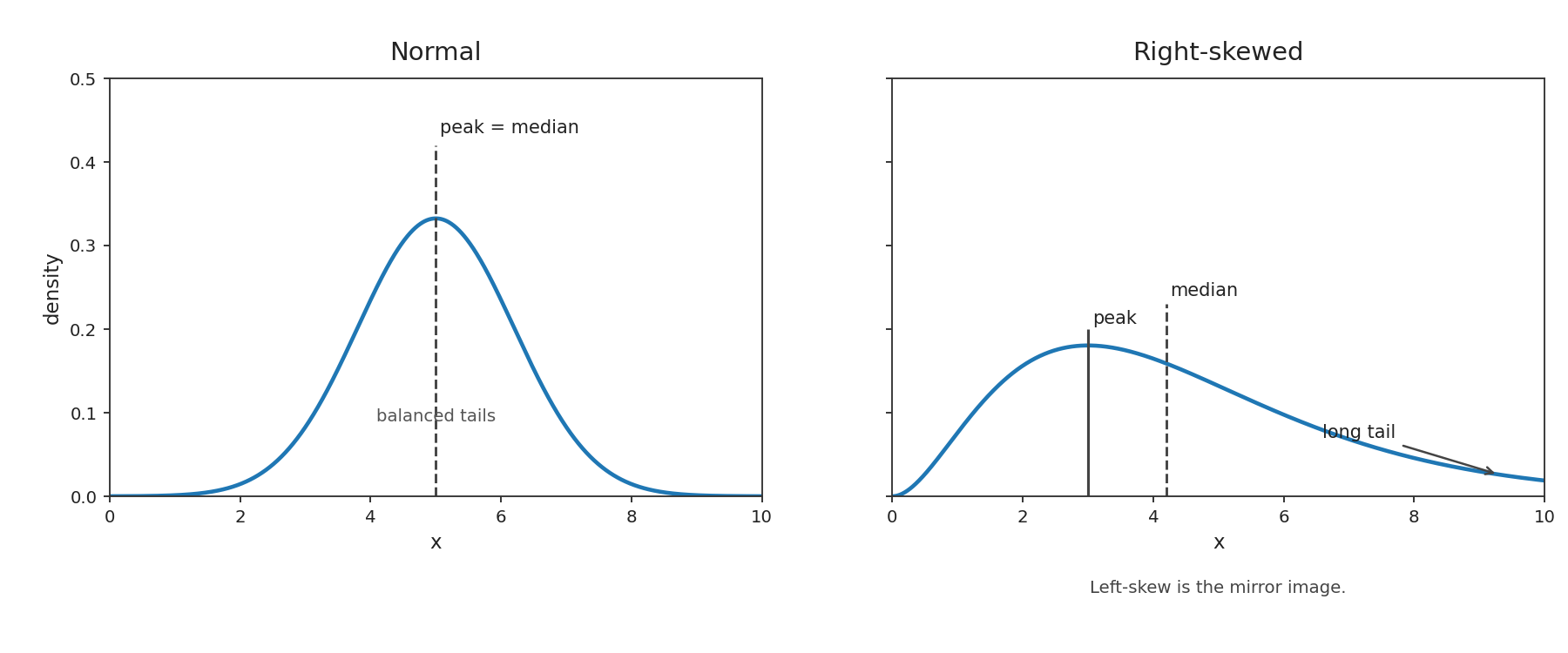
| Feature | Normal | Skewed |
|---|---|---|
| Symmetry | Tails are mirror images | One tail stretches farther |
| Median vs. peak | Coincide at center | Pulled apart by the long tail |
| Process clue | Many small influences add together, no hard boundary | A floor or ceiling on one side allows extremes on the other |
Bell-shaped Binomial vs. Normal: The Hardest Pair
This is the trickiest comparison. As you saw in the earlier course on the binomial distribution, a binomial variable with a moderate success probability and a large number of trials can look remarkably bell-shaped. Visually, it may be nearly indistinguishable from a normal curve. So how do we tell them apart?
The answer lies in process and variable type, not shape. Ask yourself two pointed questions:
- Is the variable a count of whole-number successes out of a fixed number of trials? If yes, the values can only be integers like . A true normal variable is continuous and can take any value, including decimals.
- Is there a hard boundary at and at ? A binomial variable cannot go below or above . A normal variable, in theory, extends from to , even though extreme values are rare.
For example, suppose we flip a fair coin times and count heads. The result is always a whole number between and . Even though the distribution of heads looks like a bell centered near , it is binomial because the process is repeated yes/no trials. Meanwhile, the average daily temperature in a city may also form a bell shape centered on some typical value, but temperature is a continuous measurement driven by many small atmospheric influences — making it normal.
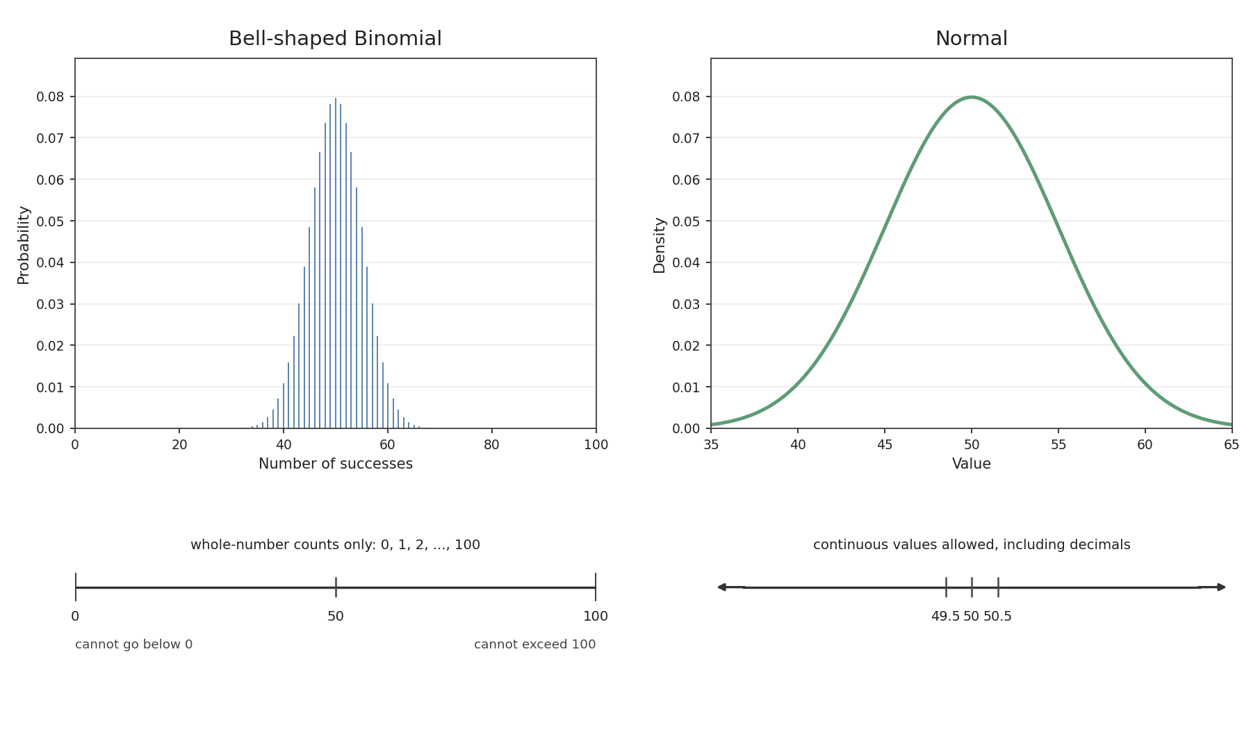
| Feature | Bell-shaped Binomial | Normal |
|---|---|---|
| Values | Integers through | Any real number |
| Boundaries | Hard floor at , hard ceiling at | No firm boundaries |
| Process | Fixed independent yes/no trials | Many small independent influences adding up |
When shape alone cannot settle the question, process evidence wins. This echoes the process-first principle from the previous lesson: knowing how the data was generated is always more reliable than eyeballing the curve.
The Deciding Features at a Glance
Across all three pairs, a single strategy emerges. First, check the shape-level giveaway — flat vs. peaked, symmetric vs. one long tail, or continuous vs. integer-valued. Second, confirm with the process-level evidence — equal likelihood, repeated yes/no trials, many additive influences, or a boundary that produces a long tail.
Here is a compact reference for the deciding features:
- Uniform vs. Normal — Look for a peak. Flat means uniform; a central peak means normal.
- Normal vs. Skewed — Look at symmetry. Balanced tails mean normal; one long tail means skewed.
- Binomial vs. Normal — Look at the variable type and process. Whole-number counts from yes/no trials mean binomial; continuous measurements from many small influences mean normal.
Keeping these distinctions in mind turns an uncertain "it looks kind of bell-shaped" into a confident, reasoned classification.
Conclusion and Next Steps
In this lesson, we sharpened our ability to separate three commonly confused distribution pairs by identifying the single feature that distinguishes each one. The core idea is that when two distributions look alike, you can almost always break the tie by examining either a specific shape detail — symmetry, flatness, or discrete vs. continuous values — or the underlying process that generated the data. Combined with the diagnostic questions from the previous lesson, these finer distinctions give you a reliable method for classifying just about any variable you encounter.
Now it is time to put these skills to the test! In the upcoming practice exercises, you will compare tricky look-alike distributions, match real-world variables to their correct families, decide whether a variable is more likely normal or skewed, and explain in your own words why a bell-shaped binomial is not the same as a true normal. Let's see how well you can spot the differences!
