Evaluating Risk Claims in Real Life
Introduction 🎉
Welcome to Evaluating Risk Claims in Real Life! In the first three lessons of this course, you learned how to turn small probabilities into concrete counts, distinguish absolute risk from relative risk, and see how repeated exposure can quietly increase danger over time. In this lesson, you will learn to:
- Identify the most common ways real-world risk claims mislead by leaving out key context, such as base rates, denominators, comparison groups, or timeframes.
- Interpret risk and test claims more accurately by checking base rates, absolute versus relative framing, and the quality of the sample or population behind the numbers.
- Apply a five-question checklist to judge whether a headline, health warning, or product claim is well-supported, incomplete, or misleading.
🪞 A Quick Reality Check
Imagine reading this headline: "New supplement cuts heart disease risk by 50%!" It sounds impressive — the kind of number that might make someone reach for a credit card on the spot. But by the end of this lesson, your first instinct will be to ask a series of pointed questions, questions that often reveal a very different picture behind the bold numbers. That habit of pausing and probing before reacting is exactly what this lesson is designed to build.
🧩 Spotting Missing Information
The most common way a risk claim misleads is not by lying, but by leaving things out. A number in a headline looks precise and objective, yet it can be almost meaningless without the right context. Here are three patterns worth memorizing:
- Missing base rate. A claim says risk is "doubled," but doubled from what? If the original risk was in , doubling it to in is a tiny absolute change. Without the starting number, you cannot judge the real impact.
- Missing denominator or sample size. "9 out of 10 dentists recommend…" sounds powerful, but if only dentists were surveyed, those carry far less weight than if were asked. The size and selection of the group matters enormously.
- Missing comparison group. "People who eat broccoli live longer" invites the question: compared to whom? If broccoli eaters also exercise more and smoke less, the broccoli itself may not be the reason.
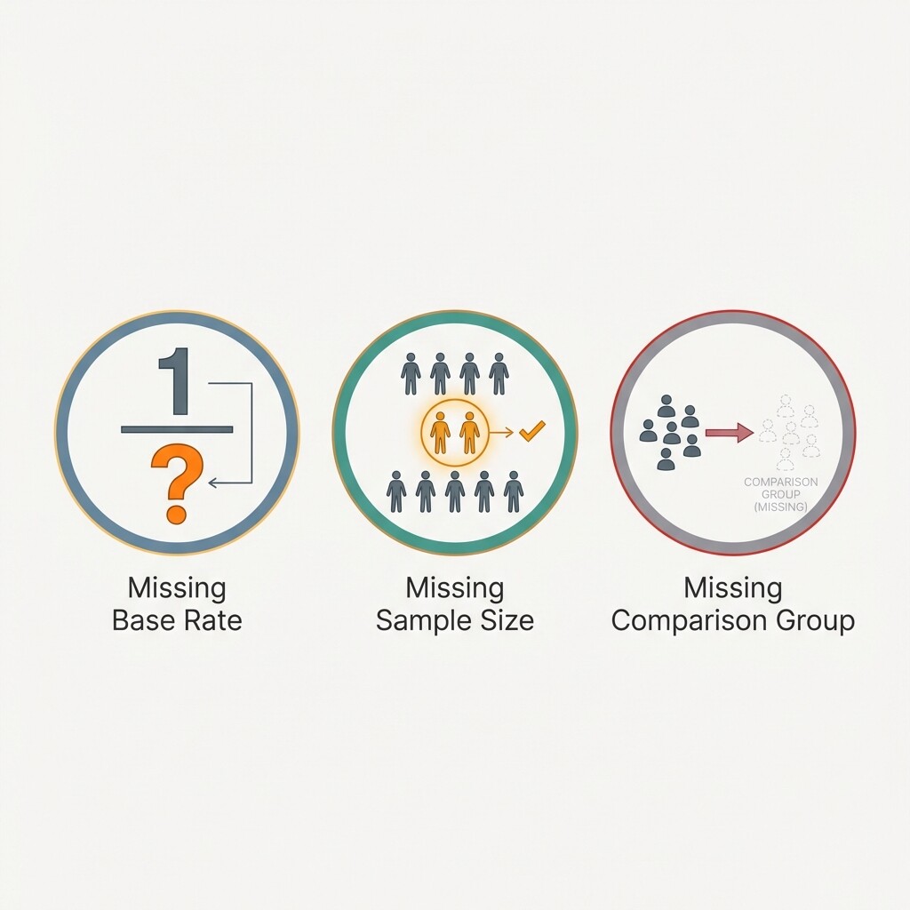
Whenever a claim uses numbers to persuade, ask yourself: What piece of context would I need to actually verify this? If that piece is absent, treat the claim as incomplete until proven otherwise.
🧪 Revisiting Base Rates and Test Results
The base rate — how common a condition is in the first place — has a huge effect on how you should interpret a positive test result. This idea becomes especially important when risk claims cite screening tests or diagnostic accuracy.
Let's walk through a concrete example using natural frequencies — a way of expressing probabilities as simple counts in a large group, such as "90 out of 10,000 people," rather than as abstract percentages — because they make the math much easier to see.
Suppose a medical condition affects in every people. A screening test has a sensitivity of (it correctly flags of those who truly have the condition) and a specificity of (it correctly clears of those who do not). Now picture people being tested:
| Group | Count | Test positive | Test negative |
|---|---|---|---|
| Have the condition | (true positives) | ||
| Do not have the condition | (false positives) | ||
| Total |
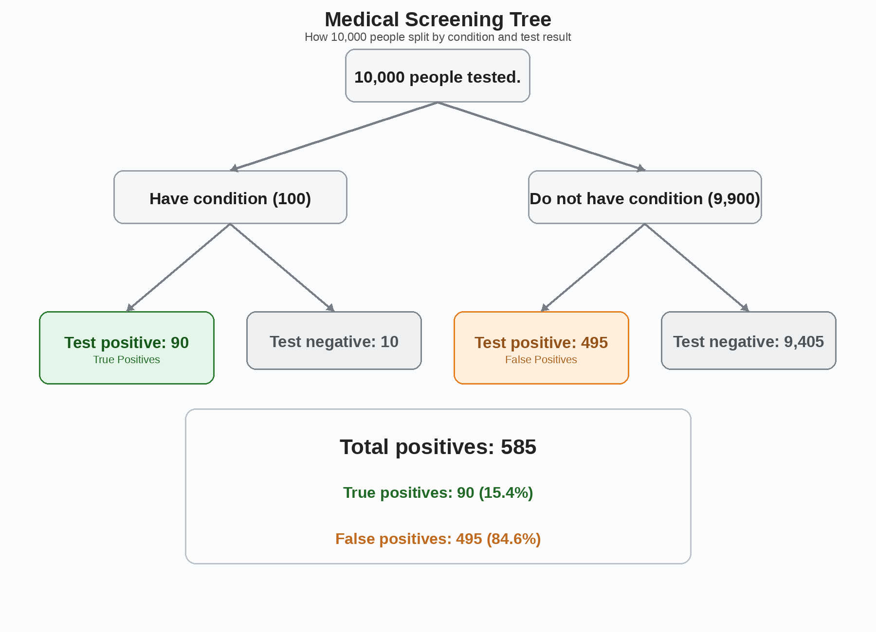
Out of the people tested, 585 people receive a positive result in total. But those positive results are made up of two very different groups:
- 90 true positives: people who really have the condition and tested positive
- 495 false positives: people who do not have the condition but still tested positive
So if you hear that your test result is positive, the important question becomes:
Out of all positive results, how many belong to people who actually have the condition?
The answer is:
This means you take the number of true positives and divide by the number of all positives:
So a person with a positive result has only about a 15.4% chance of actually having the condition.
Another way to say the same thing is:
- About 15 out of every 100 positive results are correct
- About 85 out of every 100 positive results are false alarms
That is why roughly 85% of positive results are false positives, even though the test sounds highly accurate on its own.
Why does this happen? Because the condition is still rare. Even with a pretty good test, the huge number of healthy people means that a small false-positive rate applied to a large group can produce many false alarms. In this example, the test misses only real cases, but it incorrectly flags 495 healthy people.
This is exactly the kind of context that a sensational headline like "Test is 95% accurate!" would leave out.
The lesson here is straightforward: whenever a claim involves a test or a screening result, always ask how common the condition is. Without the base rate, an "accurate" test can still be wrong most of the time.
📋 A Five-Question Checklist for Risk Claims
You now have enough tools to evaluate almost any everyday risk claim. The following checklist pulls together skills from across this course and the broader learning path into a single, repeatable process:
- What is the base rate? How common is the event or condition before the claim enters the picture? A "50% increase" means very different things depending on whether the starting risk is or .
- Is the risk given as absolute or relative? As covered previously, relative risk can make small changes sound dramatic. Always look for the absolute numbers behind the percentage.
- What is the sample or population? Was the study large or small? Was the group representative of the people the claim is aimed at? As you saw in earlier courses, small samples can produce extreme results purely by chance.
- What information is missing? Check for absent denominators, omitted comparison groups, or unspecified timeframes. If key context is missing, the claim is incomplete at best.
- Does the overall picture hold up? Combine everything above into a final judgment: is the claim well-supported, merely incomplete, or actively misleading?
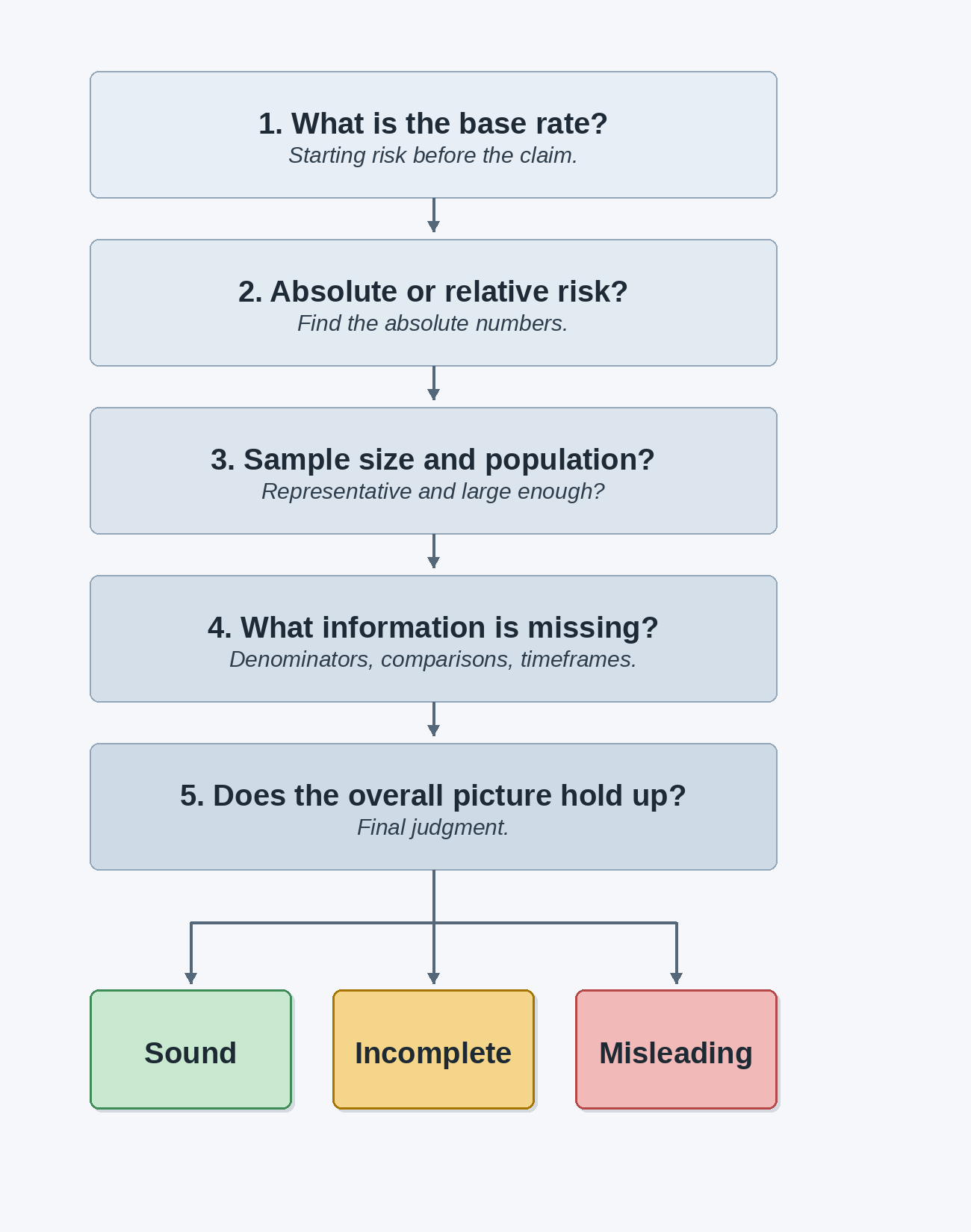
Think of these five questions as a mental filter. Most solid claims survive all five checks without trouble; most misleading ones stumble on at least one or two.
🚶 Walking Through a Health Headline
Let's put the full checklist to work on a realistic headline:
"Study finds high-dose Vitamin Z reduces cancer risk by 40%!"
Step 1 — Base rate. What kind of cancer, and how common is it? Suppose the relevant cancer affects about in people over ten years, giving a baseline risk of .
Step 2 — Absolute vs. relative risk. The "40%" in the headline is a relative reduction. A cut from gives an absolute drop of:
The risk falls from to about , a difference of just percentage points. Still beneficial, but far less dramatic than "40%" suggests.
Step 3 — Sample and population. Suppose the study followed people for ten years — matching the timeframe of the base rate. That is still a relatively small group for such a rare outcome. With a base rate below , we would expect only about cancer cases across the whole study (roughly in the control group), making the "40%" figure statistically fragile.
Step 4 — Missing information. The headline does not mention side effects, cost, who the participants were, or whether the study has been replicated. These gaps leave important practical questions unanswered.
Step 5 — Overall judgment. The claim is incomplete and likely overstated. The relative framing inflates a small absolute benefit, the sample is small for such a rare outcome, and key details are absent. A careful reader would wait for larger, independent studies before acting on this headline.
Notice how every step draws on a concept you have practiced throughout this learning path. No single question catches everything, but together they form a reliable filter.
Conclusion and Next Steps
In this lesson, you built a practical framework for evaluating real-world risk claims. You identified the most common missing-information patterns — absent base rates, hidden denominators, and unclear comparison groups — and revisited how base rates shape the meaning of test results, using natural frequencies to reveal that even "accurate" tests can produce mostly false alarms when a condition is rare. Finally, you assembled a five-question checklist that integrates skills from this entire learning path: checking base rates, distinguishing absolute from relative risk, questioning the sample, spotting missing context, and arriving at an informed judgment.
This is the final lesson of both the course and the full learning path, so you now have every concept you need to think clearly about probability and risk in everyday life. Up next are the practice exercises, where you will dissect headlines, catch misleading statistics, and write your own complete evaluations from scratch. Time to show what a well-trained critical eye can do!
