Welcome back to The Normal Distribution! We have reached lesson four of five, which means we are nearly at the finish line. So far, we have built a solid toolkit: we can recognize the bell shape, we know that values cluster near the center and thin out toward the tails, and we understand that every normal curve is fully described by its center (μ) and spread (σ). All of those lessons focused on what the normal distribution looks like. Now we turn to an equally important question: why does this particular shape show up so often in the real world?
By the end of this lesson, we will be able to explain, in plain language, the core reason behind the normal distribution's popularity. The explanation is surprisingly simple, and once we see it, bell curves will start feeling almost inevitable.
A Question Worth Asking
Heights of adults, weights of manufactured parts, repeated readings on a kitchen scale, daily temperature fluctuations — the list of quantities that follow an approximate bell shape is enormous. That should strike us as a bit mysterious. These quantities come from completely different domains, yet they all land on the same symmetric, single-peaked curve.
There must be something these situations share, something deeper than the surface details. Let's find out what it is.
Many Small Influences Adding Up
Here is the key idea: when an outcome is shaped by many small, independent influences that add together, the total tends to follow a normal distribution.
Think about adult height. Your final height is not determined by a single factor. It is nudged up or down by hundreds of influences — many genes, childhood nutrition, sleep patterns, overall health, and more. Each influence on its own is tiny compared to the final number. Some push your height a little above average; others push it a little below. Your actual height is, roughly speaking, the sum of all those small nudges on top of a baseline.
The same logic applies to a factory filling cereal boxes. The actual weight in each box is affected by small variations in the flow rate, slight vibrations of the conveyor belt, tiny differences in flake size, and so on. No single factor dominates; the final weight is the combined result of many minor, unrelated influences.
A Thought Experiment with Coins
Join the 1M+ learners on CodeSignal
Be a part of our community of 1M+ users who develop and demonstrate their skills on CodeSignal
Why the Result Is Symmetric and Peaked
Two features of this process help explain why a bell shape tends to appear:
Symmetry. Each small influence is just as likely to push the total up as down. Because of this balance, there is no reason for the overall sum to favor one side. The result is a distribution that mirrors itself around a central value.
Central piling. Extreme totals require most nudges to line up in the same direction, which is rare. Totals near the middle can arise from many different arrangements of ups and downs. More ways to land on a result means that result occurs more often, so values pile up in the center and thin out toward the tails.
These two features — symmetry and central piling — are exactly the hallmarks of the bell curve we identified in earlier lessons. The normal shape is not a coincidence; under the right conditions, it tends to emerge from adding many small, independent effects.
The Influences Do Not Have to Be Identical
A Concrete Case: Repeated Readings on a Scale
When to Expect a Normal Shape
Conclusion and Next Steps
The normal distribution shows up so often not by coincidence but because of a simple, powerful mechanism: when many small, independent influences add together, the totals tend to pile up in a symmetric bell around a central value. Extreme outcomes become rare because they need most influences to align, while middle outcomes benefit from countless favorable combinations.
Up next, you will witness this mechanism firsthand. You will run a simulation that builds a bell curve from tiny random nudges, reason through why the resulting shape must be symmetric, and apply the many-small-influences explanation to a real measurement scenario. Let's put this insight to the test!
To see why adding small influences creates a bell, let's walk through a simple thought experiment.
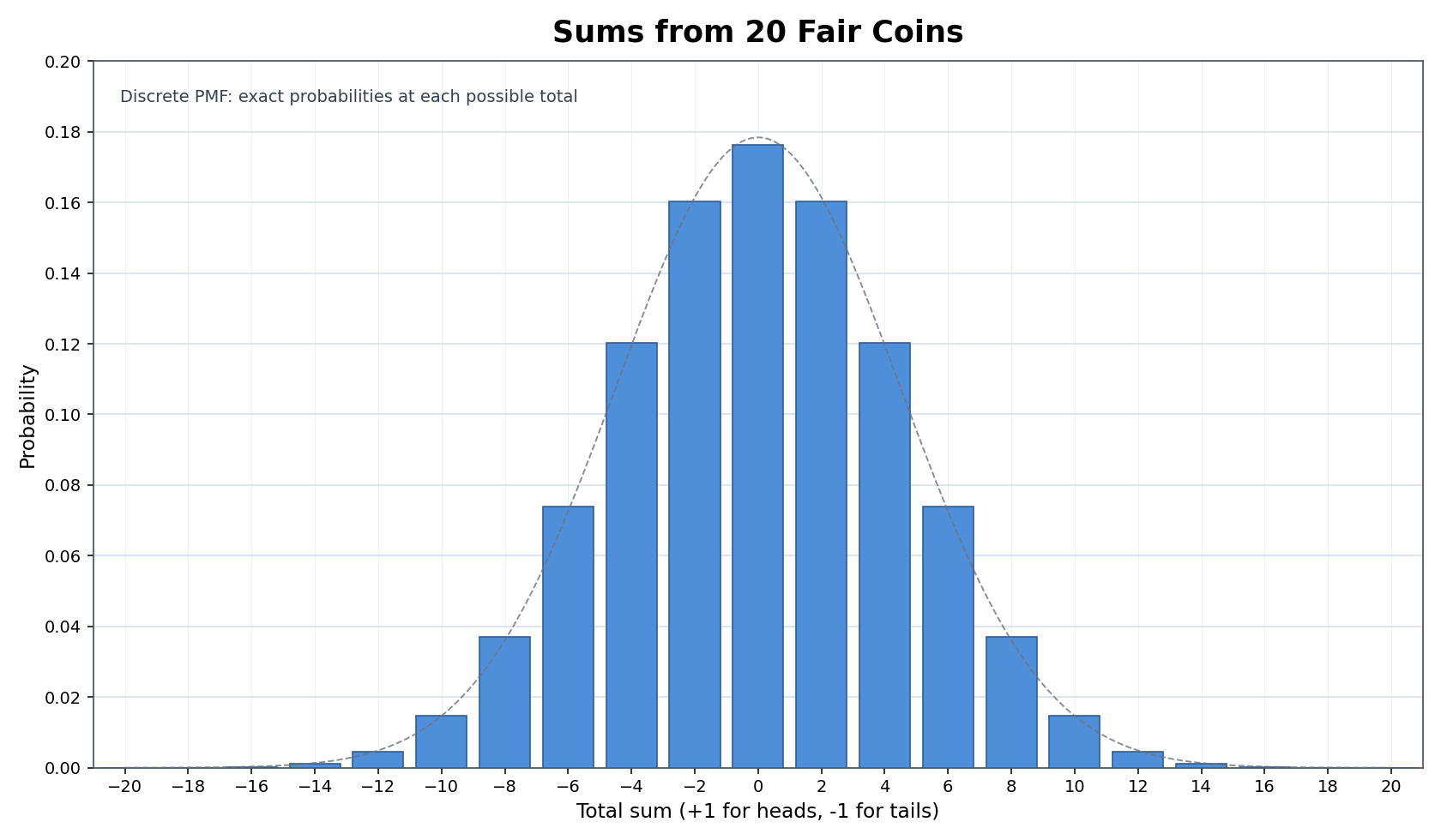
Imagine flipping 20 fair coins. For each coin that lands heads, we add +1; for tails, we add −1. Our outcome is the total sum. Each coin is one small, independent "nudge" that pushes the total slightly up or slightly down.
If we are extremely lucky, all 20 land heads and our total is +20. But that requires every single nudge to go the same way — very unlikely.
A total near 0 is far more likely because there are many different combinations of heads and tails that produce a sum close to zero. A few extra heads here can be offset by a few extra tails there.
Moderately positive or moderately negative totals (say +6 or −6) are possible but less common than totals near zero.
If we repeated this experiment thousands of times and plotted the totals, we would see a familiar shape: a symmetric peak at zero that tapers off evenly on both sides — in other words, a bell curve.
A fair question at this point: our coin example used identical nudges (+1 or −1). Real life is messier. The good news is that the reasoning still holds even when individual nudges differ in size, as long as no single influence overwhelms all the others.
Among the hundreds of factors affecting adult height, for instance, some genes have a slightly larger effect than others, and nutrition matters a bit more than the altitude of your hometown. That is perfectly fine. What matters is that the outcome is the combined result of many contributions, none of which single-handedly determines the total. When that condition is met, the sum still piles up into an approximate bell.
Suppose we place the same parcel on a kitchen scale 50 times without changing anything. We might expect to get the exact same reading every time, but in practice the readings vary slightly. Why?
Each reading is nudged by many tiny, independent influences: small air currents, minute vibrations in the table, slight shifts in the parcel's position, electrical noise in the sensor, and even temperature fluctuations affecting the electronics. Each factor adds or subtracts a tiny amount from the "true" weight. Because there are many such factors and none of them dominates, the 50 readings cluster into a bell shape centered on the true weight — values very close to it appear most often, and readings far from it are increasingly rare.
This is exactly the many-small-influences mechanism at work in everyday measurement. It also explains why scientists and engineers so commonly assume measurement error follows a normal distribution.
Now that we understand the mechanism, we have a practical test we can apply to any new variable. Whenever we encounter a quantity and wonder whether it might be approximately normal, we can ask one guiding question: Is this outcome the combined result of many small, independent factors, none of which dominates?
If the answer is yes, a bell shape is a reasonable expectation. If a single factor overpowers the rest — for example, a pass-or-fail rule that caps scores at 100 — then the many-small-influences argument breaks down and we should not automatically expect a bell. Keeping this question in mind turns the normal distribution from a memorized shape into something we can predict before ever looking at data.