Welcome back to The Normal Distribution! This is the fifth and final lesson of the course, so we are about to bring everything together. Over the previous four lessons, we built a complete toolkit: recognizing the bell shape, understanding how values cluster near the center, seeing how center (μ) and spread (σ) control the curve, and uncovering the many-small-influences mechanism that explains why bell curves appear so often. All of that was preparation for the practical skill we tackle now.
In this lesson, we will practice spotting variables in everyday life that are likely to be approximately normal and, just as importantly, learn to explain why they qualify. By the end, we will be able to look at a real-world quantity, decide whether a bell shape is a reasonable expectation, and back up that judgment with clear reasoning.
From Theory to Practice
In the last lesson, we arrived at a powerful guiding question: Is this outcome the combined result of many small, independent factors, none of which dominates? A "yes" points toward an approximate bell shape. That question is a great theoretical compass, but the real challenge is learning to use it fluently on variables we might encounter in a news article, a workplace report, or a science class.
Spotting normal variables is part pattern recognition and part reasoning. We look for the telltale signs and then check whether the underlying process fits the many-small-influences story. Let's build both skills step by step.
A Two-Part Justification
When we claim a variable is approximately normal, a strong justification has two parts working together:
Bell-shape reasoning. We expect the variable to produce a single-peaked, symmetric distribution with values thinning out evenly on both sides. Most observations should cluster near a central, typical value, and extreme observations in either direction should be increasingly rare.
Many-small-influences reasoning. We can identify numerous minor, independent factors that each nudge the outcome up or down. No single factor dominates, so the combined result naturally piles up in the center and tapers into the tails.
Neither part alone is enough. Saying "it looks like a bell" describes the shape but does not explain it. Saying "many factors are involved" explains the mechanism but does not confirm the expected pattern. A complete justification connects both: the many-small-influences process produces the bell shape.
Join the 1M+ learners on CodeSignal
Be a part of our community of 1M+ users who develop and demonstrate their skills on CodeSignal
Examples That Fit the Normal Pattern
Examples That Do Not Fit
Visualizing Non-Normal Distributions
Quick Mental Checklist
When we meet a new variable and want to decide if it is approximately normal, running through a short mental checklist can help:
Is the variable shaped by many small factors adding together? If yes, continue. If a single factor controls most of the outcome, stop — it is probably not normal.
Are those factors roughly independent of each other? They do not all need to be perfectly independent, but they should not move in lockstep.
Is there a natural central value that most outcomes hover near? If outcomes pile up in the middle with symmetric thinning on both sides, that is consistent with a bell.
Are there any hard boundaries or extreme outliers that break symmetry? A floor, a ceiling, or a long one-sided tail is a red flag against normality.
If a variable passes all four checks, calling it "approximately normal" is well justified. If any check fails, we should consider whether a different distribution — uniform, skewed, or binomial — might be a better fit.
Applying the Checklist: Standardized Test Scores
Conclusion and Next Steps
We now have a complete framework for spotting normal variables in the wild. The key is combining bell-shape reasoning — single peak, symmetric tails, central clustering — with many-small-influences reasoning — numerous independent factors, none dominant, adding together. When both pieces line up, we can confidently say a variable is approximately normal, and when one piece fails, we know to look for a different distribution.
With this lesson, we have finished the core content of The Normal Distribution. Up next, you will put your skills into action: sorting everyday variables into normal and not-normal, completing a guided justification, and writing your own from scratch. Let's see how sharp your normal-spotting instincts have become!
Let's walk through a few classic examples and see how the two-part justification works for each.
Adult heights. The heights of adults of the same sex and similar age group are approximately normal. Most people are close to the average, with very tall and very short individuals being uncommon. Height is influenced by many genes, nutrition, childhood health, sleep habits, and other factors — each one nudges height slightly up or down, none single-handedly determines the outcome, and together they add up to a bell-shaped distribution.
Resting blood pressure readings across many adults. If we measure the resting systolic blood pressure of a large group of healthy adults, the readings tend to form a bell shape centered on a typical value (around 120 mmHg). Blood pressure at any moment is affected by genetics, diet, hydration, stress level, recent physical activity, ambient temperature, and many more small influences. Because these factors combine additively and no single one overwhelms the rest, the result clusters symmetrically near the center.
Repeated measurement readings. As we saw in the previous lesson, placing the same object on a scale many times produces slightly different readings each time due to air currents, sensor noise, vibrations, and temperature shifts. The distribution of those readings forms a bell centered on the true weight — a direct consequence of many tiny, independent nudges adding together.
Recognizing what is not normal is just as valuable as recognizing what is. Here are a few common variables that fail the test.
Variable
Why it is not approximately normal
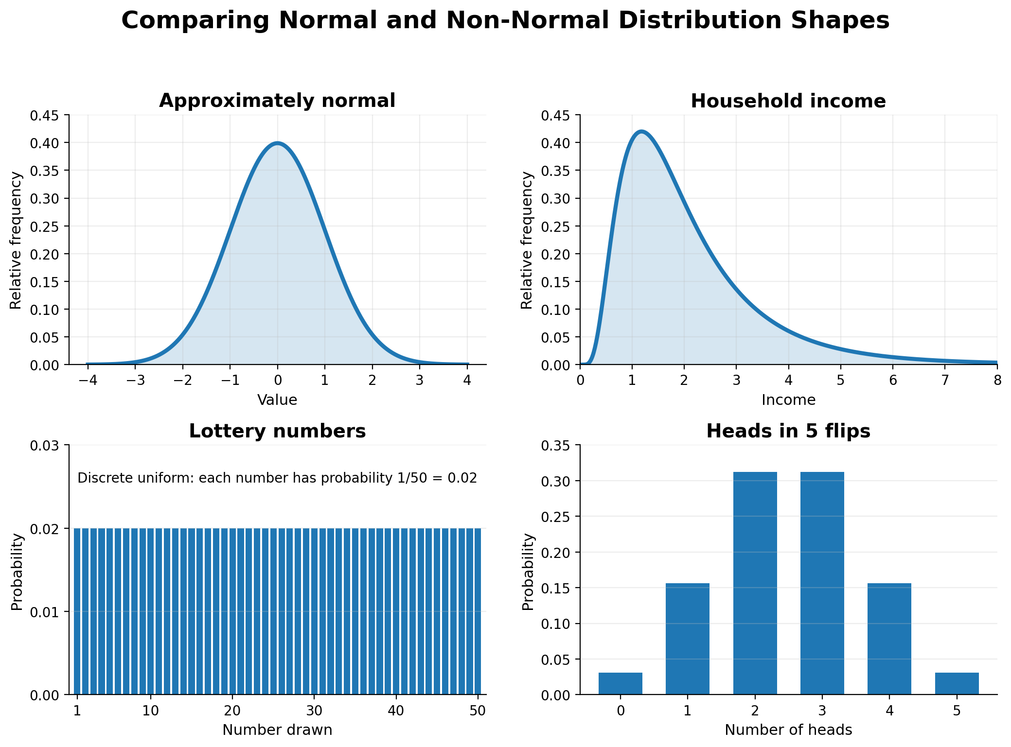
Household income
There is a firm floor near zero but no real ceiling. A small number of extremely high earners stretch the right tail far out, breaking symmetry. One dominant factor, such as career type or ownership of major assets, can overwhelm the smaller influences.
Lottery numbers drawn at random
Every number in the fixed range is equally likely. There is no clustering near a center because no additive influences are at play — the process is pure chance among separate possible numbers. This is a discrete uniform distribution.
Number of heads in 5 coin flips
This is a count of successes in a small number of trials, producing a binomial distribution. With only 5 trials, the shape is chunky and discrete, not a smooth bell.
Each of these examples breaks the normal pattern for a specific reason, leading to a distinct visual profile. While the normal distribution is defined by its smooth, symmetric bell shape, these non-normal variables produce distributions that are skewed, flat-but-discrete, or "chunky."
A quick visual comparison helps reinforce how these shapes differ from a bell curve:
Notice the pattern in these "no" answers. When one factor dominates, as with income, the distribution can become skewed. When outcomes are equally likely by design, as with lottery numbers, the distribution is uniform — but because lottery numbers are separate possible values, the graph should show equal-height bars rather than one continuous curve. And when the process counts successes in only a few trials, as with 5 coin flips, the result is discrete and chunky rather than smooth.
In each case, the normal model does not apply because the process is not driven by many small independent nudges piling up around a central value.
Let's do one full walkthrough with a fresh example. Consider the exam scores on a large, well-designed standardized test (like a national math exam taken by thousands of students).
Many small influences? Yes. Each student's score is affected by preparation quality, sleep the night before, natural aptitude across many subtopics, test anxiety, guessing luck, reading speed, and dozens more small factors.
Roughly independent? Mostly. Sleep quality does not directly control aptitude, and guessing luck is independent of preparation.
Central clustering? Yes. Most students score near the middle of the range, with fewer students at the very top or very bottom.
No hard boundary issues? As long as the test is designed so that almost nobody scores 0% or 100%, the floor and ceiling do not distort the shape.
Our justification ties both halves together: the scores are approximately normal because they result from many small, independent influences adding together, which causes values to pile up near a central score and thin out symmetrically toward both extremes. That single sentence is a model for any normal-variable justification we might write.