Clustering Around the Center
Introduction
Welcome back to The Normal Distribution! In our first lesson, we recognized the bell curve by its single central peak, mirror symmetry, and evenly tapering tails. That was about identifying the shape. Now, in this second lesson, we turn to a more powerful question: what does that shape actually tell us about the data inside it?
The answer is surprisingly intuitive. Values in a normal distribution are not scattered evenly across the range. Instead, they cluster tightly around the center and become progressively rarer toward the tails. By the end of this lesson, we will be able to look at any value on a bell curve and judge whether it is typical or unusual — all without computing a single score.
What the Curve's Height Really Tells Us
Every distribution curve is a picture of how frequently different outcomes occur. The height of the curve at any point reflects how often values in that neighborhood tend to show up. A tall section means "lots of values here," and a low section means "very few values here."
With that in mind, the bell shape sends a clear message. The towering center says that outcomes near the middle are common. The thin, low tails say that outcomes far from the middle are rare. Reading a bell curve, then, is really just reading a map of frequency.
Most Values Live Near the Center
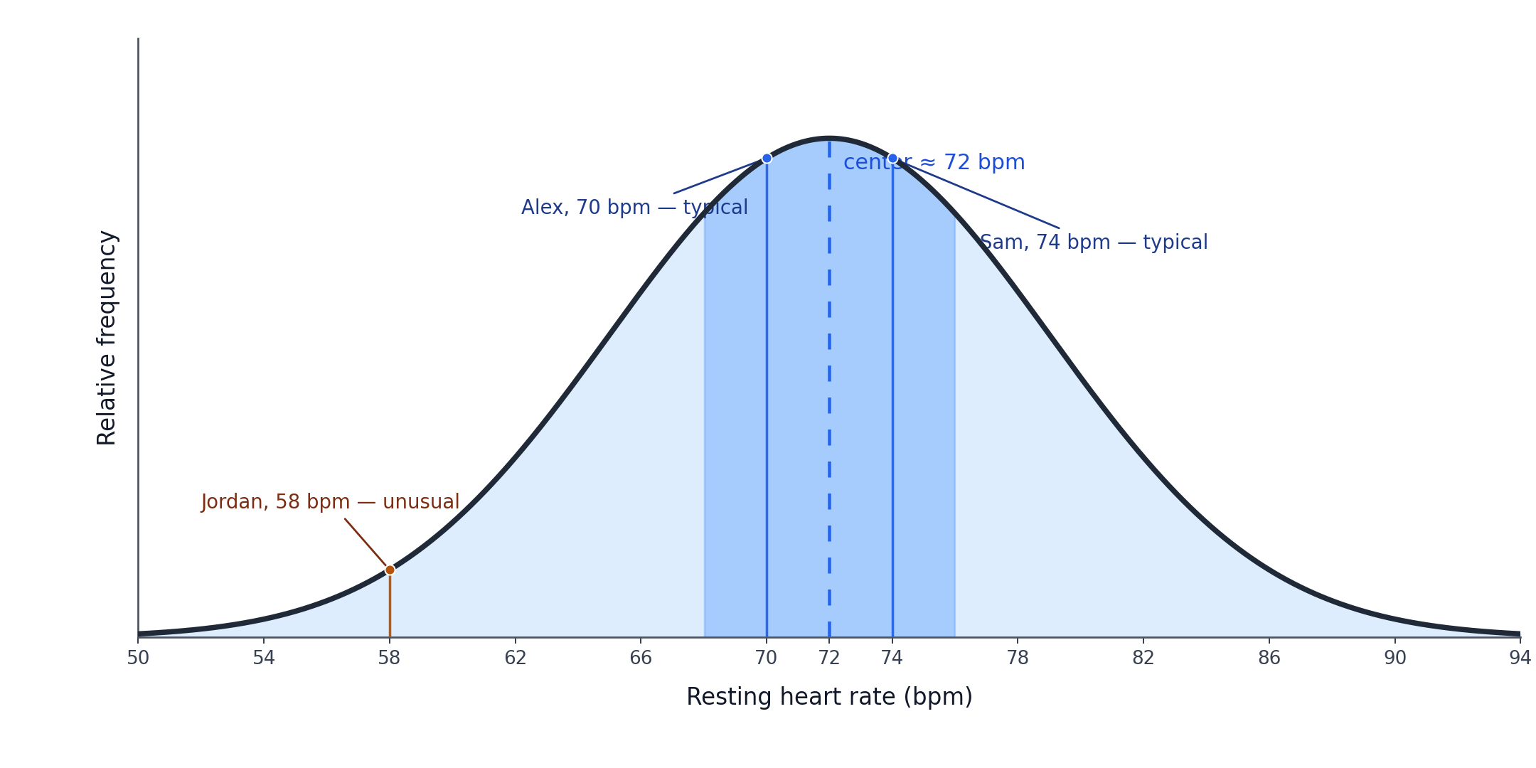
The peak of a bell curve marks the most common outcome. Because the curve is tallest here, values in this neighborhood appear more often than values anywhere else. In a large dataset that follows a normal distribution, the majority of observations sit within a fairly narrow band around this central point.
Think about the heights of adult men in a large population. If the center of the distribution sits near 175 cm, then a large share of men will measure somewhere close to that value. We will not see equal numbers of men at every height; instead, the data piles up near the middle. This concentration of values around the center is the single most important property of the normal distribution.
A Gradual Fade, Not a Sudden Cutoff
As we move away from the center in either direction, the curve drops in height. Values somewhat above or below the center still occur, but less frequently. Values far above or below the center occur even less. The decline is smooth and steady — like walking down a gentle hill rather than stepping off a cliff.
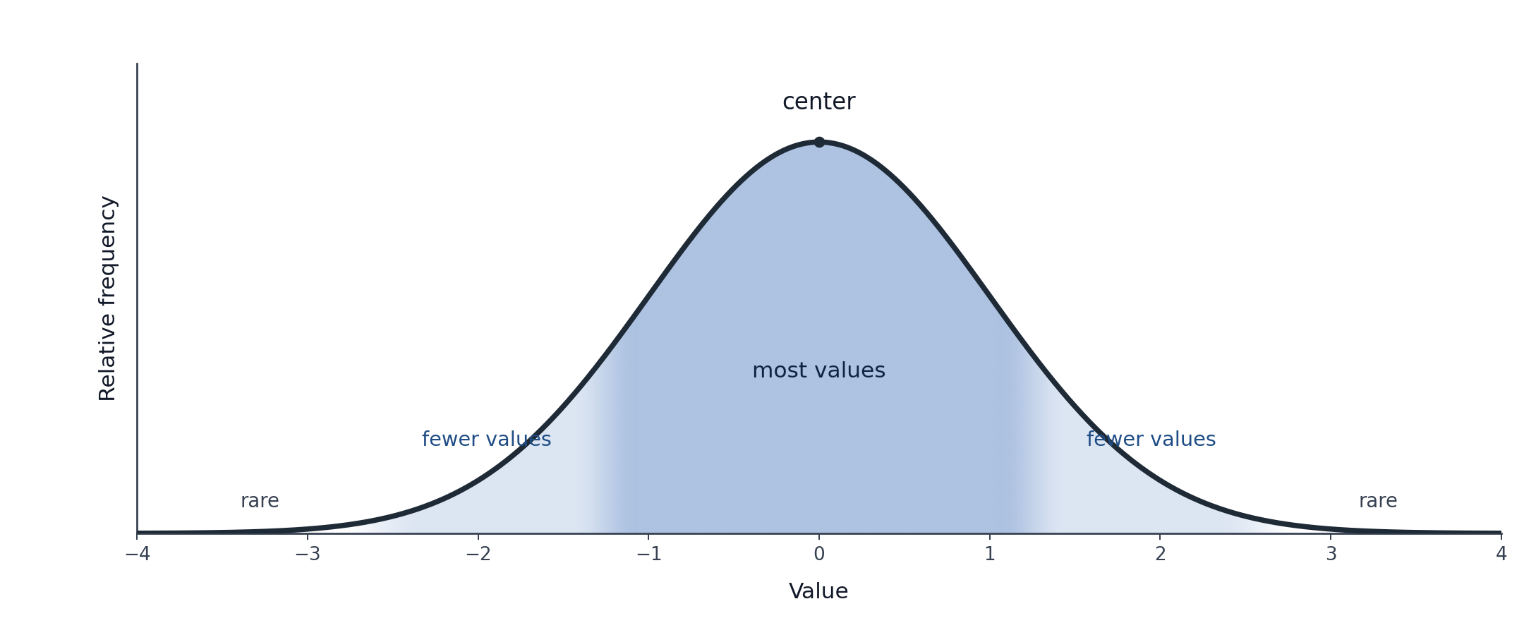
This gradual fade is what gives the bell curve its distinctive outline. If values suddenly stopped appearing past a certain point, the curve would have sharp edges like a uniform distribution. Instead, the tails stretch outward and grow thinner and thinner, reminding us that extreme values are rare but never fully impossible.