Welcome back to The Binomial Distribution! In the first lesson, we identified the four conditions that must hold for a process to qualify as binomial: two outcomes per trial, a fixed trial count, a constant probability of success, and rough independence. Now, in this second lesson, we move past that checklist and ask a more interesting question: once we know a situation is binomial, what does its distribution actually look like, and how do we read it?
Here we shift from verifying conditions to interpreting results. We will see how every possible number of successes gets its own likelihood and how a bar chart makes those likelihoods visible at a glance. By the end, you will be able to look at a binomial bar chart and quickly identify which success counts are common and which are rare.
From Conditions to Counts
The Full Range of Possible Successes
Building the Bar Chart
Join the 1M+ learners on CodeSignal
Be a part of our community of 1M+ users who develop and demonstrate their skills on CodeSignal
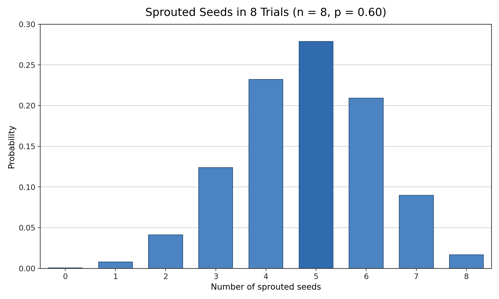
Imagine the binomial conditions are confirmed and we run our trials. Suppose we plant n=8 seeds, each with a p=0.60 chance of sprouting. After a week, we count how many sprouted. That count is a single number — anywhere from 0 (none sprouted) to 8 (all sprouted).
If we could repeat that entire batch of 8 seeds many, many times, we would not get the same count every time. Some rounds might yield 4 sprouts, others 6, occasionally 2 or even 8. Each possible count would show up with a certain frequency. The binomial distribution is simply the pattern that tells us how likely each of those counts is. Let's see how that pattern takes shape.
When we run n trials, the number of successes can be any whole number from 0 to n. No fractions, no negatives, and nothing above n. For our 8-seed example, the possible success counts are:
0,1,2,3,4,5,6,7,8
That gives us n+1=9 possible outcomes in total. Every one of these counts has some probability attached to it, even if that probability is extremely small. The binomial distribution assigns a likelihood to each and every one of these counts, and together those likelihoods add up to 1, since exactly one of the counts must occur.
The most natural way to display a binomial distribution is with a bar chart. The horizontal axis lists every possible success count from 0 to n, and each bar's height shows the likelihood of that particular count.
Return to our 8-seed scenario with p=0.60. If we planted batch after batch and recorded the sprout counts, some counts would appear far more often than others. Plotting the results produces a chart where a few bars near the middle-to-right region are tall and the bars near the edges are short. The tallest bar marks the most likely count, while the shortest bars represent counts that almost never happen.
Because the possible outcomes are whole numbers (as we discussed in the very first course of this path, these are counted outcomes rather than measured ones), each outcome gets its own separate bar. There is no bar at 3.5 or 6.7 — only at 0,1,2,…,8. This discrete, bar-by-bar structure is a defining visual feature of the binomial distribution.
Reading Likelihood from the Bars
Once the bar chart is in front of you, reading it is straightforward:
Find a count on the horizontal axis — for example, 5 successes out of 8.
Look at that bar's height — the taller the bar, the more likely that count is.
Compare bars — placing bars side by side instantly reveals which counts are more common and which are rare.
You do not need to calculate exact probabilities to draw useful conclusions. If the bar at 5 is clearly taller than the bar at 2, you know that getting 5 successes is more likely than getting 2. If the bars at 0 and 8 are barely visible, those extreme counts are very unlikely. The chart does the heavy lifting for you.
Identifying the Peak and the Tails
Every binomial bar chart has a region where the bars are tallest and regions where they shrink toward zero. The peak of the chart is the count (or sometimes two neighboring counts) with the highest bar — the single most likely outcome. For n=8 and p=0.60, the peak sits near 5, because 60% of 8 is 4.8, and the closest whole numbers are 4 and 5.
The tails are the counts far from the peak. In our example, counts like 0, 1, or 8 fall in the tails, and their bars are very short — those outcomes are possible but quite rare. When interpreting any binomial chart, you can quickly summarize it by noting three things:
Most likely count(s): the tallest bar or bars near the center of the distribution.
Likely range: the cluster of bars that together account for most of the total likelihood.
Rare counts: the short bars out in the tails, representing outcomes you would seldom observe.
A Practical Example: Light Bulbs in a Pack
Let's put all of this into practice. A hardware store sells packs of n=10 light bulbs, and each bulb has a p=0.90 chance of working properly. The number of working bulbs in a pack follows a binomial distribution with counts ranging from 0 to 10.
Because p is high, we expect most packs to contain many working bulbs. On a bar chart, the tallest bar would appear at 9 (since 10×0.90=9), and the bars at 8 and 10 would also be fairly tall. Meanwhile, the bars at 0, 1, or 2 would be nearly invisible — it would be extraordinarily unlikely to open a pack and find only 2 working bulbs.
Notice how much you can learn without computing a single number. The shape of the chart alone tells you that counts near 9 are common and counts far below 9 are rare. That is the power of reading the binomial distribution directly from its bars.
Conclusion and Next Steps
In this lesson, we moved from the binomial setup to the binomial distribution itself. We learned that it assigns a likelihood to every possible success count from 0 to n, that a bar chart displays these likelihoods visually, and that the tallest bars mark the most common counts while the shortest bars reveal the rare ones. Reading a binomial bar chart comes down to locating the peak, scanning the likely range, and noticing which counts live in the tails.
Now it is time to see these ideas in action. In the upcoming practice section, you will run your own batches of trials and watch the bars take shape, read specific counts off real charts, and describe which outcomes are likely and which are rare. Let's jump in and build that skill firsthand!