Reading Distribution Graphs
Introduction
Welcome back to Reading and Describing Distributions! In the previous lesson, you discovered that a probability distribution captures the likelihood of every possible outcome, painting a far richer picture than a single summary number ever could. That raises an obvious next question: when all those likelihoods are laid out in front of you as a graph, how do you actually read it? This second lesson answers exactly that. By the end, you will be able to look at any distribution graph and quickly tell which outcomes are common and which are rare.
From Numbers to a Visual
A distribution pairs each possible outcome with its likelihood. That pairing is powerful, but when there are dozens of outcomes, a raw list of numbers is hard to digest. A distribution graph solves this by turning all those outcome–likelihood pairs into a visual shape you can take in at a glance.
Think of it like a city skyline: once you know what the buildings and the ground represent, you can spot the tallest tower instantly. Reading a distribution graph works the same way. Our job now is to learn what each part of the graph stands for, so that the shape tells you a story instead of just looking like a collection of bars or curves.
The Horizontal Axis: Possible Outcomes
The horizontal axis (the x-axis) of a distribution graph shows the possible outcomes of the varying quantity. Each position along this axis represents one value the quantity can take.
For example, if we are graphing the number of people waiting in a grocery checkout line, the horizontal axis might display , and so on. If we are graphing the time of day that people visit a gym, the axis might run from 6 AM to 10 PM. Whatever the quantity is, its possible values are laid out from left to right.
A helpful first habit: always read the label on the horizontal axis before anything else. It tells you what is being measured or counted and sets the context for the entire graph. Skipping this step is like opening a novel to a random page without knowing the characters — the details will not make sense.
The Vertical Axis: Likelihood or Frequency
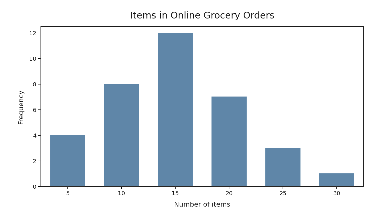
The vertical axis (the y-axis) tells you how likely or how frequent outcomes or ranges are. For separate bars, a taller bar means that exact counted outcome is more common. For smooth curves, greater height means values near that point, or in a small interval around it, are more common; the height itself is not the probability of one exact measured value.
Depending on the graph, the vertical axis might be labeled as:
- Probability — a value between and (or a percentage) indicating the chance of each outcome.
- Frequency — a count showing how many times each outcome appeared in observed data.
Either way, the reading rule is the same: greater height means greater likelihood. A short bar signals a rare outcome; a tall bar signals a common one. This single principle is all you need to start pulling useful information from any distribution graph.