Welcome back to Reading and Describing Distributions! In the first two lessons, you learned that a distribution captures the likelihood of every possible outcome and that you can read a distribution graph by pairing positions on the horizontal axis with heights on the vertical axis. Now we will build on that graph-reading skill by asking why distribution graphs sometimes use bars and other times use smooth curves. In this third lesson, you will discover that the choice of graph style is not a matter of taste; it is determined by the kind of outcome the quantity produces. By the end, you will be able to look at any everyday variable and confidently say whether its distribution should appear as bars or as a curve.
Not All Outcomes Work the Same Way
Before we talk about graph styles, let's look more closely at the outcomes themselves. Consider two simple questions you might ask during your day:
"How many emails did I receive this morning?"
"How long was my commute today?"
Both questions deal with varying quantities, and both could be described by a distribution. Yet the type of answer each one produces is fundamentally different. The email question gives you a whole number like 3 or 17 — you will never open your inbox and find 5.37 new messages. The commute question, on the other hand, gives you a measurement like 22.4 minutes or 33.71 minutes, and the true duration could be any value in between. This difference in how outcomes arise is the key idea behind today's lesson.
Counted Outcomes: Whole Units Only
Some quantities arise from counting. When we count, we work in whole units and cannot land between them. You might receive 5 texts in a day or 6, but never 5.37 texts. We call these counted outcomes (sometimes referred to as discrete outcomes).
Here are a few everyday examples:
Number of pets in a household (0,1,2,3,…)
Number of items in a shopping cart
Number of students absent from a class
Notice that in every case there are gaps between the possible values. Nothing can exist at 2.5 pets or 11.8 absent students. Each outcome is a separate, distinct step on a number line — more like the rungs of a ladder than a smooth ramp.
Measured Outcomes: Any Value in a Range
Join the 1M+ learners on CodeSignal
Be a part of our community of 1M+ users who develop and demonstrate their skills on CodeSignal
Why Bars Represent Counted Outcomes
Why a Smooth Curve Represents Measured Outcomes
A Quick Comparison
Telling Them Apart in Practice
Conclusion and Next Steps
In this lesson, you explored the important distinction between counted and measured outcomes. In the distribution models used here, counted outcomes come in whole units with gaps between them, so they are shown as separate bars. Measured outcomes can take any value along a continuous range, so they are modeled with smooth curves. The graph style is not arbitrary — it reflects how we are representing the quantity.
Now it is time to put this understanding into action. In the upcoming practice exercises, you will classify everyday variables as counted or measured, connect each type to its matching graph style, and explain your reasoning in your own words. Let's see how sharp your new counting-versus-measuring instinct really is!
Other quantities arise from measuring. When we measure, the result can fall anywhere along a continuous range, limited only by the precision of our instrument. A person's height might be 168 cm, 168.3 cm, or 168.29 cm — there is always room for a more precise reading. We call these measured outcomes (sometimes referred to as continuous outcomes).
Common examples include:
Temperature outside in degrees (72.0°, 72.4°, 73.15°, …)
A person's weight
Time it takes to run a mile
With measured quantities, there are no gaps between possible values. Between any two measurements, another measurement can always exist. The outcome space is smooth and unbroken, much like a ruler rather than a staircase.
When outcomes are counted in whole units, each possible value is a separate, isolated point on the horizontal axis. A bar is drawn above each of these individual values, and its height shows how likely or frequent that specific count is.
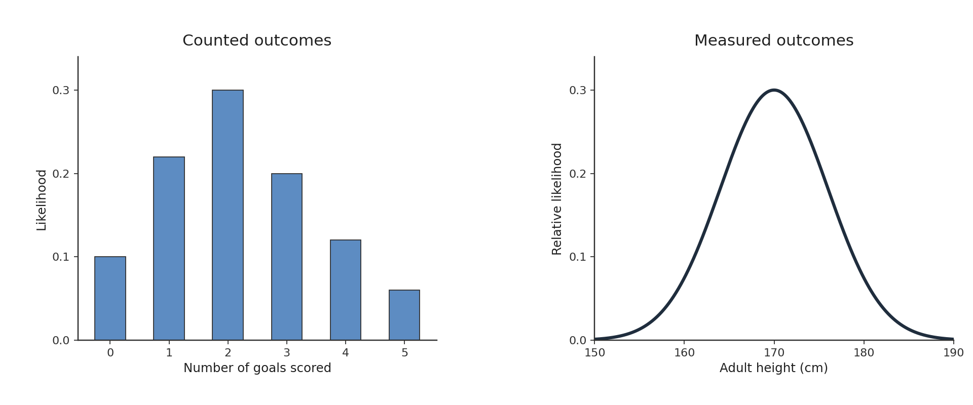
Because nothing can occur between whole numbers, the bars do not touch. The small spaces between them are a visual reminder that outcomes like 3.5 simply cannot happen. Imagine a graph of the number of goals scored per soccer match. Each value — 0,1,2,3,… — gets its own standalone bar, and the gaps between bars honestly represent the gaps between possible outcomes. The one-to-one pairing of one bar per possible count makes it easy to read exact likelihoods straight off the graph.
When outcomes are measured along a continuous range, there are infinitely many possible values packed together with no gaps. Drawing a separate bar for every conceivable measurement would be impossible — you would need an infinite number of infinitely thin bars. Instead, we use a smooth curve that flows without breaks across the horizontal axis.
The height of the curve at a point indicates relative density, not the probability of one exact measured value. A higher portion of the curve means values near that point, or in a small interval around it, are more common; a lower portion means values in that region are rarer. For example, a distribution of adult heights might show a smooth curve peaking near 170 cm and tapering off on both sides, reflecting that heights near the center are more common while extremely short or tall measurements are less common. The unbroken shape of the curve mirrors the unbroken nature of the measurement scale itself.
The table below puts the two types side by side so you can see the contrast at a glance.
Feature
Counted outcomes
Measured outcomes
How obtained
Counting whole units
Measuring along a range
Possible values
Separate whole numbers (0,1,2,…)
Any value in an interval (2.71, 3.0, 3.004, …)
Gaps between values?
Yes
No
Graph style
Separate bars
Smooth curve
Example
Number of texts received per day
Temperature outside
The core rule for the idealized distribution graphs in this course is straightforward: distinct counted outcomes are shown with separate bars, while measured quantities are modeled with a smooth curve.
In real data displays, measured values are sometimes grouped into intervals and shown with histogram bars; those bars represent ranges of values, not exact isolated outcomes.
Here, the graph style reflects whether we are treating outcomes as separate counts or as a continuous model.
When you encounter a new variable, a simple mental test can help you decide which type it is. Ask yourself: "Can a value of 2.5 (or any fraction) actually occur for this quantity?"
If the answer is no, the quantity is counted, and its distribution will appear as separate bars. Think of the number of apps on your phone — you cannot have 24.7 apps.
If the answer is yes, the quantity is measured, and its distribution will appear as a smooth curve. A person's daily water intake can certainly be 2.5 liters.
This quick check works for the vast majority of real-world situations. Whenever you are unsure about a graph's format, return to this question and let the nature of the quantity guide you.