Locating Distribution Centers
Introduction
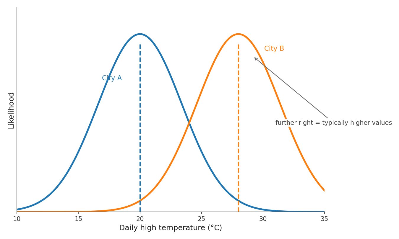
Welcome back to Reading and Describing Distributions! With three lessons behind you, you are moving into the final stretch of the course. So far, you have learned that a distribution captures the likelihood of every possible outcome, that you read its graph by pairing horizontal positions with vertical heights, and that the kind of outcome — counted or measured — determines whether the graph uses bars or a smooth curve. Now it is time to start pulling useful information out of the shapes you see. In this lesson, you will learn how to visually locate the center of a distribution, the region where a quantity's typical values live, and how to compare the centers of two distributions side by side — all without computing a single average.
What Makes a Value "Typical"?
If a friend asks, "How long does it take you to get to work?" you probably don't list every commute time you have ever experienced. Instead, you give a single rough answer like "about minutes." That answer points to your typical value — the outcome that best represents your everyday experience.
A distribution, as we know, shows all possible outcomes and how likely each one is. The center of that distribution is the region on the horizontal axis where the distribution's typical outcomes are concentrated. It is not necessarily the single most likely value; it is a neighborhood — a stretch of the axis where the distribution carries most of its weight. Think of it as the home base of the distribution: outcomes near the center are common, while outcomes far from the center are increasingly rare.
Locating the Center by Eye
To find the center of a distribution visually, focus on where the bulk of the outcomes sit along the horizontal axis. For a single-peaked distribution — whether drawn with bars or a smooth curve — the peak is a useful clue, but it is not the whole definition of center. The tallest part of the graph marks the most likely value; the center region is the part of the horizontal axis where the bulk of outcomes sits.
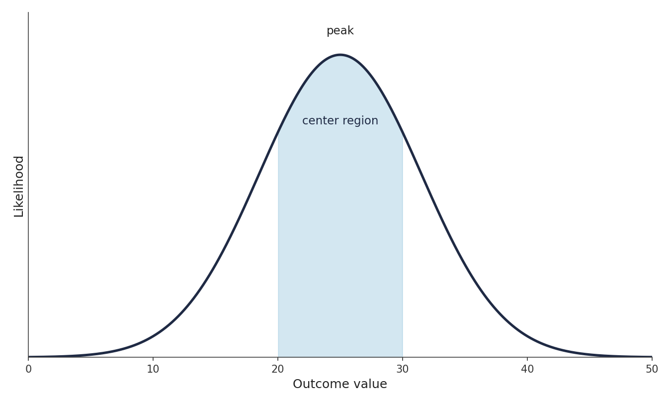
For lopsided distributions, do not rely only on the tallest point. A longer tail can make the overall pattern extend farther to one side, so use the peak together with the surrounding bulk to choose a reasonable center region. Eyeballing that neighborhood is all we need for now.
One common mistake is to confuse the center with the highest point on the vertical axis. Remember that the vertical axis shows likelihood or frequency, while the horizontal axis shows the actual outcome values. The center is always a position along the horizontal axis — a place on the outcome scale such as "around minutes" or "near cm," not a frequency like "a height of ."