Welcome back to Reading and Describing Distributions! We are on lesson four of five, which means we are almost at the finish line for this first course. So far, we have built a solid visual toolkit: we can read the components of dot plots and histograms, classify a distribution's shape, and estimate its center and spread by eye. Every one of those skills describes where the bulk of the data lives. Now it is time to turn our attention to the values that do not fit in with the rest.
In this lesson, we will learn how to spot outliers on a graph, how to tell a genuine outlier apart from a value that simply sits at the high or low end of the main cluster, and how to think about what an outlier might mean in real-world terms.
When a Value Stands Apart
In the previous lesson, we estimated center and spread by focusing on the region where data clusters most heavily. We deliberately set aside any isolated values sitting far from that cluster. Those isolated values now deserve their own careful look.
Imagine we track our morning commute for 20 days and find that 19 of those trips take between 25 and 35 minutes. On one day, a highway closure pushes the commute to 80 minutes. That 80-minute trip does not just sit at the top of the list — it lives far removed from the tight cluster of the other 19 values, with a huge empty stretch of the number line in between. That sense of separation is exactly what makes a value an outlier.
Not every value at the edge of a distribution earns this label, though. If the longest commute were 38 minutes instead of 80, it would simply be the high end of a gradual range — unusual, maybe, but not truly separated. The difference between "a bit high" and "way out there" is what this lesson is all about.
Spotting an Outlier on a Dot Plot
An outlier is a data value that falls noticeably far from the rest of the distribution. On a dot plot, it shows up as one or more dots sitting off by themselves, separated by a visible gap from the main cluster.
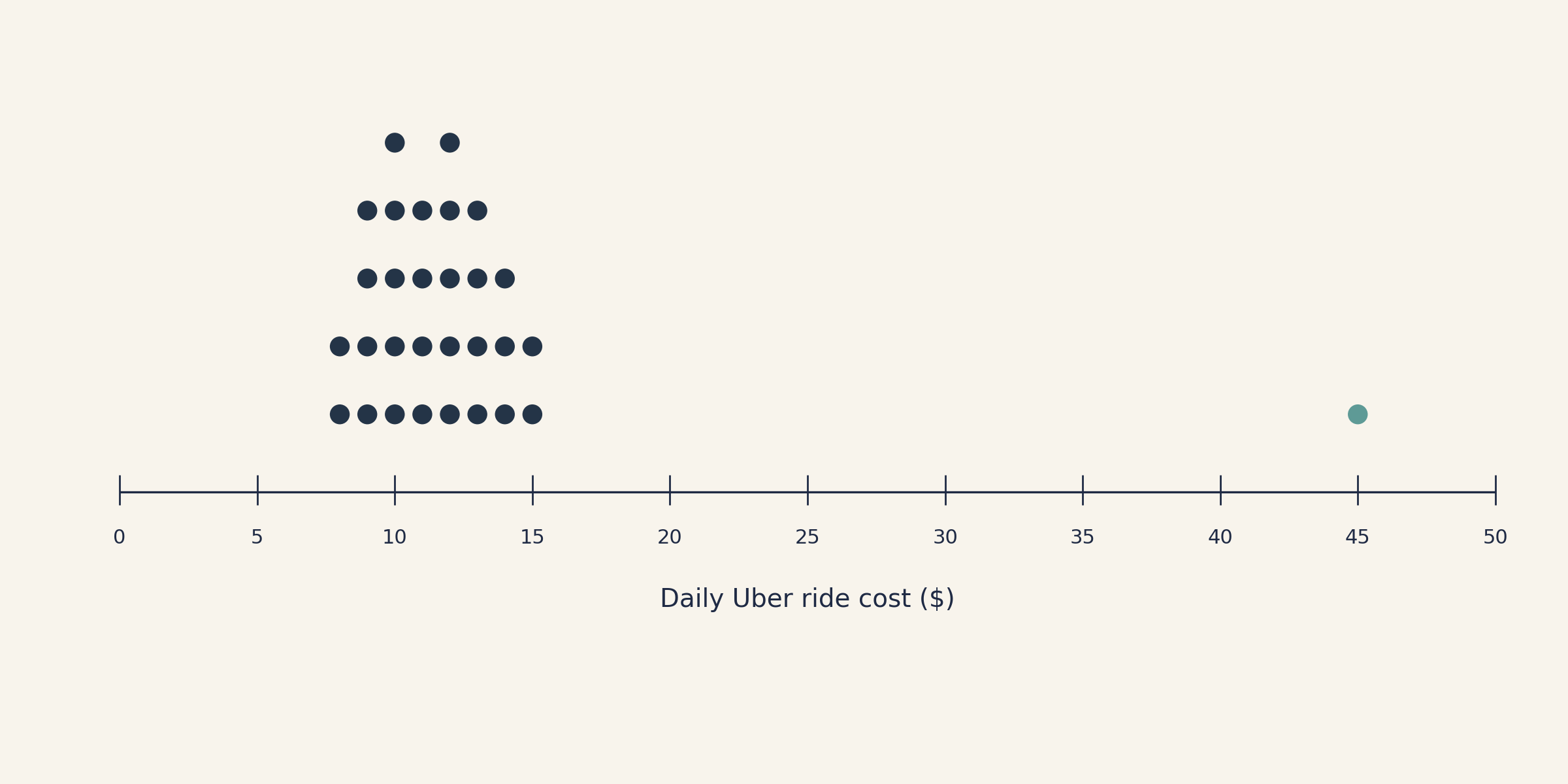
Look at the dot plot above, which shows daily Uber ride costs over a month. Most dots are packed between $8 and $15, forming a clear main cluster. Far to the right, a single dot sits near $45, separated by a wide empty stretch where no data appears at all. That gap is the visual signal: the $45 ride is an outlier.
When scanning a graph for outliers, keep two things in mind:
Look for gaps, not just extreme position. A value is suspicious when empty space separates it from the nearest neighbor in the main cluster.
Check both ends of the distribution. Outliers can appear on the low side, the high side, or even both.
Join the 1M+ learners on CodeSignal
Be a part of our community of 1M+ users who develop and demonstrate their skills on CodeSignal
The Gap Test: Outlier or Just an Extreme Value?
Interpreting Outliers in Context
Conclusion and Next Steps
We now know how to spot an outlier by looking for a gap between an isolated value and the main cluster, how to distinguish a true outlier from a value that merely sits at the high or low end, and how to interpret what that unusual value might mean in context. Combined with the shape, center, and spread skills from earlier lessons, we can give a thorough first description of almost any distribution we encounter.
One important question remains: When are visual descriptions enough, and when do we need something more precise? That is the topic of our fifth and final lesson. First, though, the practice exercises up next will ask us to identify outliers on dot plots, decide whether a suspicious value is truly separated or just at the edge, and write our own interpretation of an unusual data point. Dive in and trust the gap!
One of the most common mistakes is labeling every high or low value as an outlier. In reality, many distributions simply trail off gradually at the edges, and the values sitting there are a normal part of the pattern. The key question is always whether there is a clear gap between the value in question and the rest of the data.
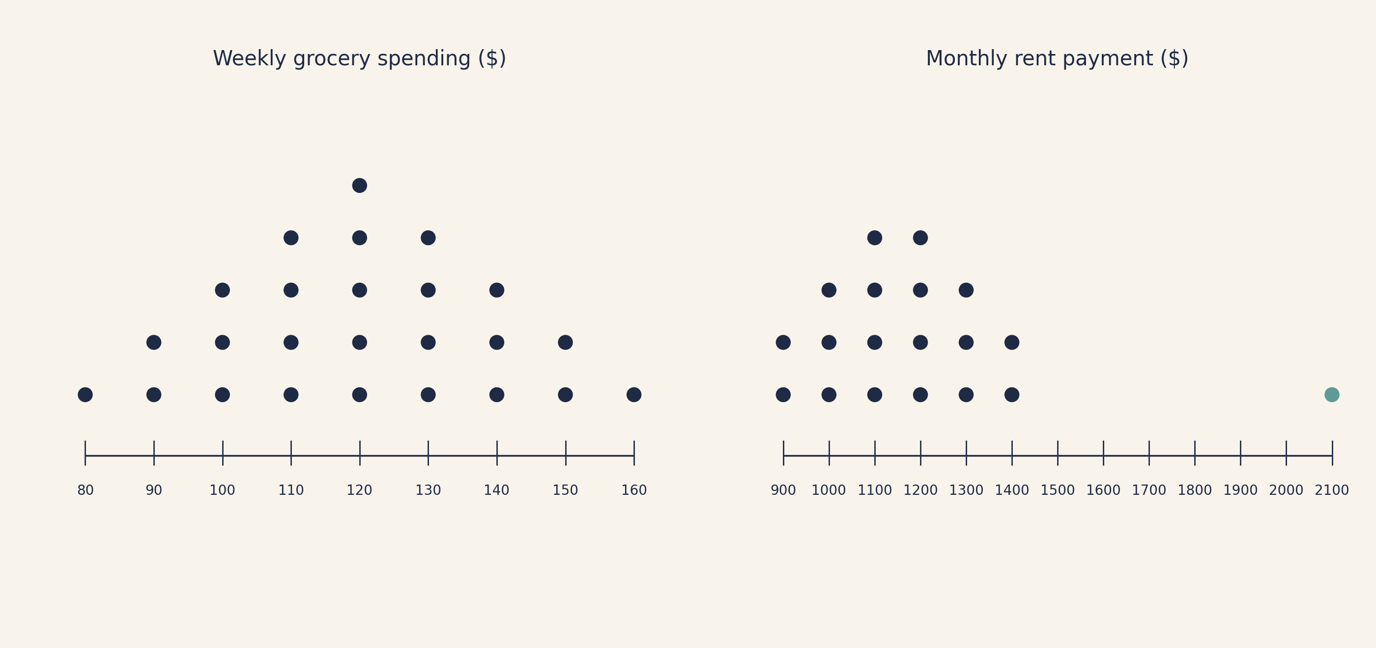
Consider two scenarios side by side. In the first dot plot below, weekly grocery spending ranges from $80 to $160, with the highest value at $160 sitting just above a handful of values near $150. There is no real gap — the data flows continuously from the center out to $160. That value is simply at the high end of the distribution, not an outlier.
In the second dot plot, monthly rent payments cluster between $900 and $1,400, but one value sits at $2,100. A large stretch of the axis is empty between $1,400 and $2,100. That separation makes the $2,100 value a clear outlier.
When we are unsure, this mental checklist can help:
Question
If "yes"
If "no"
Is there a visible gap between this value and the main cluster?
Likely an outlier
Probably just an extreme value
Does the data trail off gradually to this value?
Probably not an outlier
May be an outlier if the gap is large
Would removing this value noticeably change the shape of the distribution?
Supports calling it an outlier
Less reason to single it out
Right now, we are relying on visual judgment. Later in this learning path, we will learn a precise numerical rule (the 1.5×IQR rule) to make this call with less ambiguity. For now, a clear gap is our best guide.
Spotting an outlier is only half the job. The other half is asking, What might this value mean? An outlier is not automatically an error — it could reflect a genuine, meaningful event.
Suppose a dot plot shows the weekly tips earned by a restaurant server over 12 weeks. Eleven weeks cluster between $180 and $260, but one week shows only $40, clearly separated from the main cluster by a wide gap on the low side. What could explain it? Perhaps the server was ill and worked only one shift that week, or maybe the restaurant was closed for several days due to a holiday. Each possibility tells a different story about the data.
When we describe a distribution that contains an outlier, it is good practice to address three things:
Identify it. State the outlier's approximate value and note the gap from the main cluster.
Suggest a possible explanation. Even a brief guess ("this could reflect an unusual event") adds real meaning.
Note its impact. An outlier can pull the perceived center away from where most data lives and can inflate our sense of spread. Mentioning this helps anyone reading our description understand the typical values more accurately.
For the tips example, we might write: "The server's weekly tips typically ranged from about $180 to $260, with one week at just $40 — well below the rest of the data. This unusually low week might indicate reduced hours or a temporary closure. Setting it aside, the server's typical earnings look quite consistent." Notice how this short description identifies the outlier, offers a real-world explanation, and clarifies what "typical" really looks like once the unusual value is accounted for.