Why Graphs Fall Short
Introduction
Welcome back to Reading and Describing Distributions! You have reached the fifth and final lesson of this course. Over the previous four lessons, you learned to read dot plots and histograms, classify distribution shapes, estimate center and spread by eye, and spot outliers through gaps in the data. That is a powerful set of visual skills, and you should be proud of the toolkit you have assembled.
In this lesson, we pause to ask a critical question: How far can visual analysis actually take us? As useful as graphs are, they have real limits — limits that can lead to ambiguity, disagreement between observers, and difficulty making precise comparisons. Recognizing those limits is exactly what motivates the numerical tools you will build in the rest of this learning path.
A Quick Experiment in Perception
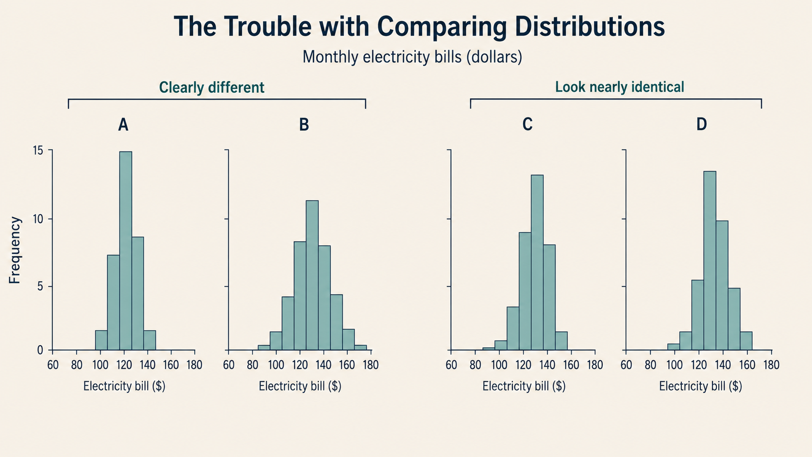
Before we dig in, try a thought experiment. Imagine two histograms displayed side by side, each showing the daily step counts of employees at two different companies over a month. Both histograms look roughly similar in shape and seem to be centered somewhere near 7,500 steps. One appears just slightly shifted to the right, and one might be a little wider.
Now ask yourself: Which company's employees walk more on a typical day? By how much? Is one group more consistent than the other, or is the spread about the same?
If you find those questions hard to answer with confidence just by looking, you are not alone. That uncertainty is not a sign that you need more practice — it is a fundamental limitation of working with pictures. Let's unpack exactly why.
When Two People See Different Things
One of the biggest challenges with visual analysis is that reasonable observers can disagree about what the same graph shows. This is not because anyone is making a mistake; it is because our eyes are not precision instruments.
Consider a histogram of weekly screen-time hours for 50 adults. One person might look at it and call the shape "roughly symmetric." Another might notice a slight pull to the right and call it "right-skewed." Both are making honest observations, yet they arrive at different descriptions. When the shape is not dramatically one-sided, the call between "symmetric" and "slightly skewed" becomes a judgment call rather than a clear fact.
The same problem shows up with center and spread. When a distribution is neatly bell-shaped, most observers agree on where the center sits. But when the shape is uneven or the data is spread out, one person might estimate the typical value at 72 while another says 76. Neither is wrong, but neither can prove their case with a picture alone. This kind of disagreement becomes an even bigger problem when we try to compare two distributions at once.