Welcome back! In the last lesson, you learned how to validate and evaluate predictive models using PredictHealth’s insurance data. You practiced splitting your data into training, validation, and test sets, building preprocessing pipelines, and using metrics and visualizations to assess your models. These are essential skills for building reliable models that generalize well to new data.
In this lesson, we will take your modeling skills to the next level by focusing on feature engineering — the process of creating custom predictors from raw data. While you have already worked with basic features like age, BMI, and categorical variables, real-world data often contains hidden patterns that can be revealed by transforming or combining existing features. Feature engineering helps you capture these patterns, leading to more accurate and insightful models.
By the end of this lesson, you will know how to create new, meaningful features from raw data, visualize their impact, and compare models built with engineered features to those using only the original variables. This will help you understand the true power of custom predictors in predictive modeling.
You have already seen how to use raw features such as age, BMI, and smoker status in your models. However, these raw features do not always capture the full story. Feature engineering allows you to transform these basic variables into new predictors that can better reflect real-world relationships.
For example, instead of using age as a simple number, you might group ages into categories that make sense for insurance risk, such as "Young Adult," "Adult," "Middle-aged," and "Senior." Similarly, BMI can be grouped into standard health categories like "Underweight," "Normal," "Overweight," and "Obese." You can also create new features, such as family size, by combining the number of children with the insured person, or convert categorical variables like smoker status into numeric values for easier modeling.
Let's look at how you can create these custom predictors in code:
Here's how a sample row looks before and after transformation:
| Original | Engineered |
|---|---|
| age: 19 | age_group: Young Adult |
| bmi: 27.9 | bmi_category: Overweight |
| children: 0 | family_size: 1 |
| smoker: yes | smoker_numeric: 1 |
Notice how age becomes age_group, bmi becomes bmi_category, children becomes family_size, and smoker becomes smoker_numeric. These transformations make the data more meaningful for modeling.
Once you have created new features, it is important to understand how they relate to your target variable — in this case, insurance charges. Visualization helps you see patterns and relationships that may not be obvious from the raw data alone. This step can also guide you in selecting the most useful features for your model.
For example, you can use bar plots to compare average insurance charges across different age groups, BMI categories, and family sizes. You can also look at how smoker status interacts with age groups to affect costs.
Here is how you might visualize these relationships:
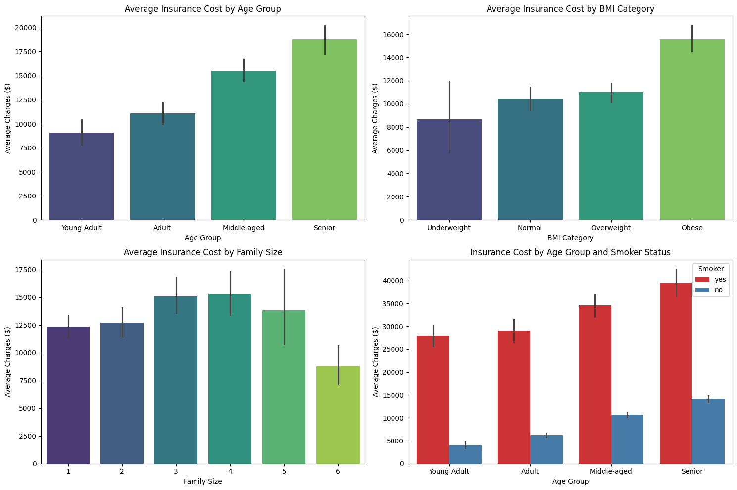
These plots will help you see, for example, that insurance charges tend to increase with age group and BMI category, and that smokers in every age group pay much higher charges. Visual inspection like this is a powerful way to spot which features are most important and how they interact.
Now that you have created and visualized your custom predictors, you are ready to use them in a regression model. This involves preparing your data by encoding categorical variables, splitting the data into training and test sets, and then training and evaluating the model.
First, you need to convert categorical features into a format that the model can use. One-hot encoding is a common approach, where each category becomes a separate column. You then combine these with your numeric features.
Here is how you can prepare the data and build the model:
A typical output might look like this:
This shows how well your model predicts insurance charges using the new, engineered features.
To understand the value of feature engineering, it is helpful to compare your new model to one built with only the original features. This means using the raw age, BMI, and children columns, along with simple encodings for categorical variables.
Here is how you can build and evaluate the original model:
Suppose the output is:
You can also visualize the predictions from both models to see the improvement. For example, plotting predicted vs. actual charges for each model side by side can make the difference clear.
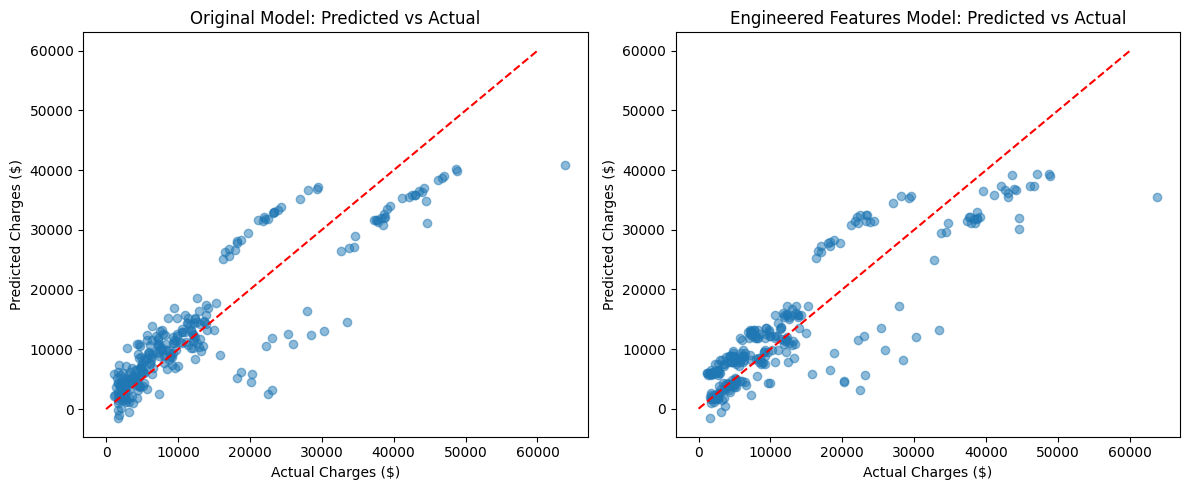
You can see that the model with engineered features produces predictions that are closer to the actual values, especially for certain groups.
Finally, you can summarize the improvement:
If the output is:
This quantifies the benefit of your feature engineering efforts.
In this lesson, you learned how to create custom predictors from raw insurance data — a process known as feature engineering. You saw how to group age and BMI into meaningful categories, create new features like family size, and convert categorical variables into numeric form. You also learned how to visualize these new features to better understand their relationship with insurance charges.
After building and evaluating a regression model with your engineered features, you compared its performance to a model using only the original variables. The results showed that thoughtful feature engineering can lead to more accurate and insightful models.
You are now ready to apply these techniques in hands-on practice. In the next exercises, you will create your own custom predictors, visualize their impact, and see how they improve your models. Keep up the great work — feature engineering is one of the most powerful tools in your data science toolkit!
