Welcome back! In the previous lesson, you learned how to load, inspect, and filter the PredictHealth insurance dataset using Python. These foundational skills are essential for any data analysis project. Now, we will take the next step by exploring how to visualize this data. Visualizing customer profiles is a powerful way to uncover patterns, spot trends, and communicate insights that might be hidden in raw numbers. In the context of health insurance, visualizations can help us understand how different factors — such as age, gender, region, and smoking status — affect insurance charges.
In this lesson, you will learn how to create several types of visualizations using real data from PredictHealth. We will build histograms, bar charts, scatter plots, and boxplots to explore the distribution of insurance charges and compare different customer groups. By the end of this lesson, you will be able to use these visual tools to gain a deeper understanding of customer behavior and prepare for more advanced analysis.
To make our plots look clean and professional, we will set an aesthetic style using Seaborn's set_style function. We will also define the size of our figures using Matplotlib's figure function. This helps ensure that our charts are easy to read and visually appealing.
Here is how you can set up your visualization environment:
Let's break down the visualization setup:
sns.set_style('whitegrid'): This sets a clean white background with subtle grid lines, making our plots easier to read. Other options include 'darkgrid', 'white', 'dark', and 'ticks'plt.figure(figsize=(15, 10)): This creates a new figure with a width of 15 inches and height of 10 inches, ensuring our plots are large enough to see clearly
By running this code, you prepare your canvas for all the visualizations we will create in this lesson.
Let's start by exploring how insurance charges are distributed across all customers. A histogram is a great tool for this because it shows how many customers fall into different charge ranges. This helps you see if most people pay similar amounts or if there are a few who pay much more or less.
Here is how you can create a histogram of insurance charges:
Let's examine each part of this histogram code:
plt.hist(): This is the main function that creates a histograminsurance_data['charges']: This selects the 'charges' column from our dataset as the data to plotbins=30: This divides the range of charge values into 30 equal-width intervals. More bins give finer detail, fewer bins show broader patternscolor='skyblue': This sets the fill color of the histogram bars to a light blueedgecolor='black': This adds black borders around each bar, making them easier to distinguishplt.title(): This adds a descriptive title at the top of the plotplt.xlabel()andplt.ylabel(): These label the x and y axes so viewers understand what the plot representsplt.show(): This displays the completed plot
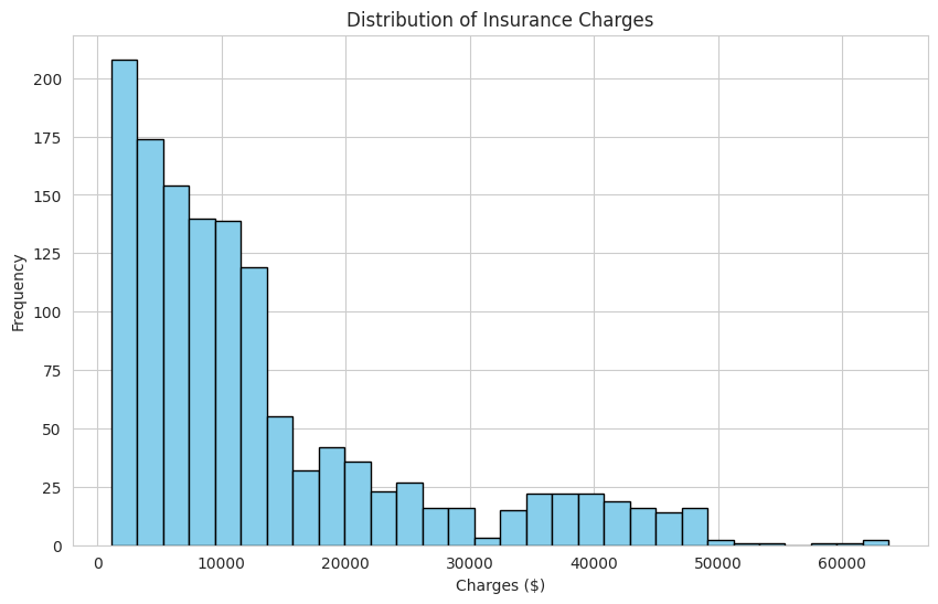
The result is a bar-like plot that shows the frequency of different charge amounts. For example, you might see that most customers have charges below $20,000, but there are some with much higher charges. This kind of visualization helps you quickly understand the spread and shape of the data, such as whether it is skewed or has outliers.
Next, let's compare average insurance charges across different groups. Bar charts are perfect for this because they make it easy to compare values side by side.
First, we will look at how average charges differ by region. We calculate the mean charges for each region and then plot them:
Output:
This code involves several steps, so let's break it down carefully:
Data Preparation:
insurance_data.groupby('region'): This groups all customers by their region (northeast, northwest, southeast, southwest)['charges'].mean(): For each region group, this calculates the average (mean) of the charges.sort_values(): This sorts the regions from lowest to highest average charges, making the chart easier to interpret.reset_index(): This converts the Series into a DataFrame with proper column names ('region' and 'charges')
Creating the Bar Plot:
sns.barplot(): This creates a bar chart using seaborn's stylingdata=region_costs_df: This specifies which DataFrame to usex='region': This puts region names on the x-axisy='charges': This puts the average charge values on the y-axishue='region': This colors each bar differently based on the regionpalette='viridis': This uses a professional color scheme that's colorblind-friendlylegend=False: This removes the legend since the x-axis labels already identify the regions
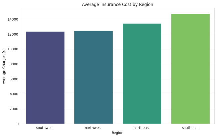
This bar chart shows the average insurance cost for each region, making it easy to see which regions have higher or lower average charges. For example, you might notice that the southeast region has higher average charges than the northwest.
Sometimes, we want to see how two variables are related. For example, does age affect how much someone pays for insurance? A scatter plot is a great way to visualize this relationship. Each point on the plot represents a customer, with their age on the x-axis and their insurance charges on the y-axis.
Here is how you can create a scatter plot for age versus charges:
Let's examine what each part of this scatter plot code does:
plt.scatter(): This creates a scatter plot where each data point is represented as a dotinsurance_data['age']: This provides the x-coordinates (age values) for each pointinsurance_data['charges']: This provides the y-coordinates (charge values) for each pointalpha=0.5: This makes each point semi-transparent (50% opacity). This is helpful because when many points overlap, you can still see the density of the data- The title and axis labels work the same way as in previous plots
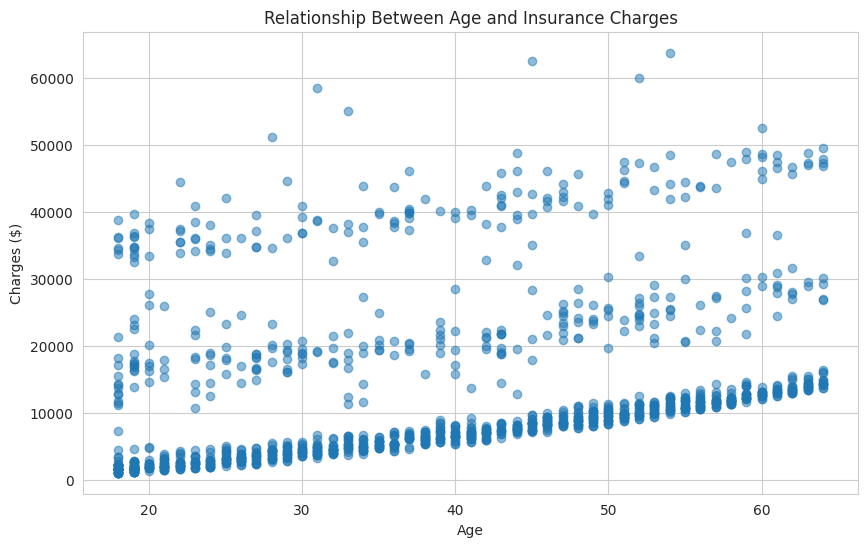
In this plot, you might notice that as age increases, insurance charges also tend to increase, especially for certain groups. The scatter plot helps you spot trends, clusters, or outliers that might not be obvious from tables or summary statistics. The transparency (alpha) parameter is particularly useful here because it helps you see where points are densely packed together.
Let's take a closer look at one of the most important factors in health insurance: smoking status. We want to compare the distribution of charges for smokers and non-smokers. A boxplot is ideal for this because it shows the median, quartiles, and any outliers in the data for each group.
Here is how you can create a boxplot comparing smokers and non-smokers:
Let's understand what this boxplot code accomplishes:
sns.boxplot(): This creates a box-and-whisker plot, which is excellent for comparing distributions between groupsx='smoker': This specifies that the x-axis should show the smoking status categories ('yes' and 'no')y='charges': This puts the insurance charges on the y-axisdata=insurance_data: This tells seaborn to use our insurance datasetpalette='Set2': This applies a predefined color scheme that makes the two boxes easily distinguishableshowfliers=False: This hides outlier points for a cleaner visualization focused on the main distribution patternswhis=1.5: This controls whisker length at 1.5 times the interquartile range (this is the default value)
Optional Parameters for Outlier Control:
showfliers=False: Completely hides outlier points, creating a cleaner look when you want to focus on the central distributionwhis=1.5: Controls whisker length (default is 1.5). Use smaller values likewhis=1.0to show more outliers, or larger values likewhis=2.5to show fewer outliers
Understanding the Boxplot Elements:
- The box shows the middle 50% of the data (from 25th to 75th percentile)
- The line inside the box represents the median (50th percentile)
- The whiskers (lines extending from the box) show the range of typical values
- Individual dots beyond the whiskers represent outliers - unusual cases that are much higher or lower than expected (when
showfliers=True)
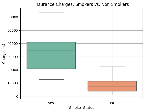
The boxplot will display two boxes — one for smokers and one for non-smokers. You will likely see that smokers have much higher charges, and the spread of their charges is also greater. Boxplots are useful because they highlight differences between groups and make it easy to spot outliers, which are individual cases with unusually high or low charges.
So far, we have been creating individual plots one at a time. However, sometimes it is more effective to display multiple related visualizations together in a single figure. This is where subplots come in handy. Subplots allow you to arrange multiple plots in a grid layout, making it easier to compare different aspects of your data side by side.
Subplots are particularly useful when you want to:
- Compare the same metric across different groups
- Show multiple variables for the same dataset
- Create a comprehensive dashboard-style view of your data
- Save space when presenting multiple visualizations
Here is how you can create a figure with multiple subplots using matplotlib:
Let's break down this subplot code:
Creating the Subplot Grid:
fig, axes = plt.subplots(2, 2, figsize=(15, 12)): This creates a 2x2 grid of subplots (2 rows, 2 columns) and returns both the figure object (fig) and an array of axes objects (axes)figsize=(15, 12): This sets the overall size of the entire figure to accommodate all four subplots
Addressing Individual Subplots:
axes[0, 0]: This refers to the subplot in the first row, first column (top-left)axes[0, 1]: This refers to the subplot in the first row, second column (top-right)axes[1, 0]: This refers to the subplot in the second row, first column (bottom-left)axes[1, 1]: This refers to the subplot in the second row, second column (bottom-right)
Key Differences When Using Subplots:
- Instead of
plt.hist(), we useaxes[0, 0].hist()to specify which subplot to draw on - For seaborn plots, we add the
ax=axes[row, col]parameter to direct the plot to the correct subplot - We use
set_title(),set_xlabel(), andset_ylabel()instead oftitle(),xlabel(), andylabel() plt.tight_layout(): This automatically adjusts the spacing between subplots to prevent overlapping labels and titles
This approach creates a comprehensive view of your data that tells a complete story in a single figure. You can see the overall distribution, relationships between variables, and comparisons between groups all at once.
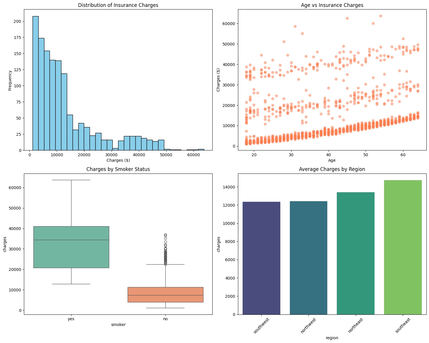
In this lesson, you learned how to use Python's visualization libraries to explore and compare customer profiles in the PredictHealth insurance dataset. You created a histogram to see the overall distribution of insurance charges, bar charts to compare average charges by region and gender, a scatter plot to examine the relationship between age and charges, and a boxplot to compare smokers and non-smokers. Each of these visualizations provides a different perspective on the data and helps you uncover important patterns and differences.
These skills are essential for any data analyst or scientist, as visualizations are often the first step in understanding a dataset and communicating findings to others. As you move on to the practice exercises, you will have the chance to create these plots yourself and interpret their results. This hands-on practice will help you build confidence and prepare you for more advanced analysis, such as regression modeling.
Keep up the good work, and remember that the ability to visualize data is a powerful tool in your data science journey. If you have any questions or want to revisit a concept, feel free to review this lesson as you practice. Good luck, and enjoy exploring the data!
