Discovering Key Cost Factors: Correlation and Visualization in Insurance Data
Introduction & Lesson Overview
Welcome back! In the last lesson, you learned how to use different types of plots — such as histograms, bar charts, scatter plots, and boxplots — to explore the PredictHealth insurance dataset. These visualizations helped you spot patterns, compare groups, and get a general sense of how insurance charges vary across different customer profiles.
In this lesson, we will take the next step: moving from simply visualizing the data to actually quantifying the relationships between customer attributes and insurance costs. Our main goal is to discover which factors — like age, bmi, number of children, and smoking status — most strongly influence insurance pricing. You will learn how to use correlation analysis and visualization techniques to identify these key cost drivers. By the end of this lesson, you will be able not only to see patterns but also to measure and compare the strength of these relationships, setting the stage for building predictive models in future lessons.
Preparing the Data for Analysis
Before we can analyze relationships, we need to make sure our data is ready. As a reminder, in previous lessons, you already checked for missing values and cleaned the dataset. Now, we will focus on selecting the most relevant numerical features for our analysis: age, bmi, children, and charges. These columns are important because they are either continuous or count data, making them suitable for correlation analysis.
Here is how you can select these columns from the insurance dataset:
This line creates a new DataFrame called numerical_data that contains only the columns we want to analyze. By narrowing our focus to these features, we can more easily interpret the results and avoid confusion from unrelated variables.
Computing and Interpreting the Correlation Matrix
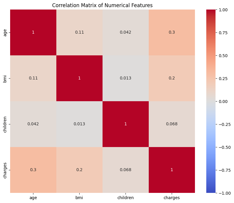
Now that we have our numerical features, we can calculate the correlation matrix. Correlation measures how strongly two variables move together. In Python, the .corr() method computes the Pearson correlation coefficient for each pair of columns. The result is a matrix where each value ranges from -1 (perfect negative correlation) to 1 (perfect positive correlation), with 0 meaning no linear relationship.
Important Note: While correlation tells us about the strength and direction of relationships between variables, it's crucial to remember that correlation does not imply causation. Just because two variables are correlated doesn't mean one causes the other. For example, if age and charges are positively correlated, this doesn't necessarily mean that getting older directly causes higher insurance costs — there could be other factors at play, such as age-related health conditions. When working with insurance data, always consider that multiple factors might influence costs, and correlation analysis helps us identify relationships that warrant further investigation.
Let's compute and display the correlation matrix:
The output will look something like this:
In this matrix, the diagonal values are always 1 because each variable is perfectly correlated with itself. The other values show the strength and direction of the relationship between each pair. For example, the correlation between age and charges is about 0.30, suggesting a moderate positive relationship: as age increases, charges tend to increase as well. The correlation between children and charges is much lower, indicating a weaker relationship.