Welcome to the first lesson of the "PredictHealth's Advanced Pricing System" course. In this lesson, you will learn how to model complex, non-linear cost patterns in health insurance data. Many real-world pricing systems, especially in healthcare, do not follow simple straight-line (linear) relationships. Instead, costs can increase faster as people age or change in more complicated ways as health factors like BMI (Body Mass Index) move away from normal ranges. By the end of this lesson, you will know how to use Python and scikit-learn to build and compare models that can capture these non-linear effects. You will also learn how to evaluate and visualize these models, which is a key skill for anyone working with advanced pricing systems.
Let us begin by looking at the insurance dataset. This dataset contains information about individuals, including their age, BMI, and whether they smoke. In real-world insurance pricing, these features are important because they affect the cost of providing health coverage. For this lesson, we will use a version of the dataset in which the cost patterns are intentionally made non-linear. For example, the effect of age on insurance charges is not just a simple increase; as people get older, costs can rise much faster. Similarly, BMI does not affect costs in a straight line — being much above or below the normal BMI can lead to higher costs.
In the code below, you can see how these features are used to create more realistic, non-linear cost patterns. The age_effect variable combines a linear and a quadratic term, so costs increase faster as age increases. The bmi_effect variable uses both a linear and a squared term, centered around a normal BMI of 25, to show that costs rise at the extremes. There is also a large extra cost for smokers, which is added as a fixed amount.
This approach helps us create a dataset in which the relationship between features and costs is more realistic and challenging, which is perfect for practicing advanced modeling techniques.
Understanding Polynomial Relationships
A polynomial relationship means that the effect of a feature is not just a straight line, but can curve or bend. Think of it this way: a linear relationship (degree 1) creates a straight line, a quadratic relationship (degree 2) creates a U-shape or inverted U-shape curve, and a cubic relationship (degree 3) can create an S-shaped curve with multiple bends.
How to Spot Polynomial Relationships
You can identify when you need polynomial features by looking for these patterns in your data:
- Scatter plots that show curves instead of straight lines - If you plot your features against the target variable and see curved patterns, linear models won't capture them well
- Residual plots that show patterns - If your linear model's errors (residuals) show systematic patterns rather than random scatter, you likely need polynomial terms
- Domain knowledge - In insurance, we know that age effects often accelerate (costs rise faster as people get older), and BMI effects are often U-shaped (costs higher at both extremes)
When to Stop Increasing Polynomial Degree
This is crucial for building practical models. You should stop increasing polynomial degree when:
- Cross-validation performance starts to decline - Higher degrees may fit training data better but perform worse on new data
- The model becomes too complex - Very high-degree polynomials can create unrealistic, wildly oscillating predictions
- Diminishing returns - If degree 3 and degree 4 give similar performance, choose the simpler degree 3
To capture these non-linear effects in our models, we use scikit-learn's PolynomialFeatures transformer. Let's understand exactly what this transformer does to our feature matrix:
How PolynomialFeatures Transforms Your Data
Starting with 2 features (age and BMI), here's what happens at each degree:
- Degree 1 (Linear): Creates 3 features
1(bias/intercept term),age,bmi
- Degree 2 (Quadratic): Creates 6 features
1,age,bmi,age²,age×bmi,bmi²
- Degree 3 (Cubic): Creates 10 features
- All degree 2 features plus:
age³,age²×bmi,age×bmi²,bmi³
- All degree 2 features plus:
For example, if you have a data point with age=30 and bmi=25, the degree 2 transformation creates:
The key insight is that the model can now learn different weights for age² (900) and age×bmi (750), allowing it to capture curved relationships and interactions between features that a simple linear model cannot.
Here is how we prepare the data and set up for polynomial modeling:
By focusing on age and BMI, we can easily visualize the effects and see how polynomial models perform compared to simple linear models.
Now, let us build models that can capture these non-linear relationships. We will use scikit-learn's Pipeline to combine the polynomial feature transformation and the regression model in one step. This makes the code cleaner and ensures that the transformation is always applied in the same way during both training and prediction.
We will create three models: a simple linear model (degree 1), a quadratic model (degree 2), and a cubic model (degree 3). Each model is built using a pipeline that first transforms the features and then fits a linear regression.
Here is the code to set up and train these models:
By using pipelines, you can easily switch between different degrees of polynomial features and compare how well each model fits the data.
After training the models, it is important to evaluate how well they perform. Two common metrics for regression problems are RMSE (Root Mean Squared Error) and R² (R-squared). RMSE tells you how far off your predictions are, on average, from the actual values. A lower RMSE means better predictions. R² measures how much of the variation in the data is explained by the model. An R² closer to 1 means the model fits the data well.
Warning About Overfitting
Higher-degree polynomial models can suffer from overfitting, especially with limited data. Overfitting occurs when a model learns the training data too well, including its noise and random variations, making it perform poorly on new data. Signs of overfitting include:
- Training performance much better than test performance
- Unrealistic predictions (like negative insurance costs or extremely high values)
- Models that perform well on training data but poorly in cross-validation
To avoid overfitting, always use cross-validation to select the optimal polynomial degree:
A sample output might look like this:
In this example, the quadratic model has the best cross-validation performance, suggesting it's the optimal choice despite the cubic model having slightly better test performance (which might be due to overfitting).
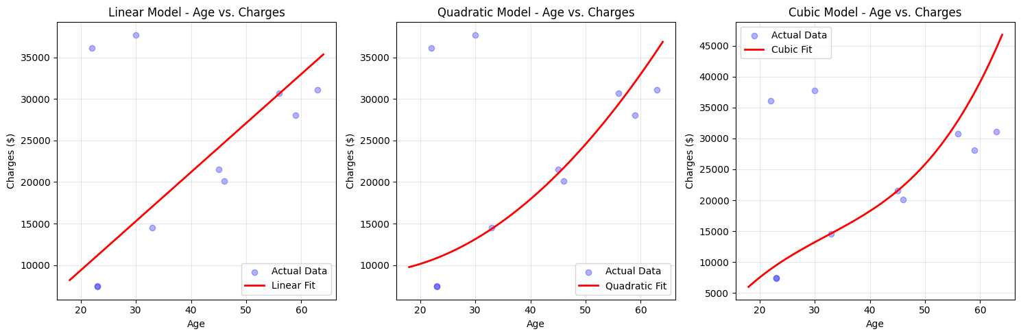
Visualization is a powerful way to understand how well your models are capturing the patterns in the data. Here, we will plot the actual insurance charges against the predicted charges for different models, focusing on the age variable. This helps you see if the model is able to follow the curves in the data or if it is missing important patterns.
For age, we keep BMI fixed at its average value and plot how predicted charges change as age increases.
Here is the code to create these plots:
You can see that the linear model draws a straight line, while the quadratic and cubic models can bend to follow the actual data more closely.
In this lesson, you learned how to model non-linear cost patterns in health insurance data using polynomial regression. You explored how real-world features like age and BMI can have complex effects on costs, and how to use scikit-learn pipelines to build and compare linear, quadratic, and cubic models. You also learned how to evaluate these models using RMSE and R², and how to visualize their predictions to see how well they capture the true patterns in the data.
Next, you will get hands-on practice with these concepts. You will have the chance to build your own models, try different polynomial degrees, and see how your choices affect the results. This will help you gain confidence in using advanced modeling techniques for real-world pricing systems.
