Welcome back to Percentages in News and Statistics! You've reached lesson four out of six, so you're already well past the halfway point in this course. So far, we've learned how to calculate percent changes, how to identify the group behind a reported percentage, and how to estimate actual counts from those percentages. In this lesson, we'll focus on a situation that comes up constantly in news and everyday conversation: comparing percentage claims that come from groups of very different sizes. As we'll see, the same percentage can mean very different things depending on how large each group is.
Imagine two headlines side by side:
- "30% of employees at Company A are remote workers."
- "30% of employees at Company B are remote workers."
At first glance, these two companies look identical on the remote-work front. But what if Company A has 100 employees and Company B has 5,000? Then Company A has just 30 remote workers, while Company B has 1,500. The percentage is the same, yet the real-world picture is completely different.
This is the core idea behind today's lesson: percentages describe proportions, not quantities. To compare actual quantities, we always need to know the size of each group.
As you may recall from our earlier work on estimating counts from reported percentages, converting a percentage into a raw number is straightforward. We multiply the group total by the percentage expressed as a decimal:
For example, if a city of 80,000 residents reports that 12% commute by bicycle, the number of bicycle commuters is:
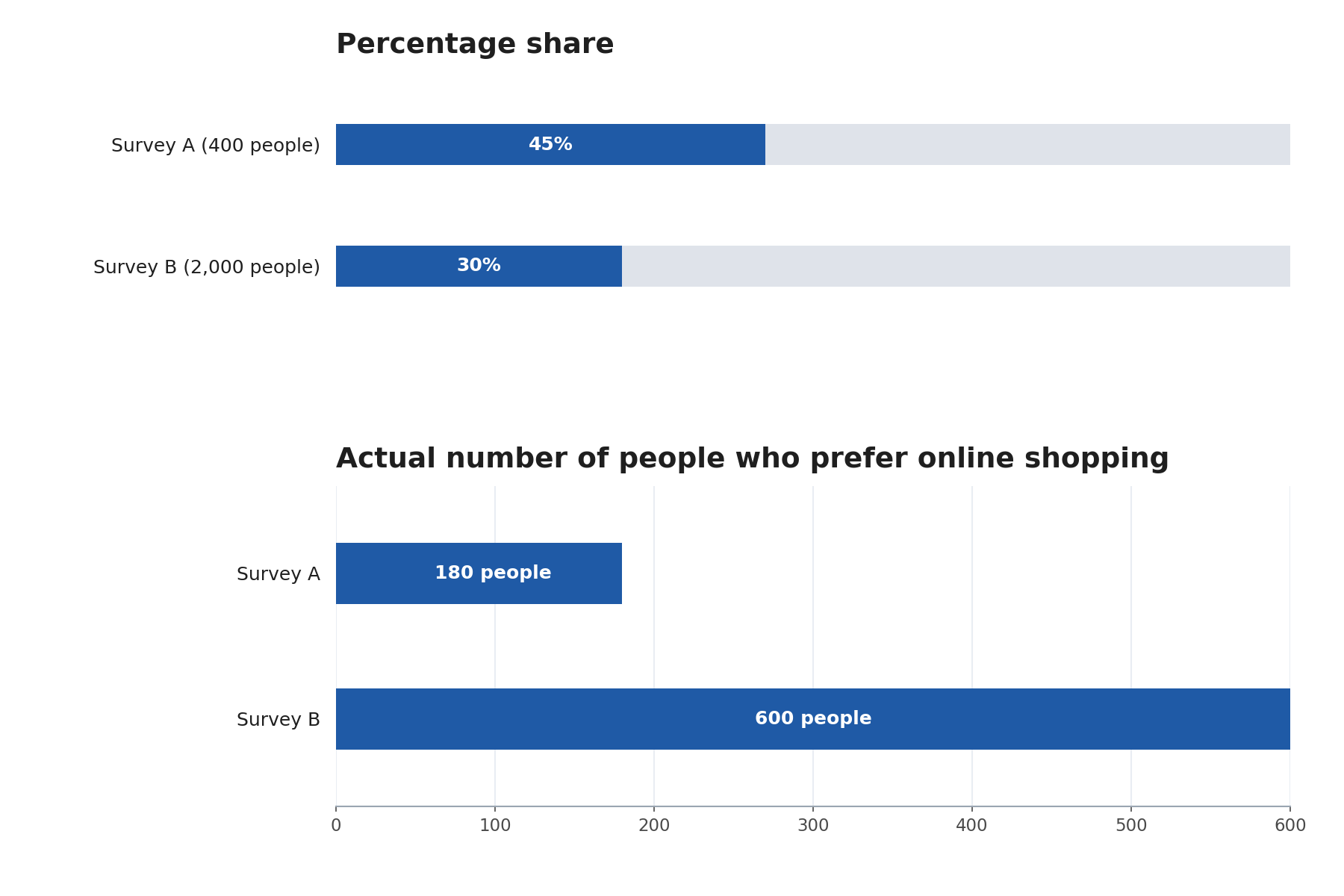
Let's walk through a realistic example. Suppose two surveys report the following results about shopping preferences:
At first, Survey A seems to show a stronger preference for online shopping because 45% is larger than 30%. But let's find the actual counts:
- Survey A: people
- Survey B: people
So when is it fair to compare percentages directly, and when is it not? Here are a few guidelines to keep in mind:
- Percentages are great for comparing proportions. If we want to know which group has a larger share of a characteristic, percentages are the right tool. In our shopping example, a larger share of Survey A's group prefers online shopping (45% vs. 30%).
- Percentages alone cannot tell us about raw counts. If we want to know which group has more people with a characteristic, we must calculate the actual numbers.
- Watch out for vague language. Words like "more," "greater," or "larger" can refer to either the proportion or the count. Always ask: more as a share, or more in total number?
A helpful habit is to pause whenever we see two percentages being compared and ask: Are these percentages from groups of similar size, or very different sizes? If the groups differ greatly in size, the percentages alone can paint a misleading picture.
Let's try one more example to make this concrete. A news article states:
"In Town X (population 5,000), 8% of residents experienced a power outage last month. In Town Y (population 50,000), 3% of residents experienced a power outage."
Which town had more outages as a share of its residents? Town X, at 8% versus 3%.
Which town had more actual outages? Let's calculate:
- Town X: outages
- Town Y: outages
The big takeaway from this lesson is simple but powerful: equal or higher percentages do not automatically mean equal or higher counts. Whenever we compare percentages from groups of different sizes, we should convert those percentages into actual numbers before drawing conclusions about quantities. This habit will help us read news reports, survey results, and data summaries with much sharper eyes.
Now it's time to put these ideas to the test! In the upcoming practice exercises, you'll spot the gap between matching percentages and matching counts, calculate the real numbers behind the claims, and explain exactly what a percentage comparison can and cannot tell us. Let's dive in!