Principal Component Analysis
Topic Overview and Actualization
Welcome to our journey into high-dimensional data and the associated challenges that it presents. We'll focus on Principal Component Analysis (PCA), a significant method in the realm of dimensionality reduction. Using a real-world example, we'll implement PCA in R. This lesson's roadmap proceeds as follows:
- Introducing high-dimensional data and understanding its challenges
- Establishing the need for dimensionality reduction
- Unveiling
PCA, its algorithm, and benefits - Implementing
PCAusingR
Understanding High-Dimensional Data
High-dimensional data describes a dataset teeming with numerous features or attributes. One good example of high-dimensional data that would benefit from Principal Component Analysis (PCA) is a dataset from a customer survey.
This dataset may have many different features (dimensions), including age, income, frequency of shopping, amount spent per shopping trip, preferred shopping time, location, and scores on several opinion and satisfaction questions, such as product variety, staff helpfulness, and store cleanliness.
If these many features all contribute relatively equally to the variance in the dataset, or if there exist correlations among these features, it might be challenging to visualize the data or draw useful conclusions directly from it. By using PCA, we can reduce the dimensionality of the dataset without significant loss of information and identify the primary areas (principal components) that explain the most variance among customers.
Let's take a look at an example where we wish to model the relationship between height and weight. In our dataset, we have three features but want to reduce the dimensionality to only two features.
In our example, we examine a dataset recording individuals' weights and heights in two different units — inches and centimeters. This redundancy increases the dimensionality of our dataset.
Visualizing Feature Redundancy
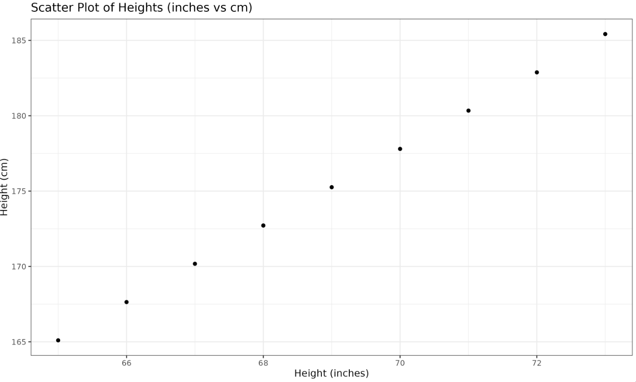
We show a scatter plot of height in inches versus centimeters, revealing the redundancy as the data points line up in a straight line.
Plotted Image: