Welcome back to Measuring Spread with Range and IQR! Lesson four of five is here, which means we are one step away from wrapping up this course. Over the past three lessons, we built up a complete toolkit: the range to capture overall spread, Q1, Q3, and the IQR to describe the middle 50%, and finally the five-number summary to package all of those landmarks into one compact profile. In this lesson, we take those five numbers and turn them into a picture called the box plot, a visual tool that makes patterns in center, spread, and symmetry jump off the page.
Why Turn Numbers into a Picture?
As you may recall from the previous lesson, we can learn a great deal from the gaps between consecutive values in the five-number summary. Still, comparing numbers mentally takes effort, especially when we want to evaluate two or more datasets side by side. A box plot translates those same five values into shapes and positions on a number line, letting our eyes do the comparison work almost instantly.
Once we learn to read the parts of a box plot, we gain a fast and reliable way to describe a distribution. No new calculations are needed — just a new way of seeing the numbers we already know how to find.
Anatomy of a Box Plot
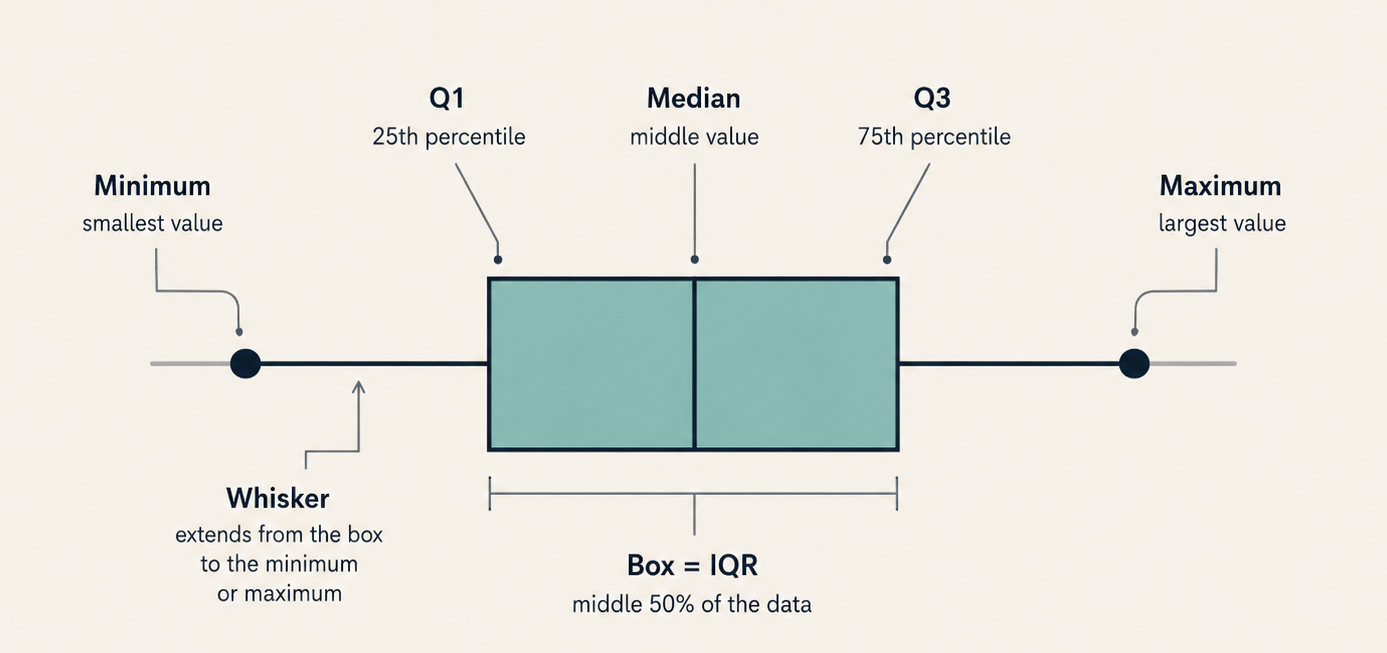
A box plot (also called a box-and-whisker plot) is built directly from the five-number summary. Every piece of the plot maps to one or more of those five values.
There are three components to identify:
The box spans from Q1 on the left to Q3 on the right. Its width represents the IQR, the spread of the middle 50% of the data.
The median line is drawn inside the box at the median value. It marks the center of the distribution.
The whiskers are thin lines extending outward from each side of the box. In the basic box plot used throughout this lesson, the left whisker stretches from Q1 down to the minimum, and the right whisker stretches from Q3 up to the maximum. (In the next lesson we will meet a common variation that draws unusually extreme values as separate points; in that version the whiskers stop at the most extreme non-outlier values instead of at the true minimum and maximum.)
Together, these elements map all five landmarks onto a single number line. The box spans the middle 50% of the data, while the whiskers show how far the remaining values reach on each side.
Join the 1M+ learners on CodeSignal
Be a part of our community of 1M+ users who develop and demonstrate their skills on CodeSignal
Reading Values from a Box Plot
What a Box Plot Reveals About Center and Spread
The median line gives us the center of the distribution at a glance. Its position within the box tells us even more: if the line sits roughly in the middle of the box, values are fairly balanced on both sides of center within the middle 50%. If it sits closer to one edge, the data in that half is more compressed while the other half is more stretched.
A box plot also displays two layers of spread simultaneously. The width of the box shows the IQR, telling us how tightly or loosely the middle half of values cluster. The total span from whisker tip to whisker tip shows the range.
A narrow box paired with long whiskers indicates that the middle 50% spans a small interval while the outer quarters extend much farther from it. A wide box with short whiskers indicates that the middle 50% covers a larger interval while the outer quarters remain relatively compact.
Recognizing Symmetry and Skew
Describing a Distribution from Its Box Plot
Conclusion and Next Steps
In this lesson, we turned the five-number summary into a box plot and learned to read it back. We identified the three core components — the box (Q1 to Q3), the median line, and the whiskers (reaching to the minimum and maximum) — and practiced extracting exact values from the plot. We also explored how the relative lengths and positions of these components reveal the distribution's center, spread, and symmetry.
In the next and final lesson, we will use the IQR to establish a formal rule for flagging outliers and discuss when the range or IQR is the better measure of spread. For now, jump into the practice exercises to test your box plot reading skills: you will label parts of a plot, pull off exact values, match box plots to their five-number summaries, and write your own descriptions of what the data reveals.
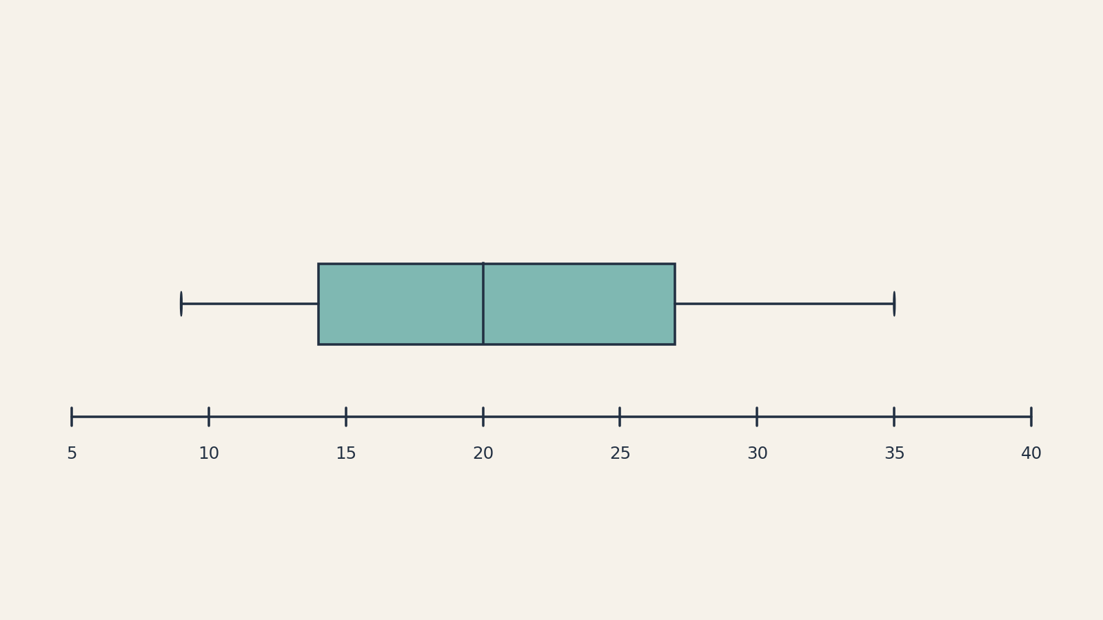
To extract the five-number summary from a box plot, we simply note where each component sits on the number line. Let's try this with the bakery order data from the previous lesson, which had the summary 9,14,20,27,35.
Box Plot Element
Position on Number Line
Summary Value
Left end of left whisker
9
Minimum
Left edge of box
14
Q1
Line inside the box
20
Median
Right edge of box
27
Q3
Right end of right whisker
35
Maximum
From these readings we can reconstruct the measures we already know: the range is 35−9=26, and the IQR is 27−14=13. Everything we computed by hand in earlier lessons is encoded right in the picture.
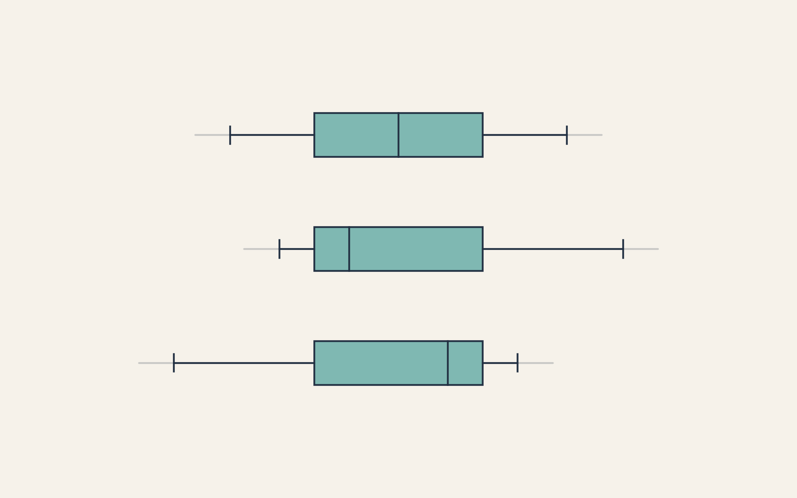
One of the most practical benefits of a box plot is how quickly it reveals whether a distribution is symmetric or skewed. Here is what to look for:
Symmetric: The median line sits near the center of the box, and the two whiskers are roughly equal in length. The plot looks balanced on both sides.
Right-skewed: The right whisker is noticeably longer than the left, and the median line may sit closer to Q1. Values stretch farther above the center than below it.
Left-skewed: The left whisker is noticeably longer than the right, and the median line may sit closer to Q3. Values stretch farther below the center than above it.
In our bakery example, the left whisker covers 14−9=5 units and the right whisker covers 35−27=8 units. The right side stretches farther, indicating a mild right skew. The busiest days are more spread out than the quietest ones.
Let's put everything together with a new scenario. Suppose we are given a box plot of weekly commute times (in minutes) for employees at a small company. Reading the positions on the number line, we find:
Min
Q1
Median
Q3
Max
10
18
25
30
55
We read the center first: a typical commute is about 25 minutes. For the middle 50%, the IQR is 30−18=12 minutes, so the middle half of commute times fall within a fairly tight 12-minute window. The overall range, however, is 55−10=45 minutes — a much wider span, hinting that some commutes are far from typical.
Next, we check for symmetry. The left whisker covers 18−10=8 minutes while the right whisker covers 55−30=25 minutes. The right side extends much farther, and the median line sits slightly left of center in the box (25−18=7 vs. 30−25=5). Both signs point to a clear right skew, meaning a few employees have notably long commutes pulling the upper end of the distribution outward.
This is exactly the kind of narrative a box plot helps us build: center, spread, and shape, all from one picture. In the practice exercises, you will do the same — read the landmarks, compute the key measures, assess symmetry, and write a brief description of what the data reveals.