Outliers and Spread Measures
Introduction
Welcome to the final lesson of Measuring Spread with Range and IQR! Over the previous four lessons, we assembled a full toolkit: the range to capture overall spread, Q1, Q3, and the IQR to describe the middle 50%, the five-number summary to profile a dataset at a glance, and the box plot to turn those numbers into a picture. Now we put those tools to their most practical use yet. In this lesson, we learn a formal rule for flagging outliers and develop the judgment to choose whether the range or the IQR is the better spread measure to report.
When Is a Value "Too Far"?
Earlier in this path, we spotted unusually extreme values by eye — scanning a graph or sorted list and deciding that something looked "off." That visual approach works in clear-cut cases, but it leaves a gray area. Two people examining the same data might disagree about whether a value is "just large" or "truly unusual."
The IQR gives us exactly the right yardstick. Because it measures how spread out the middle 50% of the data is, it captures what a "normal" amount of variation looks like. We can then express "too far" as a specific multiple of that yardstick, turning a subjective judgment call into a simple, repeatable calculation that anyone can apply.
The 1.5 × IQR Rule
The standard method for identifying outliers uses the IQR to build two boundaries called fences:
Any data value that falls below the lower fence or above the upper fence is classified as an outlier. Values that land inside the fences, including those exactly on a boundary, are not outliers.
Why the multiplier 1.5? Statistician John Tukey chose it because it strikes a practical balance: strict enough to catch genuinely extreme values, yet lenient enough to avoid flagging ordinary ones. Think of it as a widely accepted convention, much like calling a body temperature above 100.4 °F a fever. The number is not derived from a proof; it simply works well across a wide variety of real datasets.
Applying the Rule Step by Step
Let's walk through a full example. A small online store records shipping times (in days) for its last 12 orders:
Most packages arrived within a week, but one took 18 days. Let's determine whether that value qualifies as an outlier.
Step 1 — Find Q1, Q3, and IQR. With 12 values, the median is the average of the 6th and 7th: . The lower half is , so . The upper half is , so . That gives us .
Step 2 — Compute the fences.
Step 3 — Compare every value to the fences. All values from 2 through 7 fall between and , so none of them are outliers. The value 18, however, sits well above the upper fence of 11. It is an outlier.
Notice that the lower fence came out to . Since shipping times cannot be negative, a negative lower fence simply tells us that no value on the low end could possibly qualify as an outlier in this dataset.
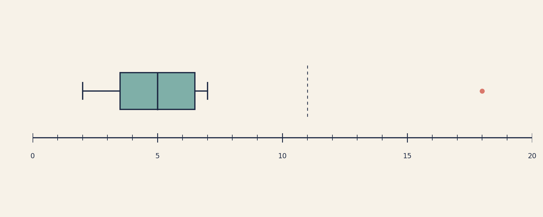
This is a good moment to revisit the box plot convention. In the previous lesson, we drew the whiskers all the way out to the minimum and maximum. Once we can identify outliers, it is common to switch to the modified box plot: outliers are drawn as individual dots beyond the whiskers, and the whiskers stop at the most extreme values that fall inside the fences. In the shipping-time plot above, the right whisker ends at 7 (the largest non-outlier), and the point at 18 appears as a lone dot to the right. From here on, whenever you see a dot floating beyond a whisker, remember that the whisker endpoints no longer mark the true minimum or maximum — they mark the most extreme non-outlier values.
