Congratulations — you have made it to the final lesson of Measuring Spread and Variability! Over the past three lessons, we built a solid toolkit: we learned what variability means, calculated the range, found quartiles, and computed the interquartile range (IQR). Each of those lessons focused on one measure at a time. Now we are going to bring it all together by placing range and IQR side by side, comparing what each one reveals about a dataset, and learning how to choose the right measure for the situation.
Think about describing the weather in a city over the past year. You could say, "Temperatures ranged from to F," which captures the full extremes. Or you could say, "On a typical day, temperatures fell between and F," which describes the everyday experience. Both statements are true, but they serve different purposes.
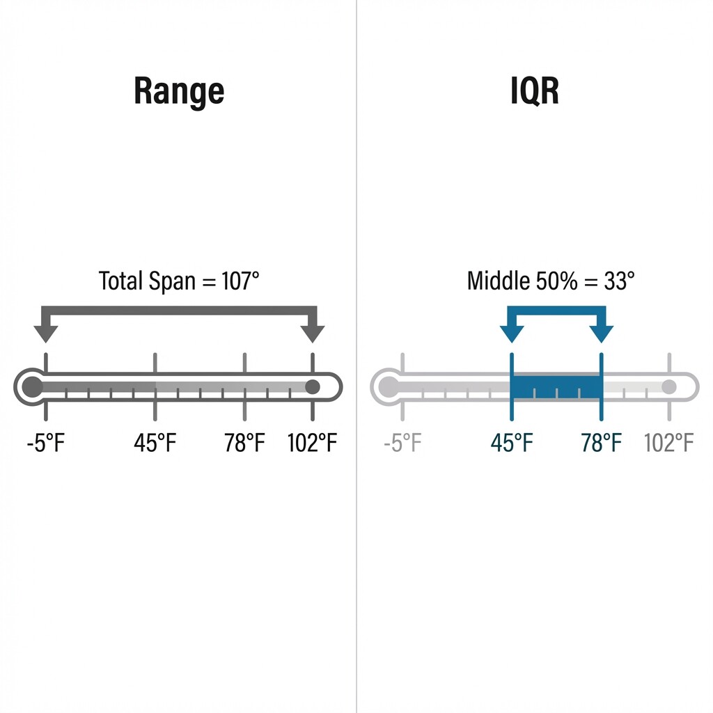
This is exactly the relationship between range and IQR. The range gives us the total span from the smallest to the largest value, while the IQR focuses on where the middle 50% of values sit. Neither measure is "better" in every case — the key is understanding what each one tells us so we can pick the more informative one for a given dataset.
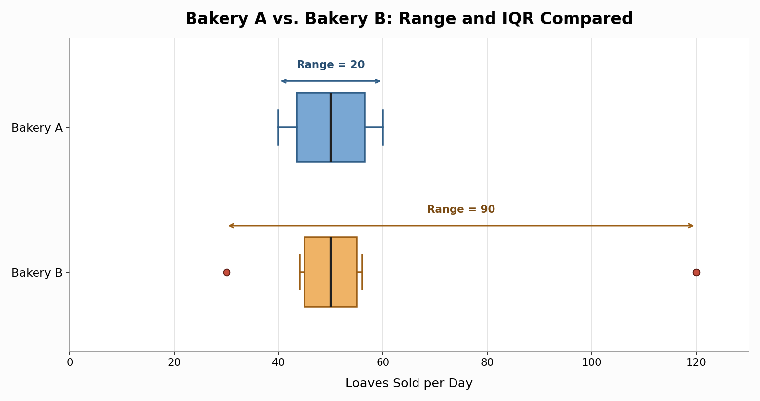
Let's make this concrete. Suppose two bakeries each tracked how many loaves of bread they sold per day over the same nine days:
First, let's compute the range for each bakery:
- Bakery A:
- Bakery B:
The bakery example highlights the core difference between these two measures:
- Range captures the total span of the data, from the absolute lowest to the absolute highest value. It is quick to calculate and easy to understand, but a single extreme value can inflate it dramatically.
- IQR captures the spread of the middle 50%. It ignores the top 25% and the bottom 25%, which means outliers or unusual extremes do not affect it.
If a bakery manager wanted to know the worst-case swing in daily sales — perhaps for ordering supplies — the range would be helpful. But if the manager wanted to understand how much sales vary on a normal day, the IQR would paint a more accurate picture.
When deciding which measure to report, consider these two questions:
- Are there outliers or extreme values? If so, the range will be stretched by those extremes and may exaggerate the typical spread. The IQR will give a more stable summary.
- Do the extremes matter for our question? Sometimes the full span is exactly what we need. For example, if we are sizing a water tank, we care about peak demand, and the range tells us how far apart the extremes are.
Here is a quick reference:
In practice, reporting both measures together is often the most informative approach, just as we did with the bakery data. The range gives the big picture, and the IQR fills in how the bulk of the data actually behaves.
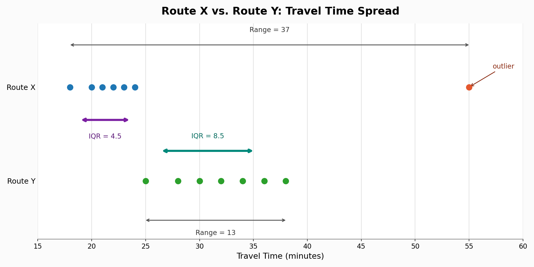
Let's walk through one more scenario to practice choosing. A city is comparing two bus routes based on travel times (in minutes) collected over seven trips each:
Route X:
Route Y:
In this lesson, we brought the range and the IQR together to see how they complement each other. The range captures the total span of a dataset and is sensitive to extreme values, while the IQR measures the spread of the middle 50% and remains stable even when outliers are present. We also practiced choosing the more informative measure based on the dataset and the question at hand, completing our full set of tools for describing how spread out data really is.
Now it is time to put everything into practice! The exercises ahead will have you computing both measures for real-world datasets, matching each measure to its key properties, and making judgment calls about which one tells the better story. Let's finish this course strong!