Welcome to the world of Grafana dashboards! If you've been using Grafana's Explore feature to run ad hoc queries and test your SQL against various data sources, you've probably noticed something: every time you close the browser or switch views, your queries disappear. While Explore is fantastic for experimentation and quick data investigation, it's not designed for ongoing monitoring or sharing insights with your team.
This is where dashboards come in. Dashboards are Grafana's answer to production monitoring. They allow you to save your queries as reusable panels, organize multiple visualizations on a single screen, and share them with others who need to monitor the same systems. Instead of running the same query manually every morning to check CPU usage, you can create a dashboard that displays that information automatically, updating in real time as new data arrives.
In this lesson, you'll create your first dashboard with three panels that monitor different aspects of system performance: CPU usage over time, average memory consumption, and disk usage for a specific host. By the end, you'll understand how to move from temporary query testing to building permanent monitoring solutions that you and your team can rely on.
You can create a new dashboard from scratch in either of these ways:
- Navigate to the Dashboards section in the left sidebar, then click the New button and select New Dashboard
- Click the + icon in the upper right corner of Grafana, which will show you options including New dashboard, Import dashboard, and New alert rule
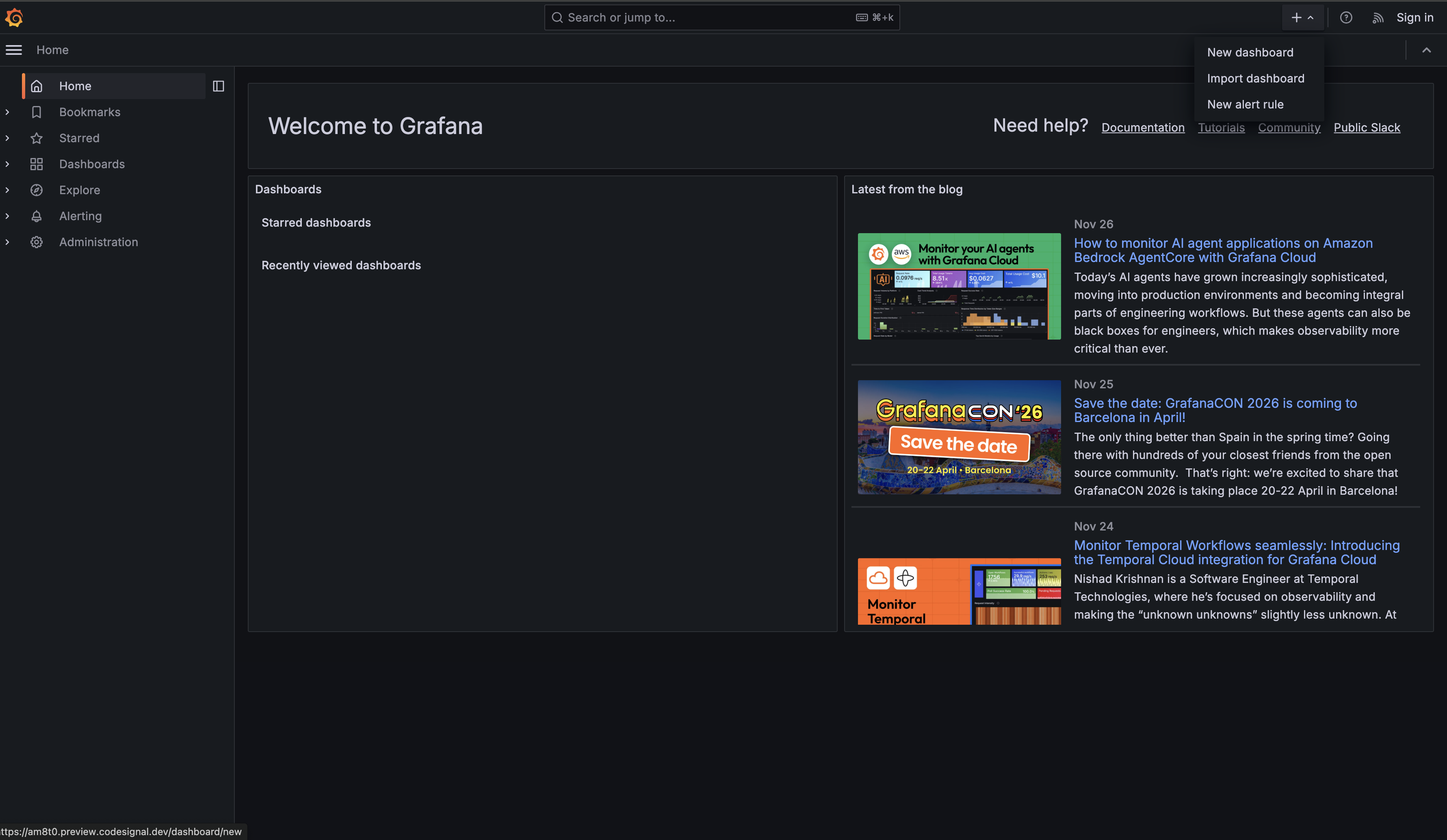
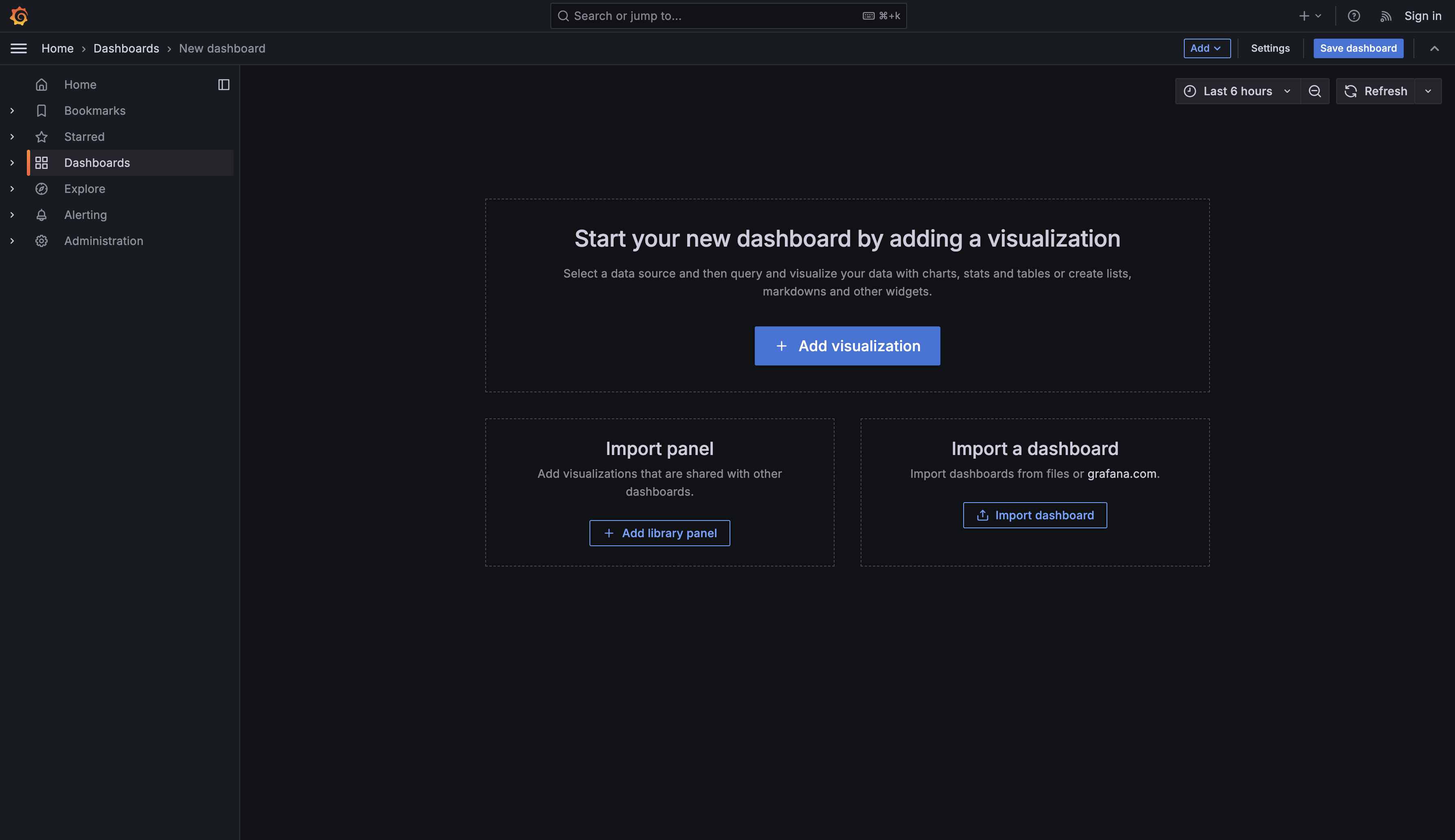
Choose New dashboard using either method. Grafana will present you with a screen titled “Start your new dashboard by adding a visualization” with several options:
- Add visualization - Select a data source and then query and visualize your data with charts, stats and tables or create lists, markdowns and other widgets
- Add library panel - Import visualizations that are shared with other dashboards
- Import dashboard - Import dashboards from files or grafana.com
Now, look at the Panel options section on the right side of the screen. Find the Title field (currently showing “Panel Title”) and change it to CPU Usage Over Time.
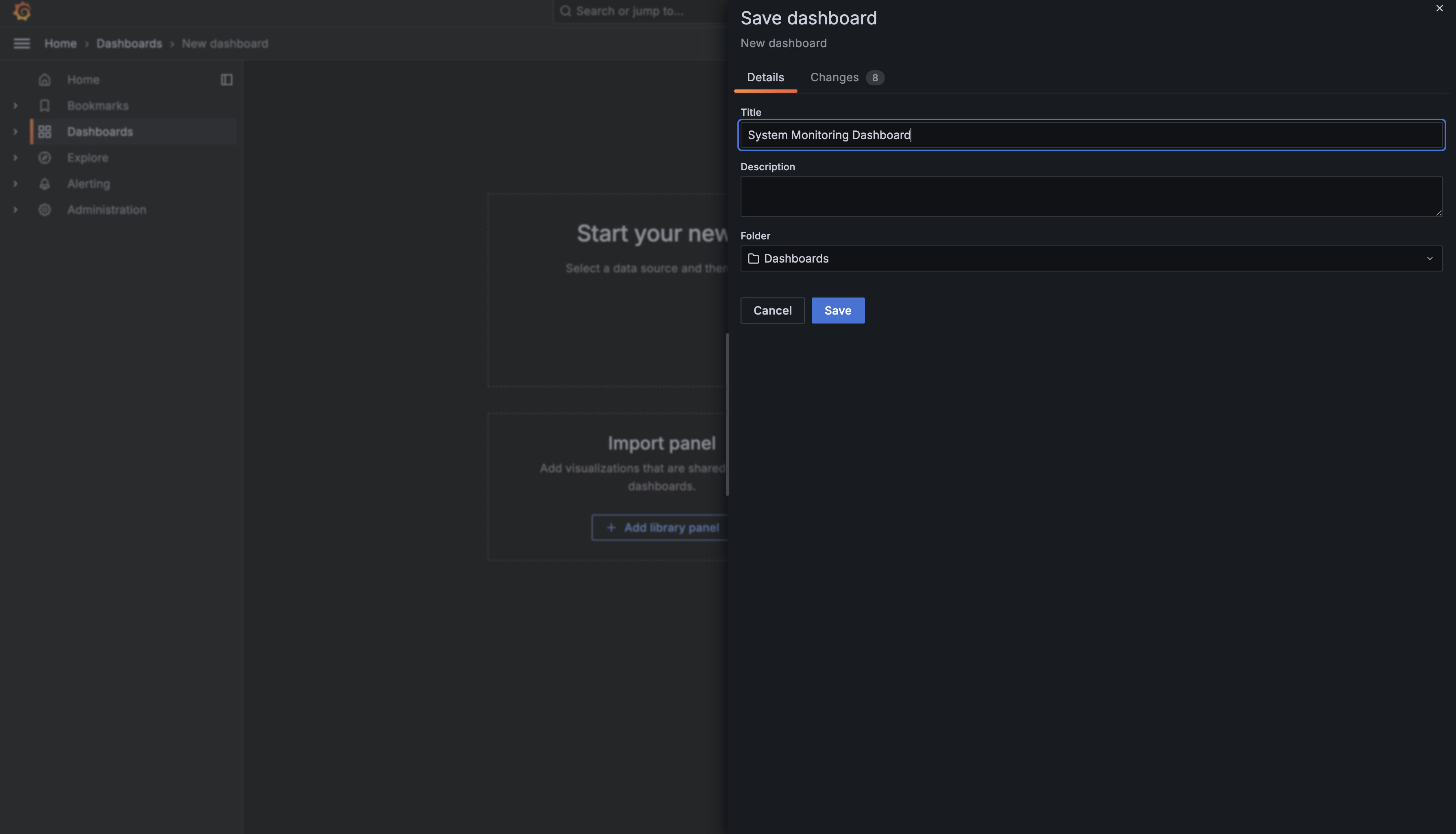
Click the Save dashboard button at the top right of the screen. Grafana will ask you to name your dashboard — enter System Monitoring Dashboard and click Save.
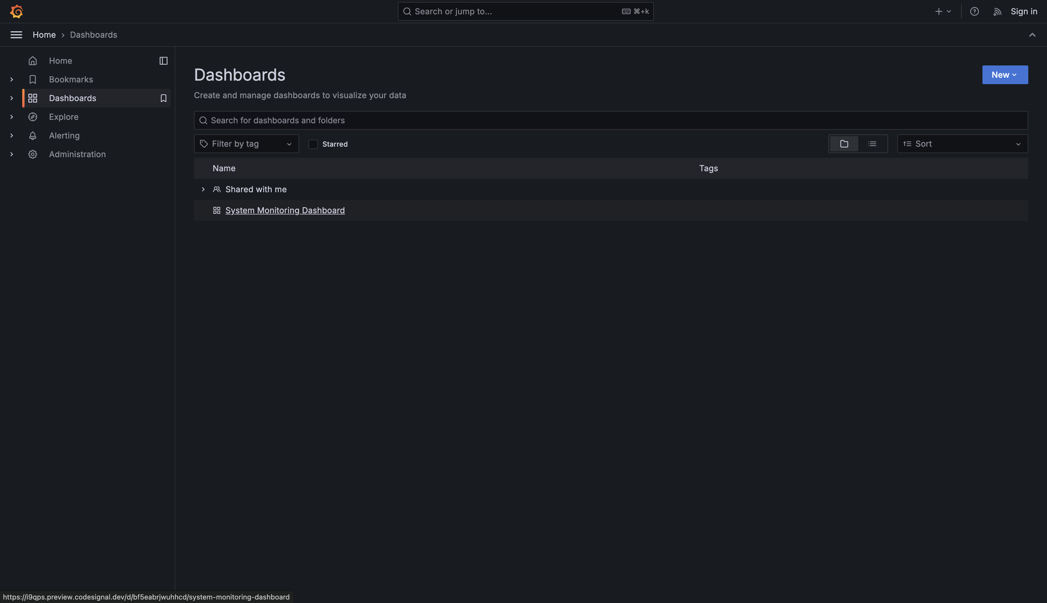
If you now navigate to the Dashboards section in the left sidebar, you’ll see your newly created dashboard listed with the name System Monitoring Dashboard.
Now if you click on your dashboard, it will open the page we saw before. Let’s add a visualization.
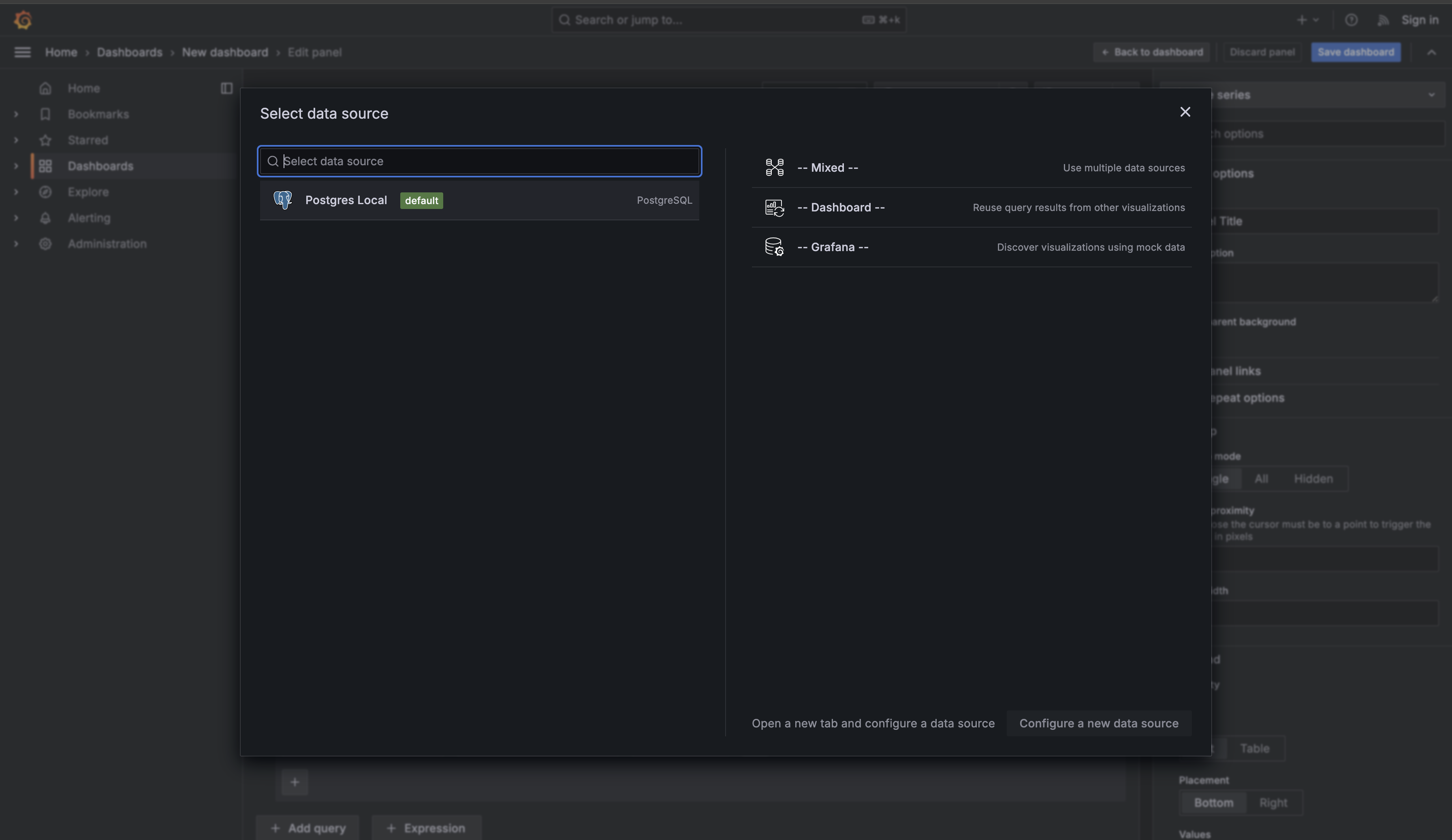
Select Add visualization. Grafana will now prompt you to choose a data source. Click on PostgreSQL to select your database as the data source.
You’ll now see the panel editor interface with a query editor at the bottom of the screen and a preview of your visualization above it. This is where you’ll write your SQL queries and configure how the data is displayed. On the right side are the panel options.
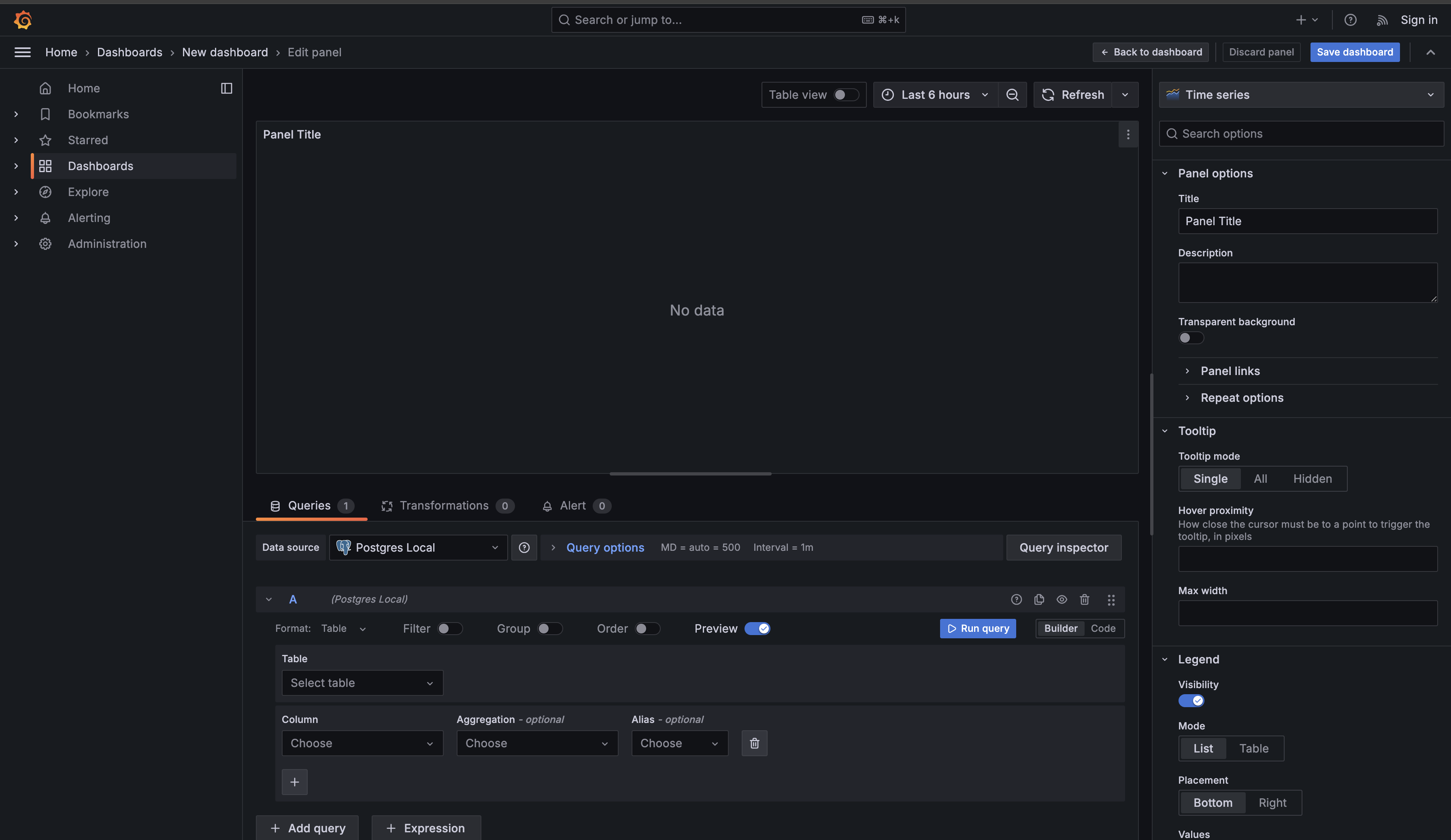
Look at the query editor section at the bottom. You’ll see that the Format dropdown is currently set to Table. This is Grafana’s query builder mode, which provides a form-based interface for constructing queries.
For the queries we’re writing, we’ll use raw SQL instead. Click the Format dropdown and change it from Table to Code. The query builder interface will disappear and be replaced with a text editor where you can write SQL directly.
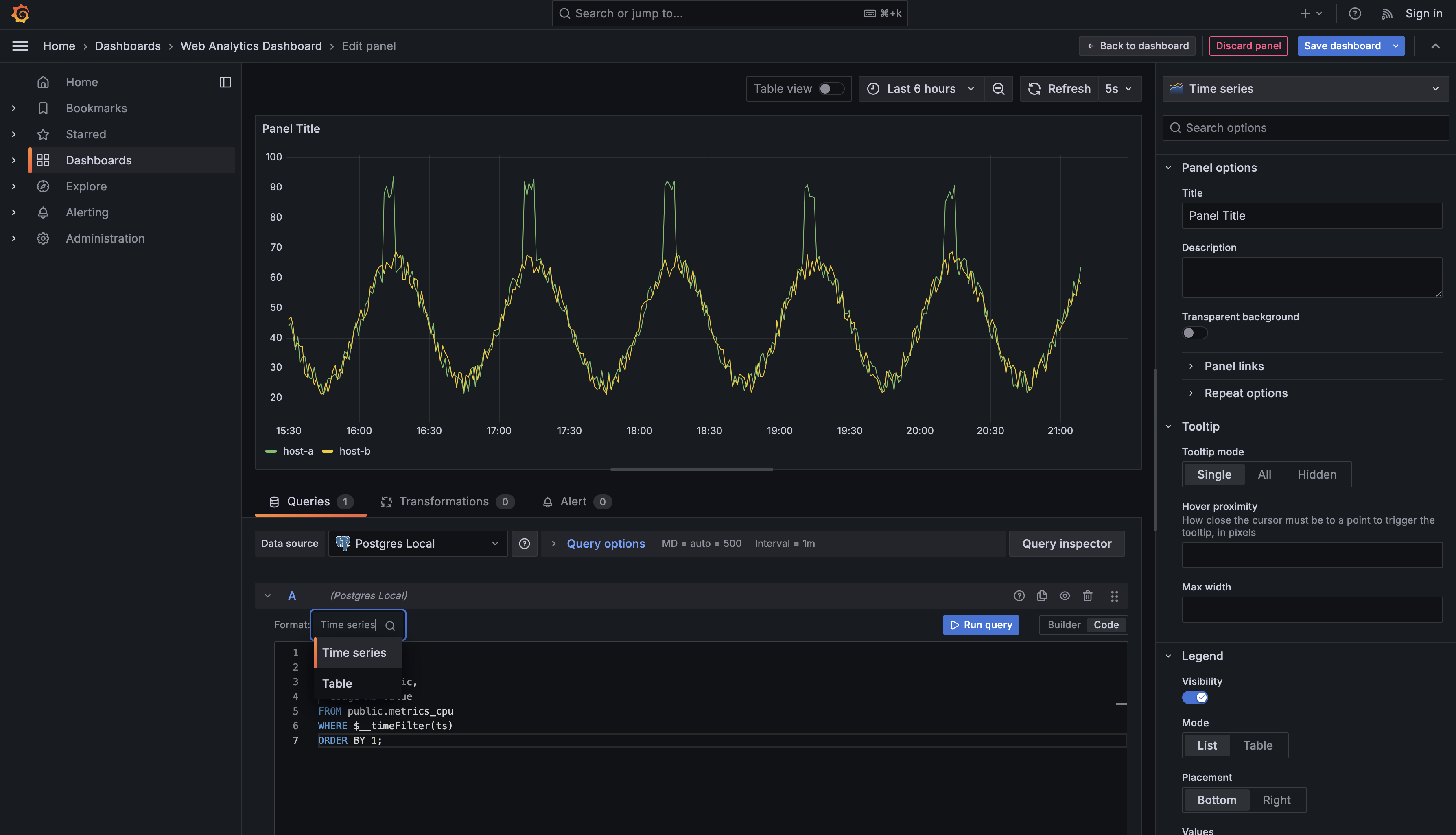
Now write a query to display CPU usage over time for all hosts in your system. In the SQL editor, enter this query:
After entering the query, click Run query.
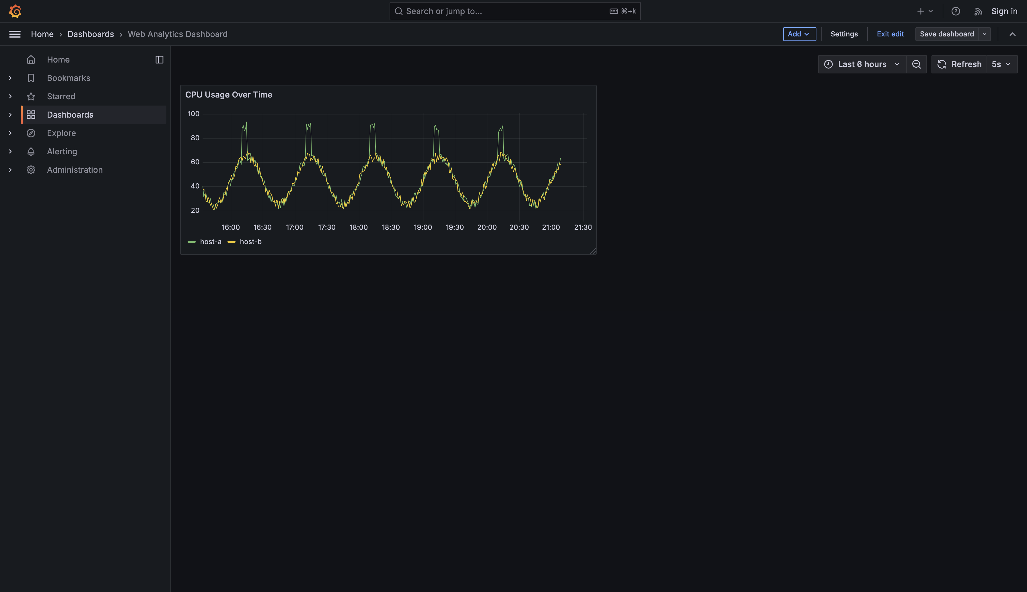
By default, Grafana will display the results as a table. Change the visualization type from Table to Time series, because the table view only shows raw rows, while the time series view tells Grafana to interpret your timestamp column as the X-axis and split your results into separate lines based on the host name.
Once you’ve selected the Time series visualization, you should see a chart appear with multiple colored lines, each representing a different host.
Let’s break down what makes this query work for dashboard panels:
$__time(ts)converts your timestamp column into a format that time series visualizations can understand (it tells Grafana which column is the x-axis time field).$__timeFilter(ts)automatically filters results to the dashboard’s selected time range (from the time picker).host AS metricandusage AS valuefollow Grafana’s time series convention:metricdetermines how series are split (one line per host)valueis what gets plotted on the y-axis
Now, look at the Panel options section on the right side of the screen. Find the Title field (currently showing “Panel Title”) and change it to CPU Usage Over Time.
Finally, click the Save dashboard button to save the entire dashboard. Grafana will present a save dialog where you can optionally add a note describing your changes.
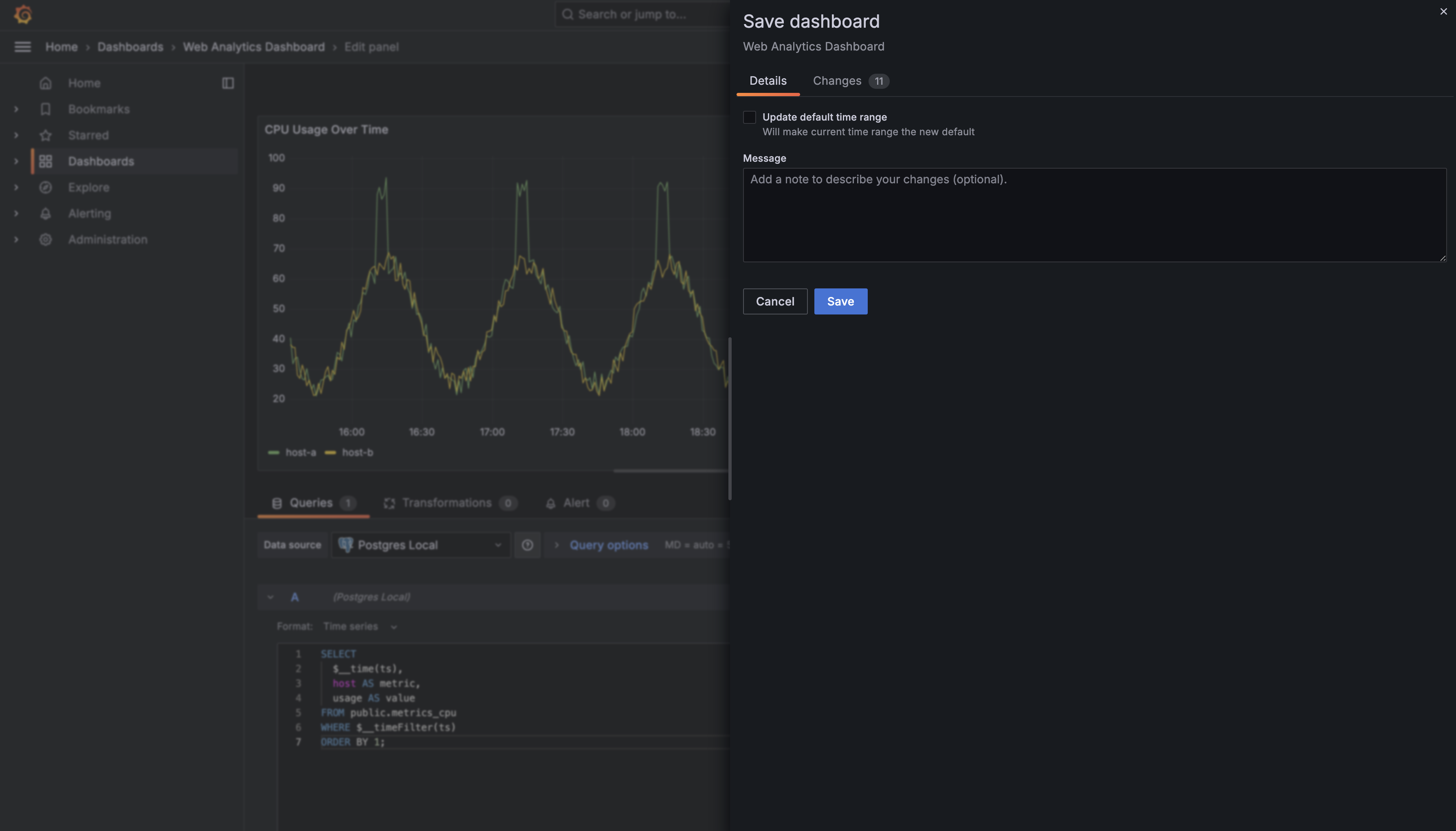
Click Save to confirm. Now if you navigate to the Dashboards section and select System Monitoring Dashboard, you’ll see your first created panel displaying CPU usage across all hosts.
Now let's add a second panel to display a single summary statistic: the average memory usage across all hosts. Click the Add button and select Visualization again. This time, we're going to use a different visualization type.
Enter this query in the query editor:
This query is simpler than the first one because we're not creating a time series. We're calculating a single aggregate value: the average memory usage in megabytes. Notice that we still use $__timeFilter(ts) to respect the dashboard's time range, but we don't need $__time(ts) since we're not plotting values over time.
Now, instead of keeping the default time series visualization, look for the visualization picker in the panel settings (usually on the right side). Change it from Time series to Stat. The Stat visualization is designed for displaying single values prominently, often with large text and optional sparklines or gauges.
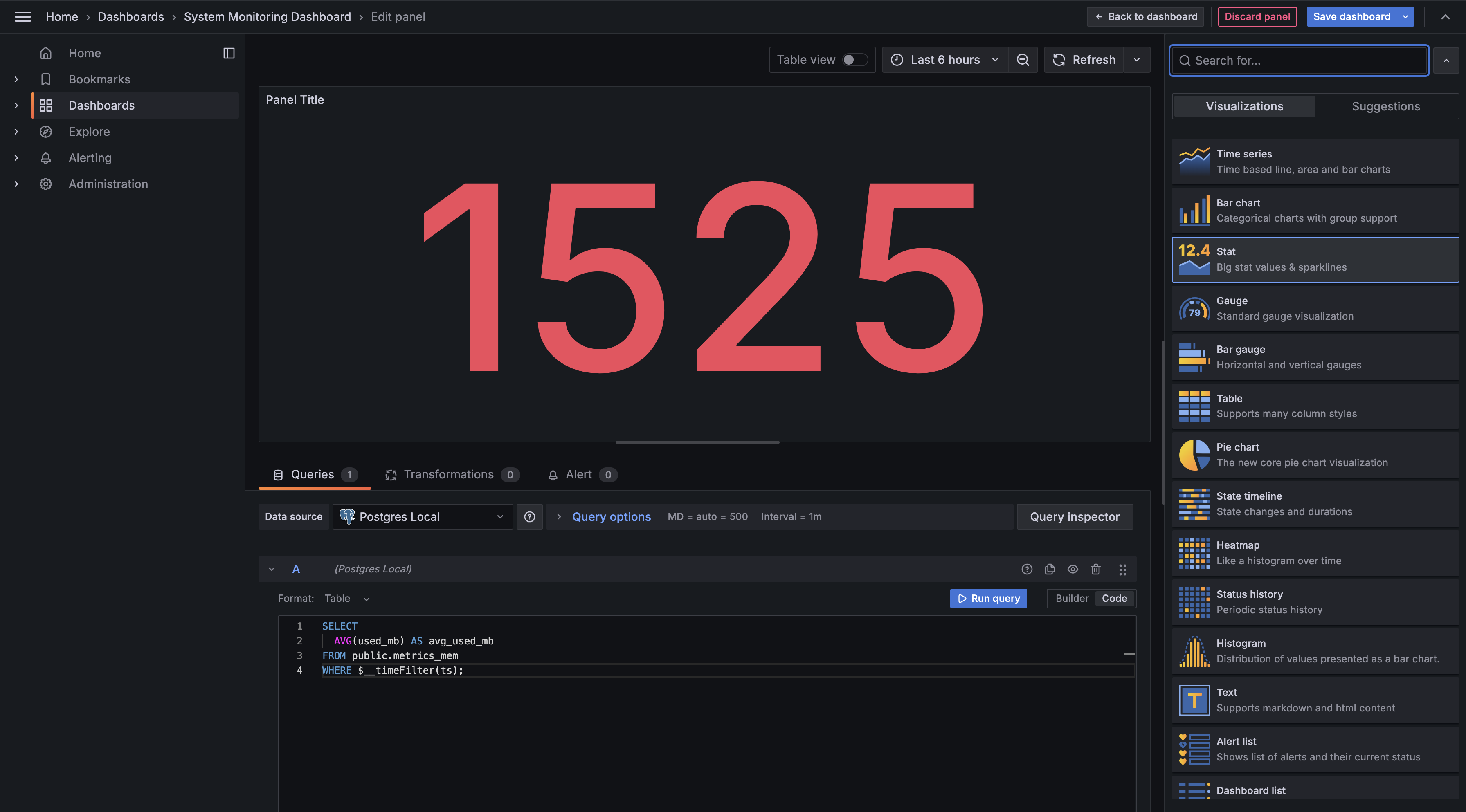
The Stat panel will now show that average memory value as a large number on your dashboard. This is perfect for metrics where you want to see the current or aggregate state at a glance rather than tracking changes over time. You can customize the display by adjusting units (change it to bytes (IEC) to automatically format as MB, GB, etc.), thresholds for color coding, or even add a background gauge.
Give this panel a title like Average Memory Usage and click Save Dashboard to add it to your dashboard. Grafana will typically place it below your first panel, but you can drag it around the grid to position it wherever makes sense.
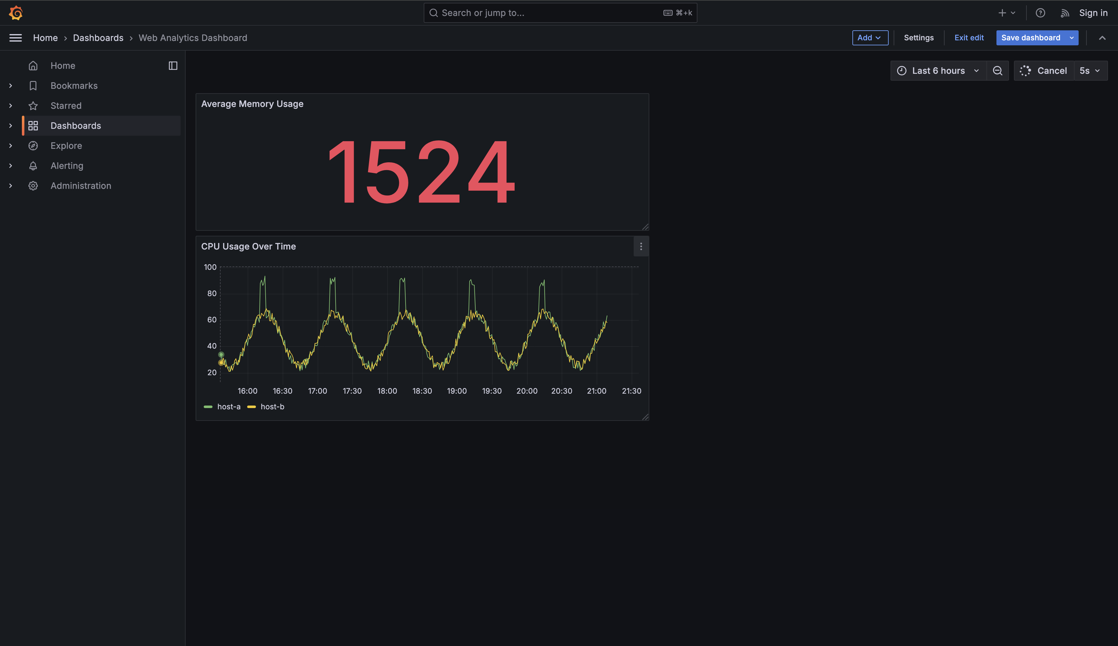
You've just created your first Grafana dashboard, which is a permanent, organized collection of visualizations that monitors your systems in real time. Unlike the temporary queries in Explore mode that disappear when you close the browser, dashboards are saved monitoring solutions that automatically update as new data arrives. They allow you to arrange multiple panels on a single screen, each showing different aspects of your system's performance, and share these views with your entire team for consistent monitoring.
Through creating two different panels, you learned the essential workflow of dashboard building: selecting a data source, writing queries that Grafana understands, choosing appropriate visualization types for different data, and arranging panels in a logical layout. You mastered key Grafana patterns including $__time() to identify timestamp columns and $__timeFilter() to make queries respect the dashboard's time controls. You also discovered how different visualization types serve different purposes on a dashboard — time series charts for tracking trends over time and stat panels for displaying current aggregate values at a glance. This combination transforms raw database queries into a comprehensive monitoring interface that you and your team can rely on for production systems.
