In the previous lesson, you built your first time-series panel that displayed CPU usage trends over time. You learned how to structure queries with time, value, and metric columns, and you used Grafana's special macros to make your visualizations dynamic and responsive to the time picker. Those multi-line charts showing CPU usage rising and falling across different hosts gave you a powerful way to spot patterns and track changes over time.
But here's the thing — sometimes you don't need to see every wiggle in the data. Sometimes you just need to answer a simple question with a single number: "What's the average memory usage right now?" or "How much disk space is left?" Think about walking into an operations center and glancing at a big screen. You don't want to study a complex graph to figure out if everything is okay. You want to see "Average Memory: 4.2 GB" displayed prominently and instantly know the system's status.
This is where Stat Panels come in. While time-series panels show you trends and patterns over time, Stat Panels distill your data down to one key summary value. Instead of drawing lines and curves, they display a single, prominent number — often with color coding to indicate if things are healthy or concerning. By the end of this lesson, you'll write a query that calculates the average memory usage across your selected time range and displays it in a Stat Panel. This new skill complements what you learned in the last lesson, giving you a complete toolkit for building informative dashboards.
Let's take a moment to understand the fundamental difference between the two types of visualizations you're working with. In your last lesson, your CPU query returned many rows — one for each timestamp and host combination. When you ran that query with the Time series format selected, Grafana took all those rows and drew them as connected lines on a graph. That's perfect when you want to see how values change over time.
Stat Panels work differently. They expect your query to return just one row with one value. Instead of plotting multiple data points on a chart, Grafana takes that single number and displays it big and bold on your dashboard. It's the difference between a detailed graph showing your car's speed every second during a trip versus just displaying "Average Speed: 65 mph" at the end.
You'll use Stat Panels when you need to show averages, totals, current status indicators, or counts. For example, "Total Errors: 23," "Average Response Time: 142ms," or "Active Users: 1,847." These are metrics where seeing the overall summary is more important than tracking every individual fluctuation. They're particularly useful at the top of dashboards, where you want to provide quick status checks before diving into detailed time-series graphs below.
The key technical difference is in the query structure. Remember how your time-series query had to carefully rename columns to time, value, and metric? Stat Panel queries don't need that structure at all. In fact, they work better with aggregate functions that collapse many rows down to summary statistics. This is where SQL functions like AVG(), SUM(), COUNT(), MIN(), and MAX() become your best friends.
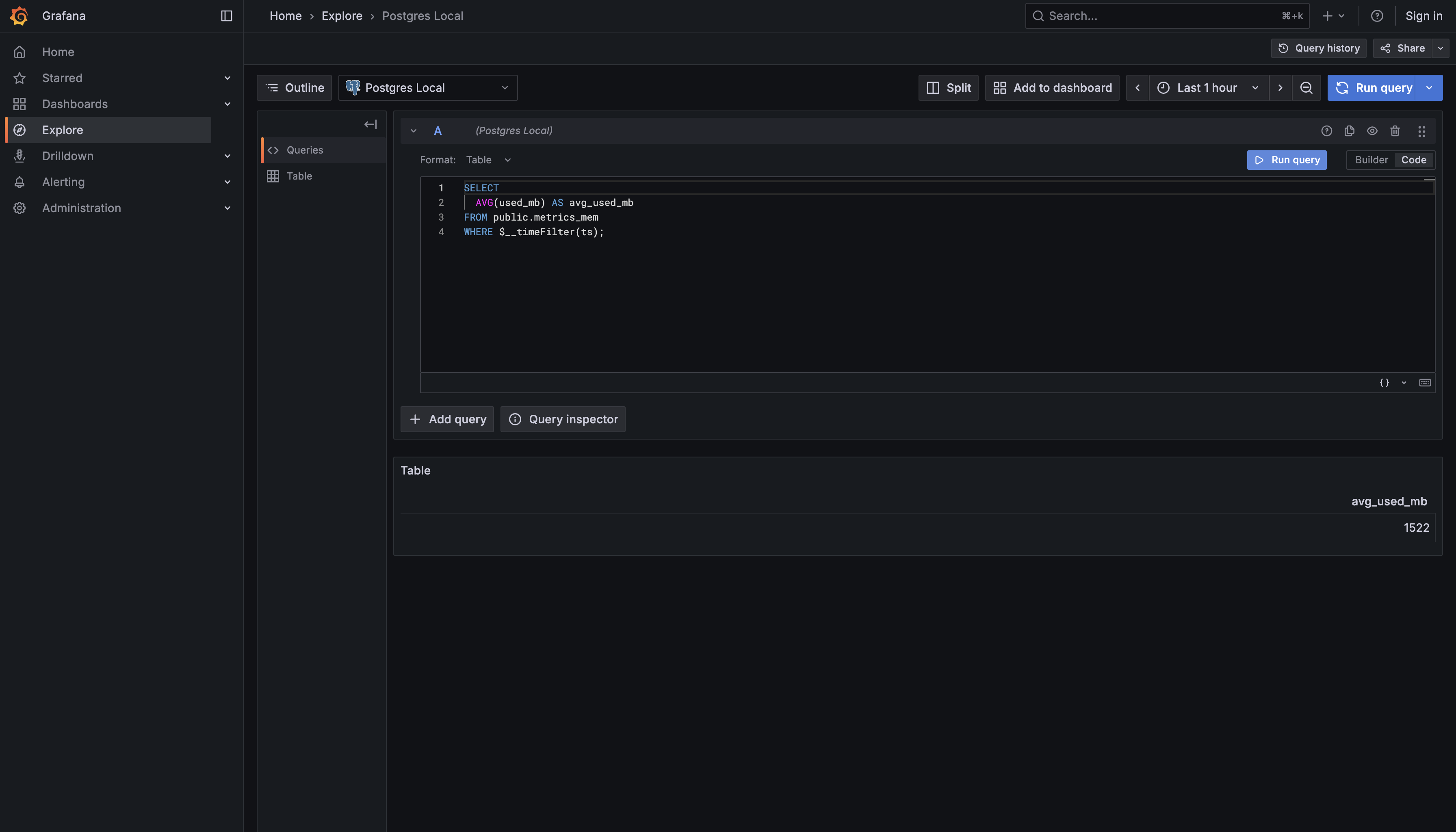
Now let's get hands-on with memory data. Your database contains a table called metrics_mem that follows the same pattern you saw with metrics_cpu in the last lesson. It has a ts column for timestamps, but instead of tracking CPU percentages, it records memory statistics in megabytes. The key columns you'll work with are used_mb (how much memory is currently in use) and available_mb (how much memory is free). Just like with CPU, measurements are recorded regularly over time for monitoring your infrastructure.
To create a Stat Panel showing average memory usage, you need to use SQL's AVG() function. This function is part of what SQL calls aggregate functions — they take multiple rows of data and calculate a single summary value from them. When you write AVG(used_mb), you're telling the database: "Look at all the used_mb values in my filtered dataset and calculate their average."
Let's build the query step by step. You start with SELECT AVG(used_mb), which tells PostgreSQL to calculate the average of the used_mb column. Notice that you're not selecting the individual used_mb values — you're selecting a calculation performed on those values. This is fundamentally different from your time-series query, where you selected actual column values and renamed them.
Next comes FROM public.metrics_mem, which should look familiar from your previous work. You're simply telling the database which table to read from. The schema prefix ensures you're referencing the correct table in your database structure.
You've just learned a completely different way of querying data for Grafana. Instead of selecting columns and aliasing them to time, value, and metric for time-series visualization, you now know how to use aggregate functions like AVG() to collapse many data points into a single summary statistic. This is the fundamental pattern for Stat Panels: use an aggregate function to calculate one value, apply WHERE $__timeFilter(ts) to respect the dashboard's time range, and give your result a clear name with an alias.
The key takeaway here is understanding when to use which approach. Time-series panels show you the journey — how values change over time. Stat Panels show you the destination — what's the overall summary? Both are essential for building comprehensive dashboards. At the top of your dashboard, you might have Stat Panels showing "Avg CPU: 32%," "Avg Memory: 4.2 GB," and "Disk Usage: 67%." Below those, you'd have time-series graphs showing the detailed trends for each metric. Together, they give you both the quick status check and the detailed analysis.
In the upcoming practice exercises, you'll write this average memory query from scratch and experiment with other aggregate functions. You'll calculate minimum and maximum memory usage, explore different metrics from the metrics_mem table, and get comfortable with the pattern of writing queries that return single summary values. Remember, the pattern is always the same: pick an aggregate function, apply it to a column, filter by time range, and give it a meaningful name. Once you master this pattern with memory metrics, you'll be able to apply it to any metrics table in your database.