Let's explore our next chart: the scatter plot. Its job is to help you see if there's a relationship between two different numerical variables. For example, is there a connection between a car's weight and its fuel efficiency?
Engagement Message
Can you think of two numeric measurements that might be connected?
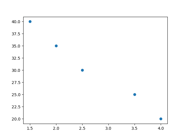
In a scatter plot, each dot represents one item, and its position is determined by its values for the two variables being compared—one on the x-axis and one on the y-axis.
Engagement Message
If one dot represents a single car, what two measurements might it show?
To create a scatter plot, you need two lists of numbers that are the same length. The first list is for the x-axis values, and the second is for the y-axis values.
Engagement Message
Any guesses on what method we'll use to create scatter plots?
The Matplotlib method for this is ax.scatter(). You pass your two lists of data as arguments.
ax.scatter(heights, weights)
Matplotlib will then plot a point for each corresponding pair of height and weight values.
Engagement Message
Let's look at a complete example, shall we?
Here is the full code to create a scatter plot comparing engine size and highway fuel efficiency for cars.