We've made some great charts, but a plot without labels is like a map without a key. To tell a clear story, your chart needs text that provides context.
Engagement Message
Why is it risky to share a chart that has no text explaining it?
The first piece of context is the Title. It's a short, descriptive headline at the top of your chart. In Matplotlib, you add it with the ax.set_title() method.
ax.set_title("Monthly Sales Growth")
Engagement Message
What would be a good title for a bar chart of student counts?
Next, we label the axes. The ax.set_xlabel() and ax.set_ylabel() methods describe the data on the horizontal and vertical axes, respectively. It's crucial to include units when relevant, like "(in Millions)" or "(°F)".
Engagement Message
If your y-axis shows values like 10, 20, 30, why is "Revenue" less clear than "Revenue (in thousands of $)"?
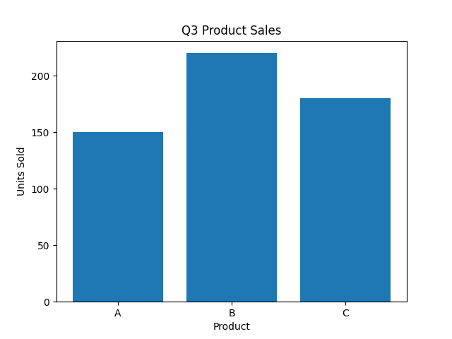
Let's add labels to our bar chart from an earlier lesson.
Engagement Message
What would happen if someone saw this chart without any labels—how might they misinterpret the data?
This code produces a complete, self-explanatory chart.