Time to explore line plots! Unlike bar charts that compare separate categories, line plots excel at showing how a value changes continuously—like tracking stock prices over time.
Engagement Message
What's something in your life that changes continuously over time?
Line plots connect data points with lines, creating a visual flow that makes trends obvious. The line helps your eye follow the pattern smoothly from one point to the next.
Engagement Message
Why might this be better for showing a trend than just scattered dots?
To create a line plot, you need two lists of equal length: one for your x-axis values (often time periods) and one for your y-axis values (the measurement you're tracking).
Engagement Message
If tracking monthly sales, what would your two lists contain?
In Matplotlib, you use the ax.plot() method. You provide your x-values list and your y-values list, and it automatically plots the points and connects them with lines.
ax.plot(months, sales_data)
Engagement Message
Let's look at a complete example, shall we?
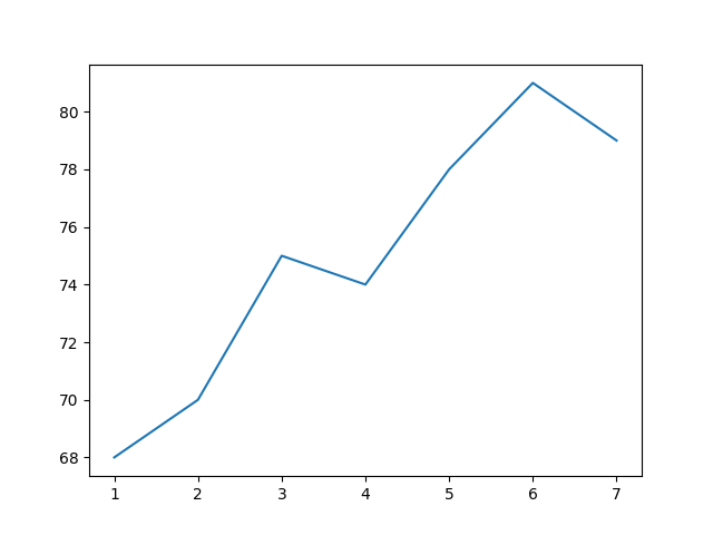
Here is the full code to plot temperature changes over a week:
Engagement Message
What do you think this plot would look like?