Ready to explore data distributions? Histograms are perfect for understanding how your numerical data is spread out. Instead of plotting each data point, they group similar values together and show the counts.
Engagement Message
Why might knowing the spread of data be as important as knowing the average?
Histograms work with a single list of continuous numerical data—like the heights of 100 people or the scores of 500 students on a test.
They group these numbers into ranges called "bins" and then create a bar representing the count of values in each bin.
Engagement Message
Have you worked with histograms before?
For example, if you have student test scores, you could create bins for 70-79, 80-89, and 90-100. The histogram would show a bar for each range, with the height of the bar indicating how many students scored in that range.
Engagement Message
What would a very tall bar in the 90-100 range tell you about the test?
To create a histogram in Matplotlib, you use the ax.hist() method. You only need to provide one list of data.
ax.hist(data_list)
Matplotlib automatically calculates the ranges (bins) and counts for you.
Engagement Message
Ready to look at the complete example?
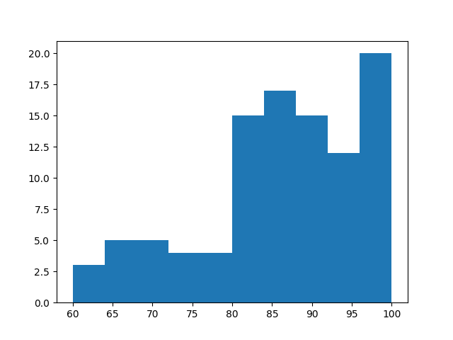
Let's look at the code to create a histogram for a list of 100 test scores.
Engagement Message