Welcome to Data Distributions and Center, the first course in your learning path on understanding and analyzing data! This is the first lesson, so we are right at the starting line. Over the coming lessons, we will explore how to summarize datasets using measures like the mean, median, and mode. But before we calculate anything, we need to understand what we are looking at when we examine a collection of numbers. That is exactly what this lesson is about: what a data distribution is and what it can tell us.
Imagine you ask ten coworkers how many minutes they spend commuting to work each day. You might get answers like 10, 15, 12, 45, 14, 13, 60, 11, 15, and 12. Written as a simple list, these numbers are hard to make sense of quickly. Are most commutes short? Are there a few unusually long ones? A list alone does not answer these questions very well.
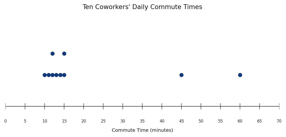
This is why we think about data as a distribution rather than just a collection of individual values. When we look at data as a distribution, we shift our focus from each separate number to the overall pattern the numbers form together. That shift in perspective is the foundation of everything else in this course.
A data distribution describes how the values in a dataset are spread out. More specifically, it tells us three things:
- What values are present and the range they cover (the smallest to the largest).
- How often each value (or group of values) occurs, sometimes called the frequency.
- Where values are concentrated or dispersed — whether most values cluster together in one area or are spread far apart.
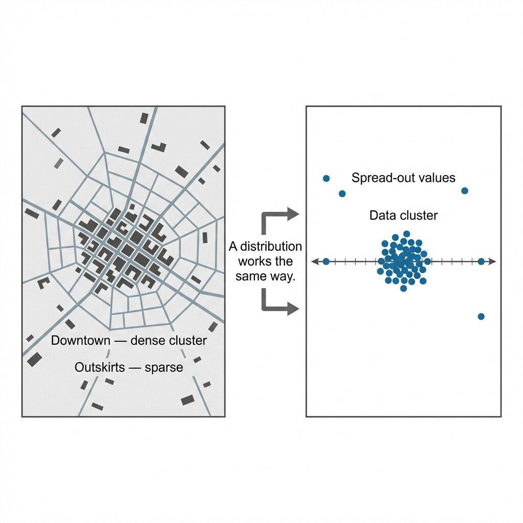
Think of a distribution as a map of your data. Just as a city map shows where buildings are packed tightly downtown and where neighborhoods thin out toward the edges, a distribution shows where data values pile up and where they are sparse.
Notice that none of these three aspects require any formulas or calculations. You can begin describing a distribution simply by observing the data carefully — and that is exactly what we will do next.
Let us put this into practice with a real-world example. Suppose we track the number of cups of coffee sold at a small café each day over one week:
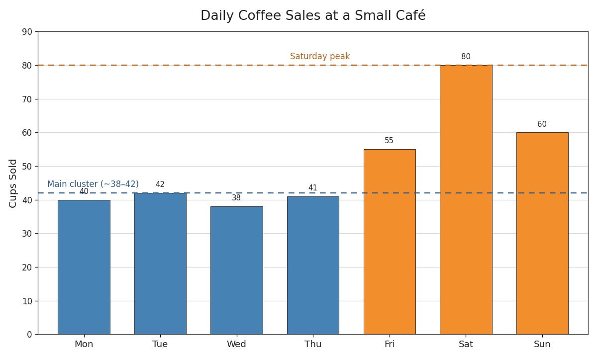
Even without any formulas, we can describe this distribution informally by thinking about our three key aspects:
- Range of values: Sales range from a low of cups to a high of cups.
- Frequency and clustering: Four of the seven days saw sales between and , so values are concentrated in that narrow band.
It is worth pausing to highlight how a distribution description differs from simply listing the data. Consider the difference:
Before you jump into practice, here are a few points worth keeping in mind:
- The median is not affected by how extreme the outer values are. If the highest study time were instead of , the two middle values would still be and , and the median would remain . Recall that every value influences the mean; the median, by contrast, only cares about position.
Now that you have seen both the mean and the median, you might be wondering when each one is more useful. As a quick preview: when numerical data is fairly balanced and has no extreme values, the mean is often a good summary because it uses every value. When a dataset includes an unusually high or low value, the median is often more helpful because it stays focused on the middle position instead of being pulled by that extreme value.
We will explore this comparison in more detail later in the course when we study outliers and skew. For now, it is enough to remember that both measures describe center, but they do so in different ways.
In this lesson, we learned that a data distribution is a way of describing the overall pattern in a dataset. It captures the range of values, how frequently they occur, and how they are concentrated or spread out. Even with a small dataset and no calculations, we can write a meaningful informal description by noting where values cluster, how far they spread, and whether any values sit apart from the rest.
Up next, you will put these ideas to work in a set of practice tasks where you will identify, match, and write your own distribution descriptions. This is a great chance to sharpen the observational skills we just discussed — so let's dive in!
