Establishing Project Context with CLAUDE.md
Introduction: The Context Problem in AI Coding Assistants
Welcome back! In previous courses, you mastered the fundamentals of working with Claude Code. Now, in this next step, we’ll tackle one of the biggest challenges in AI-assisted coding: persistent project context.
Imagine if you had to re-explain your entire workflow to Claude every single session—reminding it about color schemes, chart formatting, data quirks, and library preferences. It’s repetitive and easy to miss details. Fortunately, Claude offers a solution: the CLAUDE.md file.
In this lesson, you’ll learn how to set up a CLAUDE.md—a persistent, project-specific instruction manual that lets Claude remember your standards and preferences automatically. You’ll build a complete example for a penguin visualization project, and see how a single, simple prompt can produce a publication-ready chart. By the end, you’ll know how to write your project’s “rules” once and have Claude follow them every time, without repeating yourself.
What is CLAUDE.md?
A CLAUDE.md file is a persistent memory and instruction manual for Claude Code within a specific project. When you run Claude Code in a terminal, it automatically looks for a file named CLAUDE.md in your current directory. If found, Claude reads the entire contents and treats it as part of its instructions before you even type your first prompt.
This creates a powerful workflow: you write your project's standards, preferences, and conventions once in the CLAUDE.md file, and Claude applies them automatically in every session. Unlike your conversation history (which gets cleared between sessions), the CLAUDE.md file remains unchanged until you explicitly update it, providing true persistent context.
How CLAUDE.md Differs from README.md
You might be wondering: "Isn't this just like a README.md file?" While both are markdown files in your project root, they serve completely different audiences.
A README tells someone about your project: how to install it, what it does, how to run it. A CLAUDE.md tells Claude how to work on your project: which libraries to prefer, what coding style to use, how to format visualizations. You're not documenting the project for future developers—you're creating an instruction set that Claude will follow in real time as it writes code.
Let's build a complete CLAUDE.md file for a Palmer Penguins visualization project, piece by piece. You'll see how each section contributes to creating a context-aware AI assistant.
Project Overview and Dataset Context
Start with the fundamentals: what is this project, and what data does it work with?
The Project Overview sets the quality bar: "publication-ready and scientifically accurate" tells Claude this isn't casual exploration. The Dataset Context provides essential facts about the data structure. The "Known issues" line is particularly important—it prepares Claude to handle missing values properly rather than ignoring them.
Preferred Libraries
Define which tools Claude should reach for first:
This section prevents Claude from suggesting alternatives that might produce inconsistent results. The parenthetical notes like "(for confidence intervals, regression)" help Claude understand when to use each library. Without this section, Claude might default to different libraries in different sessions, breaking visual consistency.
Coding Conventions
Establish your "how we write code here" rules:
Notice the specificity: instead of "use good variable names," we provide an example (df_penguins not df). Instead of "save high-quality images," we specify exactly: 300 dpi with bbox_inches='tight'. Each rule is concrete and actionable. The instruction to "always handle missing values explicitly" ensures Claude never silently drops data without explanation.
Chart Styling Guidelines
For visualization projects, this is the most critical section. Include exact specifications:
This level of detail ensures perfect consistency across all visualizations. The exact hex codes (#FF6B6B, #4ECDC4, #95E1D3) mean every chart uses identical colors. The typography specifications down to the point size eliminate subjective interpretation. The example in the Layout Standards ("Bill Length (mm)") shows Claude exactly how to format axis labels with units.
Visualization Standards
Define file naming, data handling, and interactivity rules:
The File Naming section with examples ensures you can find visualizations later. The Data Integrity section prevents silent data loss—Claude will always explain what happened to missing values. The specific instruction to "report the number of observations" means you'll immediately notice if filtering went wrong.
Quality Checklist
Give Claude a pre-flight checklist to verify before finishing:
This checklist format helps Claude self-verify its work. The Notes section captures project-specific preferences that don't fit elsewhere—like generating "standalone Python scripts" rather than notebook cells.
The Complete CLAUDE.md File
Here's what you've built—a comprehensive instruction manual that sits in your project directory:
This single file now contains everything Claude needs to know about your project's standards and preferences.
Seeing CLAUDE.md in Action
Now let's watch the magic happen. With your CLAUDE.md file in place, you give Claude a simple, minimal prompt.
That's it. Seven words. No mention of colors, no specifications about fonts or DPI, no reminders about which libraries to use. Just a straightforward request.
Step 1: Claude Reads Your Context
The first thing Claude does is read the CLAUDE.md file to understand your project:
Claude automatically checks the directory structure, reads your CLAUDE.md file (all 74 lines), and examines the dataset. This happens before Claude writes a single line of code. Your entire project context—colors, fonts, conventions, standards—is now loaded into Claude's working memory.
Step 2: Claude Generates Context-Aware Code
With the context loaded, Claude creates a Python script following every guideline:
Notice the file name: scatter_bill_dimensions.py follows the naming convention from your CLAUDE.md ("Use descriptive names" and "Include plot type in name"). The script includes a docstring (per your coding conventions) and uses your preferred libraries (pandas, matplotlib).
Step 3: Claude Executes and Reports
Claude runs the script and reports exactly what you specified in your Data Integrity guidelines:
The output includes the observation count (342 of 344 penguins) and breakdown by species—exactly as required by your "Report the number of observations used" rule. Claude handled the 2 missing values explicitly, as instructed.
Step 4: Claude Provides Insights
Finally, Claude delivers the visualization with scientific interpretation:
Claude confirms it followed all your styling guidelines without you asking: species-specific colors, 300 dpi, axis labels with units, informative title. This confirmation acts like a verbal quality checklist.
The Result
Here's the chart Claude created:
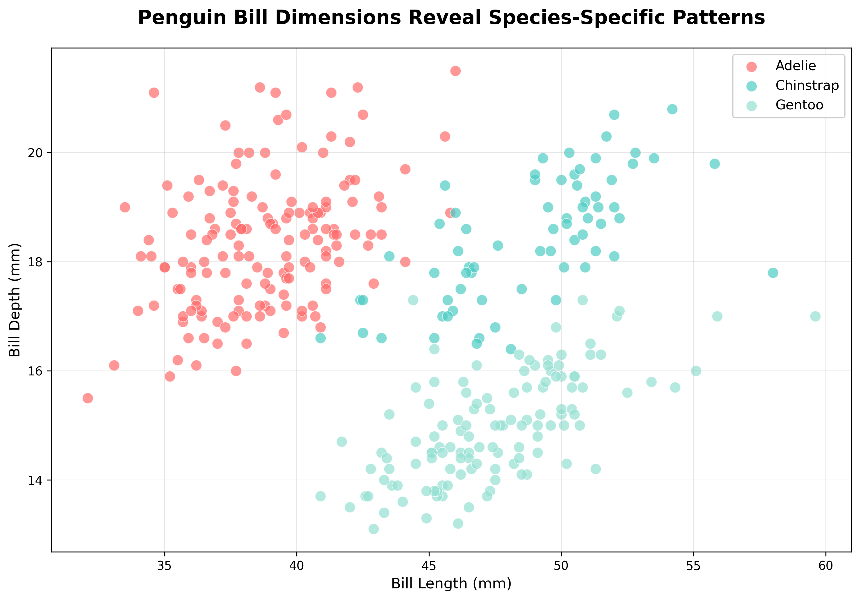
Look closely at this visualization. Each species uses exactly the hex codes from the CLAUDE.md: Adelie in coral red (#FF6B6B), Chinstrap in teal (#4ECDC4), and Gentoo in mint green (#95E1D3). The title is 16pt and bold. Axis labels are 12pt with units ("Bill Length (mm)"). The grid has alpha of 0.3. Every single detail matches the specifications—and you didn't ask for any of it explicitly.
Why This Works: The Power of Persistent Context
The CLAUDE.md file transformed a seven-word prompt into a publication-ready visualization because:
The Color Scheme section gave Claude exact hex codes, eliminating guesswork about colors.
The Typography section specified every font size (title: 16pt, labels: 12pt, ticks: 10pt), ensuring consistency.
The Layout Standards required axis labels with units and grid lines with alpha=0.3, which Claude followed precisely.
The Data Integrity rules forced Claude to handle missing data explicitly (342 of 344 penguins) and report the breakdown.
The Coding Conventions specified 300 dpi with bbox_inches='tight' for all saved plots.
The File Naming standards resulted in scatter_bill_dimensions.png instead of plot1.png.
Without the CLAUDE.md file, your prompt would need to include every single specification:
That's exhausting to type every time—and easy to forget details. The CLAUDE.md file encodes all these preferences once, and Claude applies them automatically. This is the power of "write once, use forever."
Summary and Practice Preview
You've learned how to solve the context problem that plagues AI coding assistants. By building a CLAUDE.md file section by section, you created a persistent instruction manual that transforms Claude from a forgetful assistant into a context-aware collaborator. The file includes project overview, dataset context, library preferences, coding conventions, styling guidelines, visualization standards, and quality checklists—everything Claude needs to produce consistent, publication-ready outputs.
When you write "create a chart of the bill dimensions," Claude already knows your color palette, font sizes, DPI requirements, data handling rules, and file naming conventions. The result: a perfectly styled visualization that follows every guideline without you having to repeat yourself.
In the upcoming practice exercises, you'll create your own CLAUDE.md files for different visualization projects. You'll structure project context, define styling rules, and test whether Claude follows your guidelines automatically. Get ready to experience the power of "write once, use forever" as you build reusable workflows that make every session more productive.