Matching Graphs to Situations
Introduction
Imagine that you are given a description such as “a tank is draining” and several possible graphs. More than one graph may fall as time passes, but only one may have the right starting amount, rate, and time interval. Matching becomes reliable when you read the graph as evidence instead of choosing the picture that looks familiar.
You are now in the second of four lessons in Comparing and Interpreting Graphs. In this lesson, you will use axes, starting values, direction, rate behavior, shape, and key points to connect a graph with a real-world situation. By the end, you will be able to choose a plausible match and explain your choice with specific features and units.
Use A Consistent Matching Process
Think of a graph as a story about how one quantity changes in relation to another, then read that story in a fixed order:
- Read the axes. Identify the input, output, units, and domain.
- Find the beginning. Check the output at the left end of the domain (the -intercept when the input is included).
- Describe the direction. Decide whether the output increases, decreases, or stays constant.
- Compare the rate. Determine whether the rate is constant, increasing, or decreasing.
- Inspect special features. Look for intercepts, turning points, symmetry, or a distinctive curve.
- Test the full story. Make sure the values, units, domain, and range make sense in the situation.
A strong match agrees with all the important clues. One feature, such as a rising graph, may suggest several situations, but the complete pattern usually points to the best choice.
Quick Review: Axes, Domain, And Starting Value
- Labels before shape. A line that rises as distance increases may represent a taxi fare, while a similar line that rises as time passes may represent a growing savings balance. The units give the graph its meaning.
- Domain and range. The domain is the set of inputs for which the graph applies (a tank graph may run only from to the end of the observation); the range is the set of possible outputs (water, customers, and cost are not negative). A candidate graph with impossible values is probably not the match.
- Starting value and intercepts. The -intercept gives the output at input , and an -intercept shows where the output is zero — the moment a tank empties, a debt is paid off, or a supply runs out.
For a taxi ride of miles costing dollars, , so the graph begins at : a 3-dollar starting fee plus 2 dollars per mile.
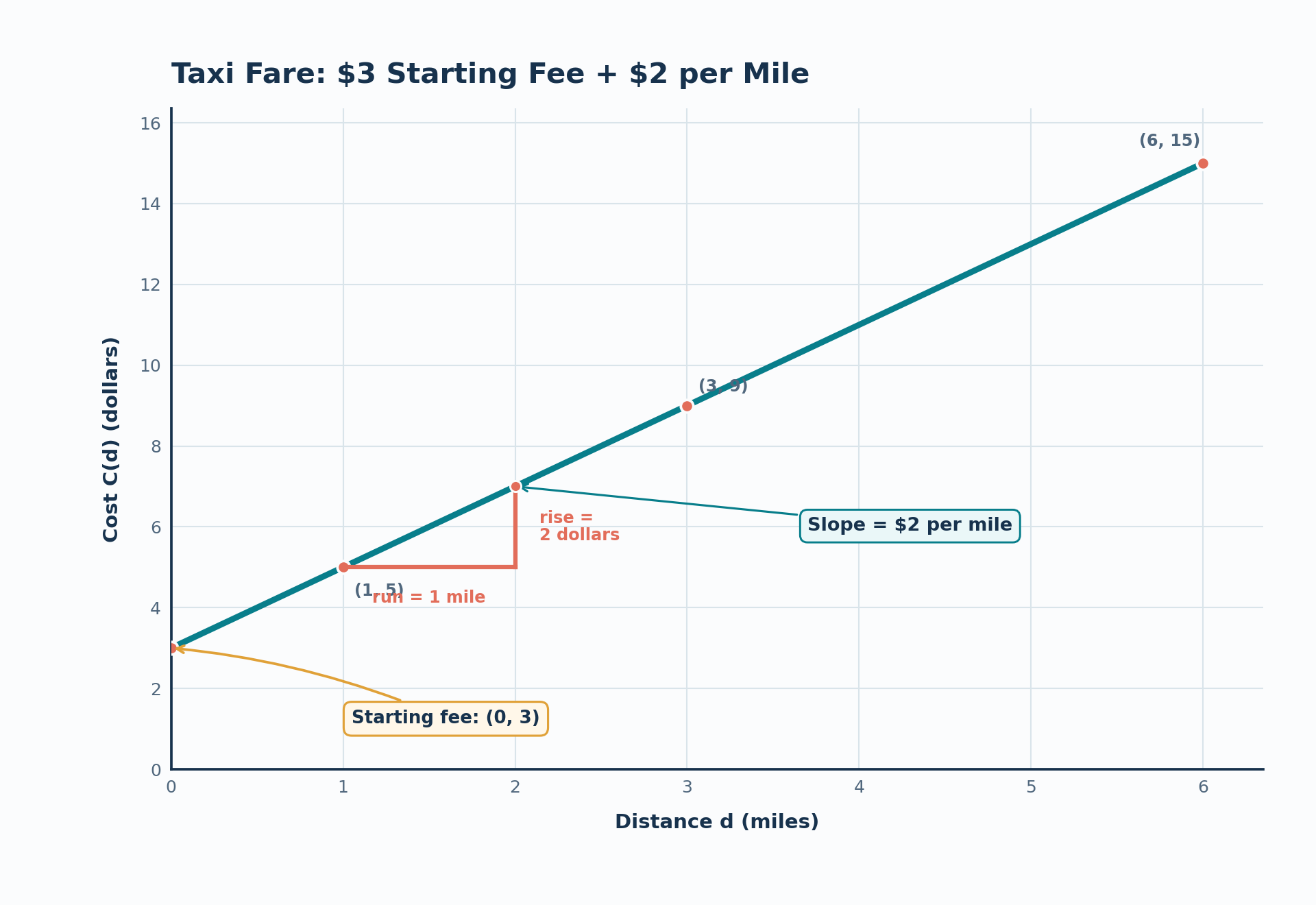
Note that a left endpoint is a -intercept only when the graph includes .
Read Direction And Rate Together
Trace the graph from left to right. Its movement tells you whether the output is changing upward, downward, or not at all.
| Graph movement | Meaning | Possible situation |
|---|---|---|
| Rises | The output increases | A balance grows or a tank fills |
| Falls | The output decreases | A tank drains or a temperature drops |
| Stays horizontal | The output remains constant | A price or temperature is held steady |
Direction alone rarely identifies one situation, because distance traveled, a taxi fare, and a population all rise. The next question is how quickly the output responds, which you measure with
A straight line has a constant rate of change, so this slope is the same between any two points. A curved graph has a changing rate; comparing its steepness at different inputs describes that change.
| Graph pattern | Rate behavior | Possible interpretation |
|---|---|---|
| Straight and rising | Constant positive rate | A taxi fare increases by a fixed amount per mile |
| Straight and falling | Constant negative rate | A tank loses a fixed amount per minute |
| Rising and getting steeper | Positive rate is increasing | A population grows more quickly over time |
| Falling and flattening | Negative rate is becoming smaller in magnitude | A hot drink cools quickly at first, then more slowly |
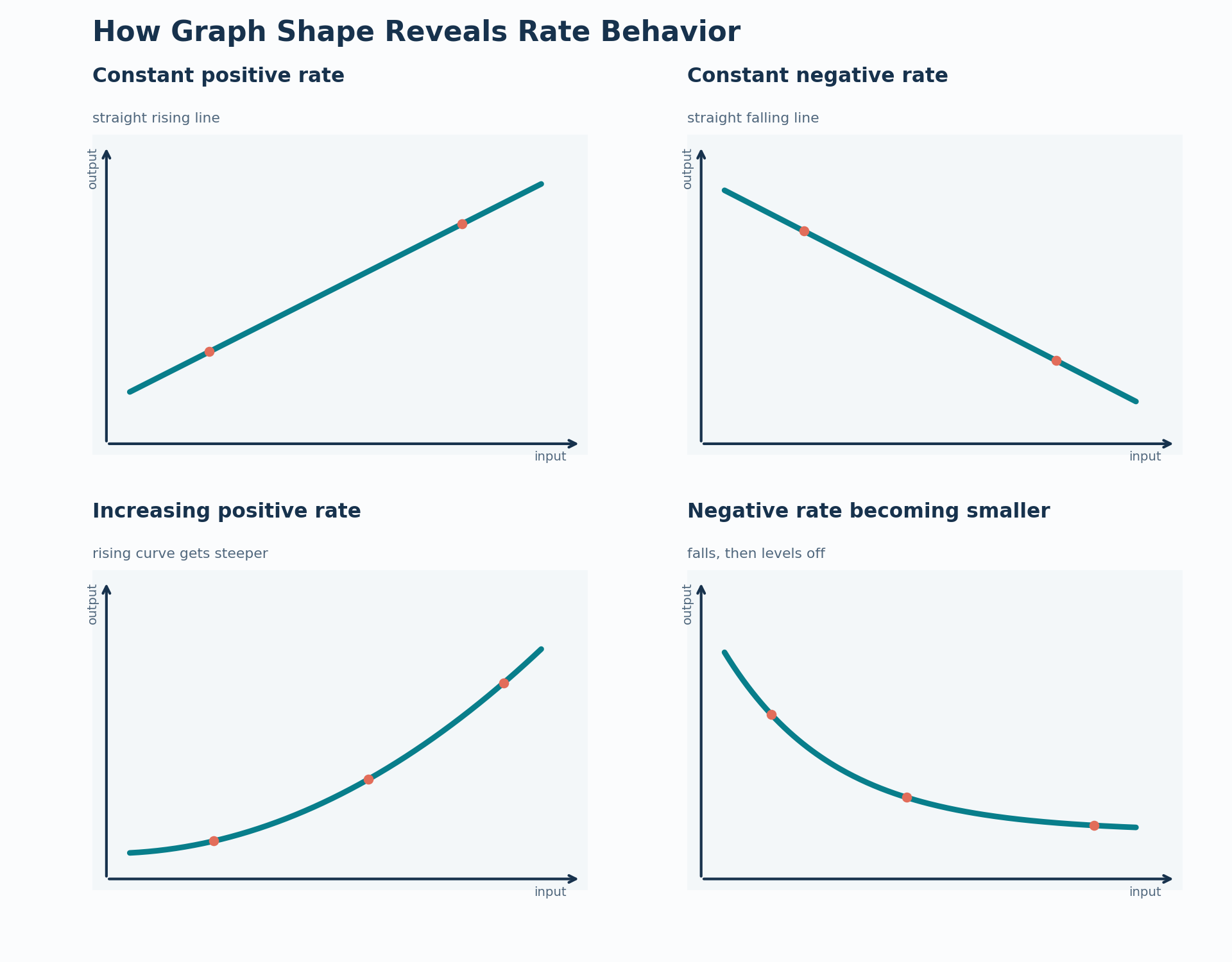
In the fourth graph, the label “negative rate becoming smaller” means the rate is becoming smaller in magnitude — that is, the rate is becoming less negative, so the graph falls more gradually.
Always include units when interpreting a rate. A slope of 2 could mean 2 dollars per mile, 2 liters per minute, or 2 meters per second. The number alone does not tell the whole story.
Use Shape, Symmetry, And Turning Points
Rate behavior creates recognizable shapes. These shapes are useful clues, but they should support the information from the axes, starting value, and domain.
| Graph feature | What to notice | Possible situation |
|---|---|---|
| Straight line | Constant rate | A fixed charge per mile |
| U-shape | Decreases to a minimum, then increases | Height along a valley or a cost with a least expensive option |
| Downward-opening curve | Increases to a maximum, then decreases | Height of a thrown ball |
| V-shape | Decreases to a sharp minimum, then increases | Distance from a landmark along a straight path |
| Exponential-like curve | Rate changes continuously without a turning point | Bacteria growth or cooling |
A turning point is where a graph changes direction. Its input often tells when an important event occurs, while its output tells the value reached at that event. For example, the turning point of a height graph may show the time and height of a ball’s highest point.
A graph may also be symmetric, meaning that points on opposite sides of a central location have matching outputs. Symmetry can support a match, but it is not enough by itself. The labels, units, and domain must still fit the situation.
Combine Several Clues
The best matches use a graph’s full signature rather than one isolated feature. The table below shows the combination of clues you might expect in several common models.
| Situation | Features to expect |
|---|---|
| Taxi fare | Positive starting value, straight increasing line, constant rate |
| Hot drink cooling | High starting temperature, decreasing curve, faster decrease at first, then flattening |
| Ball thrown upward | Rises, reaches a maximum, then falls |
| Bacteria population | Positive starting value, increasing curve, possibly becoming steeper |
| Distance from a landmark | V-shaped graph if the input represents position along a straight path |
These are simplified models. Real measurements may contain small irregularities, but the dominant direction, rate behavior, and key features should still make sense.
Worked Example: A Decreasing Line
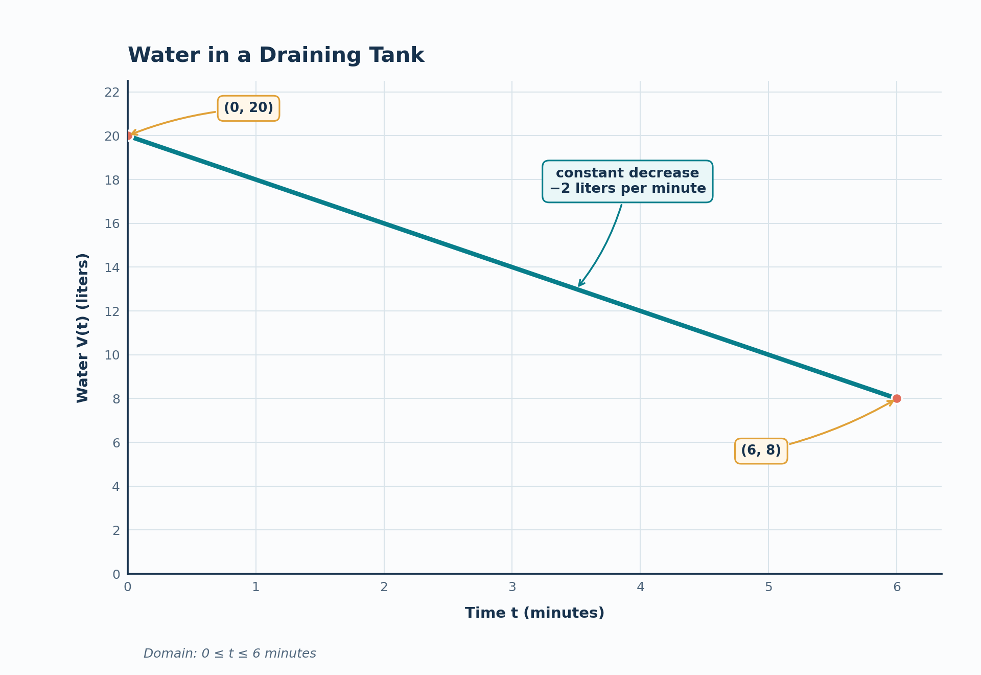
Let’s apply the strategy to a graph of water in a tank. The horizontal axis represents time in minutes, and the vertical axis represents volume in liters. The graph passes through and , forms a straight line, and falls from left to right.
Calculate its rate of change:
The tank loses 2 liters per minute. A model for the displayed interval is
Now compare the graph with several possible situations:
| Candidate situation | Match? | Reason |
|---|---|---|
| A tank draining at a constant rate | Yes | The volume starts at 20 liters and decreases by 2 liters per minute |
| A savings account receiving regular deposits | No | The balance would usually increase rather than decrease |
| A ball thrown into the air | No | Its graph should rise to a maximum before falling |
| A bacteria population growing over time | No | The population should generally increase |
The draining tank is the best match because it agrees with the starting value, direction, constant rate, units, and domain. The model describes only ; without more information, you should not assume that the same line continues indefinitely.
Worked Example: A Curve With A Turning Point
A line is easy to recognize from its constant rate. Now consider a graph of height over time that begins at 1 meter, rises to a maximum, and returns to 1 meter after 4 seconds. The graph is curved and opens downward.
This pattern fits a ball thrown upward from a platform and later caught or landing at the same height. One possible model is
The turning point occurs at seconds, halfway between the two times when the height is 1 meter. At that time, , so the ball reaches a maximum height of 21 meters. The coordinates of the turning point describe both when the event occurs and the value reached.
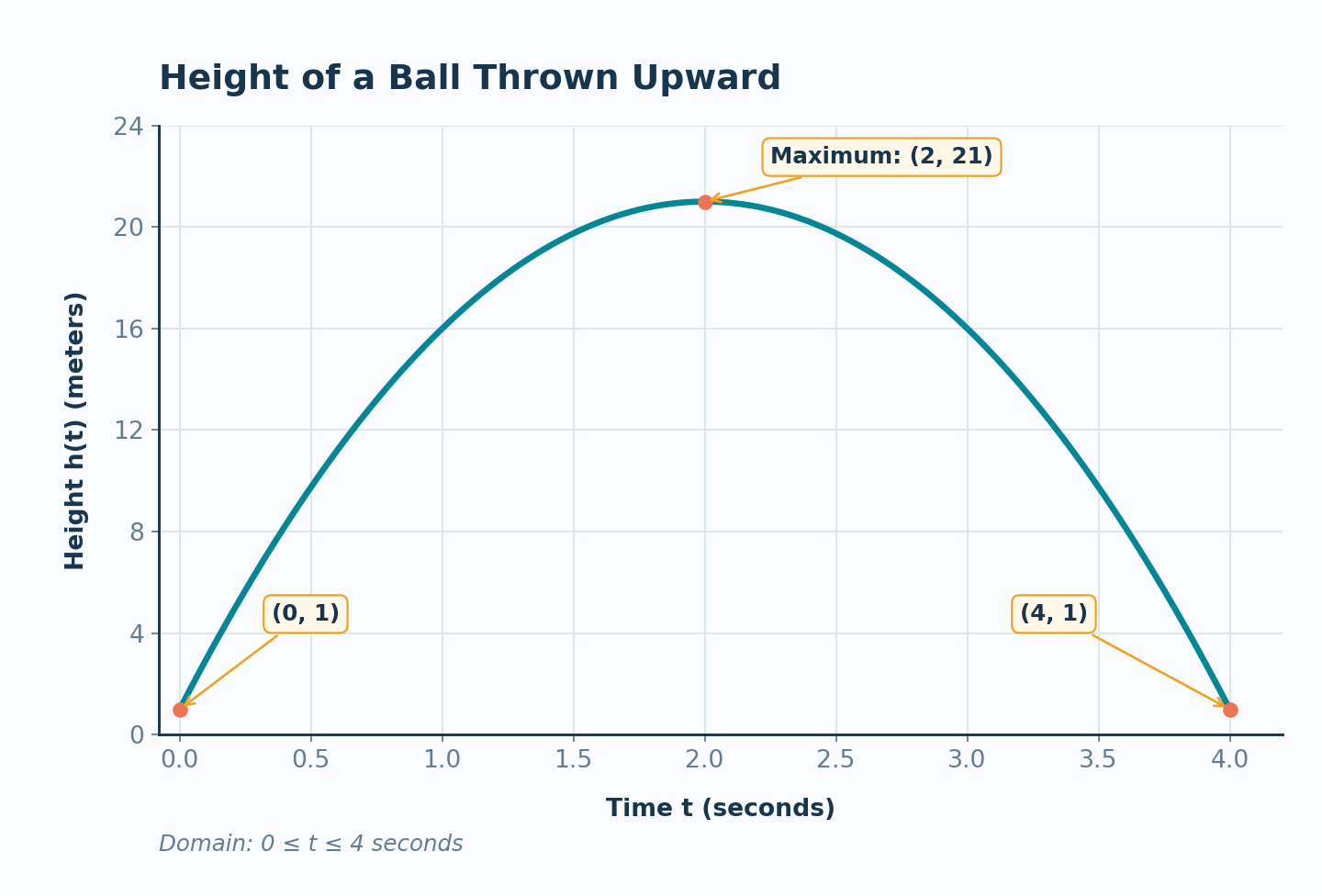
This graph does not match a savings account that receives regular deposits because the balance would not normally rise and then fall. It also does not match a cooling drink, which generally decreases from the beginning rather than rising first.
Common Mistakes
When matching graphs to situations, watch for these errors:
- Looking only at direction. Many situations increase or decrease, so also compare the starting value, rate, and shape.
- Treating the first visible point as the y-intercept. It is a y-intercept only if the graph includes an input of .
- Calling every curved graph exponential. A parabola, a cooling curve, and an exponential graph can all be curved, but their rate behaviors differ.
- Ignoring the domain and range. A model may stop when an object lands, a tank reaches a stated endpoint, or a trip ends.
- Forgetting units. A rate of 2 dollars per mile tells a different story from a rate of 2 liters per minute.
Explain Your Match Clearly
A good answer does more than name a situation. It points to the graph features that support the choice.
| Evidence to mention | Useful sentence frame |
|---|---|
| Axes and domain | “The horizontal axis represents ___, and the graph applies from ___ to ___.” |
| Starting value | “At the beginning, the output is ___, so the situation starts with ___.” |
| Direction and rate | “The output ___ at a constant/changing rate, which fits ___.” |
| Special feature | “The intercept/turning point/minimum/maximum shows ___.” |
You do not need to mention every small detail. Use two or three decisive features, include their units when possible, and explain why the complete pattern fits better than the alternatives.
Conclusion And Next Steps
To match a graph to a real-world situation, read its axes and domain before judging its shape. Then use its starting value, direction, rate behavior, intercepts, and turning points as connected evidence; a convincing match agrees with the whole pattern and the units. You can now distinguish, for example, a constant-rate drain from a rising population or a ball’s rise and fall.
In the practice section, you will compare candidate graphs and situations, read or calculate key values, and write brief justifications for your choices. Use the sentence frames from this lesson to support each match with specific evidence.
