Interpreting Graphs in Context
Introduction
This is the first lesson in Comparing and Interpreting Graphs. You already know how to read coordinates, calculate slope and intercepts, and identify extrema. This lesson uses those tools for a new purpose: explaining what a graph says about a real situation.
A graph might describe a delivery van's location, the amount of water in a tank, or a company's profit. Here you will turn coordinates, intercepts, rates, extrema, and turning points into precise statements with appropriate units and domain limits.
Start With the Labels and the Domain
A graph is a compact story about how one quantity changes in relation to another. A rising segment might describe a tank filling, a balance increasing, or a temperature becoming warmer, so the shape alone does not tell you which situation is represented. The labels supply the missing meaning, so read both axes before following a curve or calculating a rate: what does each axis measure, in what units, and at what scale?
The endpoints matter just as much. The domain shown on the graph limits how far an interpretation can go. If a drone-height graph has the domain
where is time in minutes, the graph describes the recorded flight from 0 through 9 minutes. It does not tell us what happened at , even if the curve could be extended mathematically. The same boundary check applies to outputs: a graph of height or of the number of customers may not support negative values, even though negative numbers are possible in other settings.
Translate Coordinates Into Statements
For a function , the point means : the output is when the input is . If the horizontal axis shows time in hours and the vertical axis shows water volume in liters, then means:
After 3 hours, the tank contains 42 liters of water.
A strong interpretation names both quantities and their units. The sentence pattern "At [input], the output is [value]" keeps the coordinate order correct: the first value describes the horizontal quantity, the second describes the vertical quantity.
Interpret Intercepts as Events
An intercept is a coordinate with a built-in event. The -intercept () answers "What is the output when the input is zero?" The -intercept () answers "When does the output reach zero?"
Suppose a graph shows an account balance over time. The -intercept means the account has 500 dollars at time zero, and the -intercept means the balance reaches zero after 4 months.
The same intercept can represent very different events depending on the context: an -intercept might show an empty tank, a break-even point, or the moment a traveler returns to a starting location. Note also that a -intercept is not automatically the beginning of the situation; it describes the output at only if that input is included in the graph's domain.
Read Slope as a Contextual Rate
In context, slope is a rate, and its units are the output units divided by the input units:
A slope of miles per hour means distance increases by 45 miles for every additional hour. A slope of degrees Celsius per hour means temperature decreases by 2 degrees Celsius each hour. A positive slope means the output increases as the input increases, a negative slope means it decreases, and a zero slope means the output stays constant. When the units and scales match, a larger absolute value means faster change.
Two cautions apply when you attach a rate to a story:
- On a curved graph, the slope between two points is an average rate over that interval, not one constant rate everywhere. Only a straight section has a single constant rate.
- Do not judge a rate by how steep the line looks. Axis scales can exaggerate or flatten a graph; the numerical slope and its units give the actual rate.
Interpret Extrema and Turning Points
A maximum is the greatest output on a stated domain or interval, and a minimum is the least. In context, the input tells you when or under what condition the high or low occurs, and the output tells you its value.
| Feature | Meaning in context |
|---|---|
| Maximum | The quantity reaches its greatest value on the stated domain or interval. |
| Minimum | The quantity reaches its least value on the stated domain or interval. |
| Turning point | The graph changes direction, such as changing from increasing to decreasing. |
A maximum or minimum may be local, meaning it is highest or lowest compared with nearby points rather than across the entire graph. An endpoint can have the greatest or least output without being a turning point, because the graph does not continue on both sides to show a change in direction.
Apply the Features to a Drone Flight
Suppose represents a drone's height in meters, where is time in minutes. The recorded flight has the domain , begins at , rises to , and then descends to .
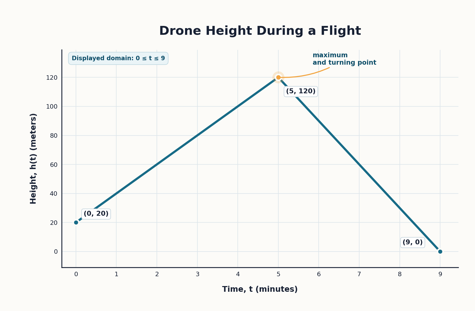
| Graph feature | Meaning in context |
|---|---|
| The graph describes the recorded flight from 0 through 9 minutes. | |
| At time zero, the drone is 20 meters above the ground. | |
| Segment from to | The drone's height increases at a constant rate during this part of the flight. |
| The drone reaches a maximum height of 120 meters after 5 minutes. | |
| The drone reaches the ground after 9 minutes. |
Because the rising section is straight, its rate of change is constant:
The drone gains 20 meters of height each minute during that section. The descending section is also straight, so its slope is
so the drone loses 30 meters of height per minute from 5 to 9 minutes. Every statement comes from a graph feature and includes the quantities, units, and time interval that give it meaning.
Use a Reliable Interpretation Routine
When a question asks what a graph feature means, use the following routine:
- Read the labels and units. Identify the input, output, and scale on each axis.
- Check the domain. Note the input values for which the graph actually applies.
- Locate the feature. Decide whether you are examining a point, intercept, segment, extremum, or turning point.
- Translate the mathematics. State the meaning in a complete sentence using both quantities and their units.
- Check the direction or rate. Explain whether the output is increasing, decreasing, constant, or changing at a particular rate.
This routine keeps you from stopping at a statement such as "the point is ." Instead, you can explain that the quantity reaches 120 units when the input is 5 units, and you can add the relevant rate or event when the graph provides it.
Check for Common Interpretation Errors
Even when the graph is easy to read, a small wording mistake can change the meaning. Use the table below to check your interpretation before accepting it.
| Common mistake | Better approach |
|---|---|
| Switching the coordinates | Read as input first and output second. |
| Leaving out units | State the units for coordinates and for rates. |
| Extending the situation beyond the graph | Make claims only for inputs in the stated domain. |
| Calling every high or low point a turning point | Confirm that the graph actually changes direction. |
| Treating a curved graph as having one constant rate | Use an interval average rate unless the graph shows a straight section or the context gives another rate. |
When you are uncertain, return to the axis labels and ask what each coordinate represents in the situation. A complete interpretation should connect the feature to the story, not merely repeat its numerical coordinates.
Conclusion and Next Steps
To interpret a graph, begin with its labels and domain, then translate each feature into a statement about the situation. Coordinates connect an input to an output, intercepts mark input-zero or output-zero events, slopes describe rates with units, and extrema or turning points describe important levels and changes in direction.
In the practice activities that follow, you will read graphs from real-world settings and explain what their features mean without extending the story beyond the values shown. Use the axes, units, and interpretation routine as your checklist, and support each conclusion with a coordinate, rate, or interval from the graph.
