When Single Summaries Mislead
Introduction
In the first lesson of Comparing and Communicating Distributions, we established a dependable rule: pair mean with SD for symmetric data, and pair median with IQR when skew or outliers are present. That rule handles a wide range of real-world datasets and will continue to serve you well.
But here in lesson two, we confront an important follow-up question: what if even the right pairing still misses the real story? Some distributions contain structure that no single center and no single spread measure can faithfully capture. Learning to spot these situations is just as important as knowing which pairing to choose, because a technically correct summary can still be deeply misleading. By the end of this lesson, you will recognize the most common culprits — bimodal distributions and hidden subgroups — and know what to do instead of forcing a single summary.
When One Cluster Becomes Two
The decision between mean + SD and median + IQR assumes that our data forms one main cluster of values, even if that cluster is stretched to one side by skew or pulled by outliers. In those cases, a single center still lands among the bulk of the data, and a single spread still describes how tightly that bulk is packed.
Not all distributions cooperate, though. Some data naturally splits into two or more separate groups, creating peaks in different places with a gap between them. When that happens, any single center — mean or median — can land right in the gap where almost no data points sit. The result is a "typical" value that describes nobody and a spread that measures the distance between groups rather than the variation within them. Let's look at a concrete case to see exactly how this breaks down.
Bimodal Distributions: Two Peaks, One Problem
A bimodal distribution has two distinct peaks. Each peak represents a cluster of values where data points concentrate, separated by a valley of lower frequency. These shapes appear far more often than you might expect.
Here is a simple example. A coffee shop owner tracks how many minutes each of customers spends in the shop during one morning:
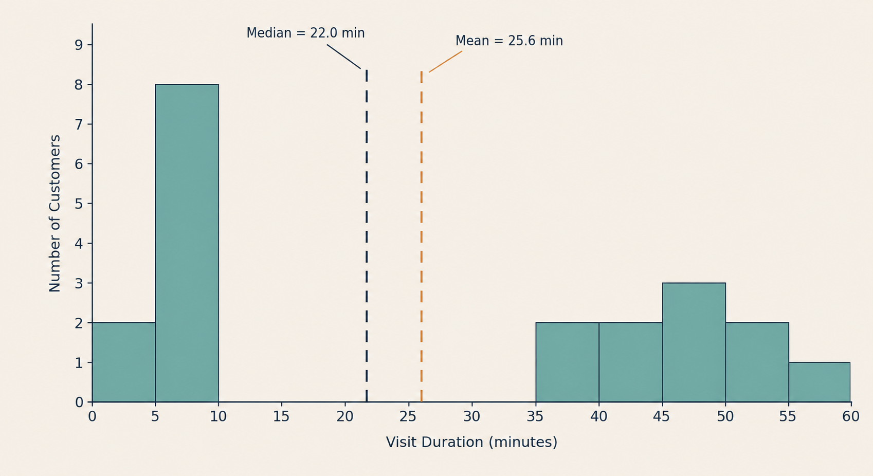
A histogram of these visit times reveals two clear groups:
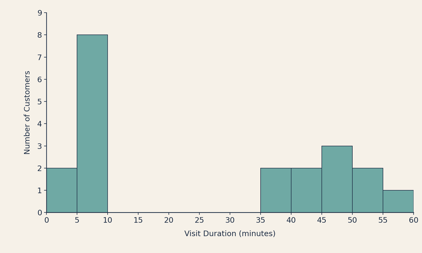
The left cluster (around to minutes) represents grab-and-go customers who pick up their order and leave. The right cluster (around to minutes) represents customers who stay to work or socialize. The middle of the histogram is nearly empty — and that empty middle is exactly where trouble begins.