In this unit, you'll learn how to turn raw numbers into visuals that actually help people make decisions. By applying principles found in the HBR Guide to Data Analytics Basics for Managers, you will move beyond simply receiving reports and learn to actively evaluate how data is generated and presented. Data visualization is not about making charts look fancy—it's about making your message clear, memorable, and actionable. When you master these skills, your charts and dashboards will become tools for insight that prompt specific business actions.
The foundation of effective data visualization is matching your chart type to the specific relationship you want to emphasize. Before building a visual, you must decide if the data is meant to be presented or circulated. This informs the visuals that you will choose. For instance, if you are standing in front of an audience, your slides should show high-level conclusions that can be processed in seconds. If you are emailing a report, you can provide more complex layers for the reader to study at their own pace.
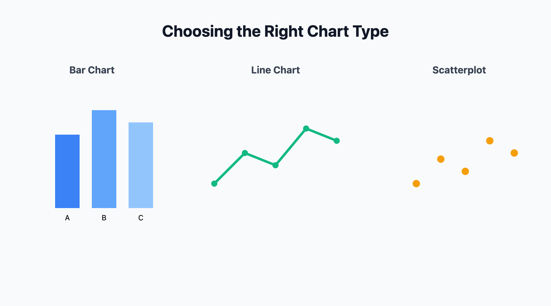
To compare values across categories, a bar chart is usually the clearest choice—think of a quick snapshot like "Sales by region: North $1M, South $2M, West $1.5M." To show how something changes over time, a line chart makes trends easy to spot, such as "Website traffic from January to June." When you need to show how two variables relate, a scatterplot is ideal for identifying whether one factor might be influencing another.
Pie charts should be used sparingly and only when you have very few categories; otherwise, they fail to provide a coherent explanation of the situation. The best visuals answer the audience’s question before they even have to ask.
A great visual must be easy to interpret, relevant to the business problem, and provide a fresh perspective. Visual clutter—like excessive colors, 3D effects, or decorative icons—distracts from your point and risks leading the audience to see patterns in random noise.
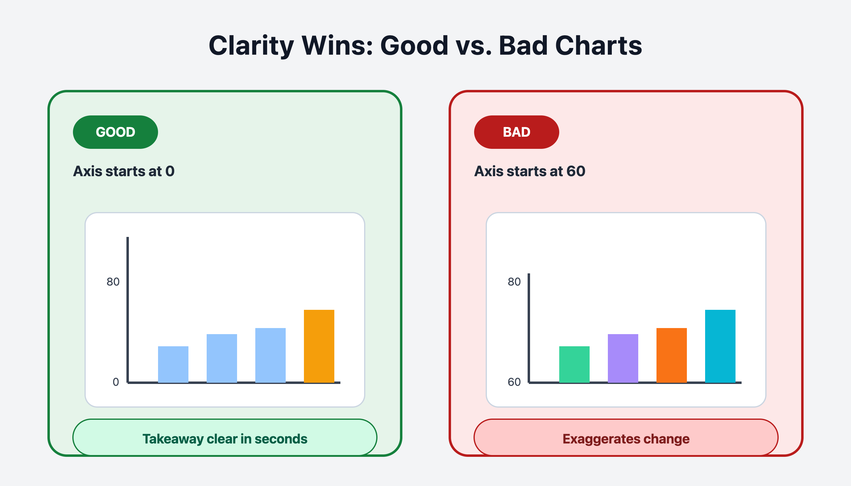
It’s also critical to avoid misleading your audience by manipulating axes or scales. Always start your vertical axis at zero unless there is a compelling reason to do otherwise, as changing the range can falsely suggest a dramatic relationship where none exists. Use color or bold text intentionally to highlight meaningful changes, such as a specific sales spike. If a colleague cannot understand the main takeaway of your chart within a few seconds, it needs to be simplified. The goal is to reduce the effort required for the audience to reach a sound conclusion. Let's compare the two visuals in this image to demonstrate this:
This exchange between two team members demonstrates how to apply these design principles during a typical project review. It highlights the transition from simply displaying information to purposefully selecting visuals that guide decision-making.
- Natalie: Hey Jake, can you take a look at this dashboard? I added a bunch of charts to cover all the data points from last quarter.
- Jake: Sure, let me see... Hmm, there are a lot of pie charts here, and some of them have eight or nine slices. It’s hard to tell which numbers actually drive our performance and which are just surface-level stats that don't lead to action.
- Natalie: I wanted to show everything to be thorough, but I guess it does look busy.
- Jake: What if we use a bar chart instead? That way, the differences between product lines will be much clearer. Also, we should remove the 3D effect—it's a distraction that makes it harder to compare the actual heights of the bars.
The real value of visualization is helping people see what matters—differences, changes, and critical points. Because people often make decisions based on emotion and then use data to justify them, you must use visuals to build a compelling case. A bar chart showing that one product significantly outperformed another provides the evidence needed to support a shift in strategy.
Show trends by connecting data points over time, making it easy to spot upward or downward movement. If there’s a target or a goal, add a clear line or marker to show exactly where performance meets or misses that mark. Whenever possible, annotate your visuals with short notes to explain why a certain trend is happening. For instance, noting that a sales drop was caused by a specific supply issue helps your audience focus on the reality behind the numbers. Data is most powerful when it is used as supporting material for a narrative that moves people to act.
In the upcoming roleplay session, you’ll get hands-on practice reviewing and improving real-world dashboards—identifying what works, what doesn’t, and how to make your visuals truly ready for high-stakes business choices.
