At this point in the course, you already know how to get Grafana-ready time series, how to enrich them with joins, and how to keep dashboards reusable with clean field organization.
This unit is about the last mile: shaping results into something a human can scan in five seconds and confidently act on. In practice, that usually means taking a dataset that’s technically correct and making it smaller, clearer, and ranked.
The transformations you’ll use constantly for that are:
- Filter data by values
- Group by
- Reduce
- Rename by regex
And one honorable mention that shows up everywhere operational dashboards exist:
- Sort by
Grafana transformations run sequentially (top to bottom). Each transformation modifies the dataset that the next transformation receives, so the order is part of the logic. For example, Reduce → Sort by creates a meaningful “Top offenders” ranking, while Sort by → Reduce usually just rearranges raw datapoints before collapsing them.
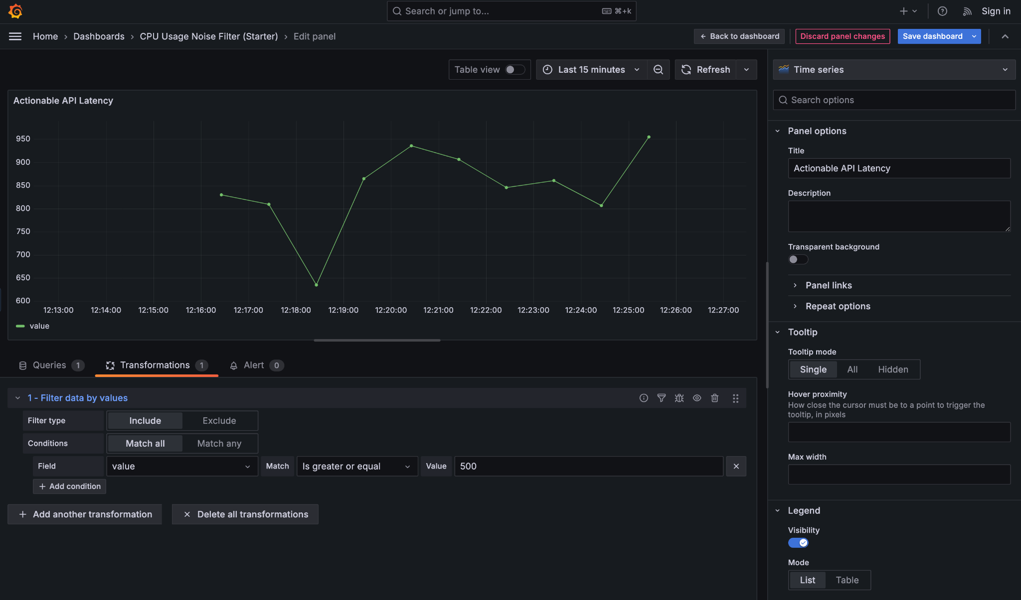
Filter data by values is a noise-reduction transformation that lets you hide data that isn’t actionable, without changing the underlying query. This keeps your SQL reusable and shifts “what matters right now” decisions into the panel itself. It’s especially useful for dashboards where normal behavior should fade into the background and only problematic states should draw attention.
Imagine a table of API request metrics with fields like endpoint, latency_ms, and error_rate. Most endpoints respond quickly and have no errors, but occasionally one endpoint becomes slow or unstable. Rather than showing everything, you can filter the data so the panel only displays rows where latency_ms is high or the error rate crosses a threshold. The result is a quieter dashboard that highlights issues instead of normal traffic.
To do this, it helps to understand the key controls:
- Filter type (Include / Exclude): Include keeps rows that match your condition (for example, keep requests with latency ≥ 500 ms), while Exclude removes matching rows (for example, hide rows where status is
200). - Match all / Match any: determines how multiple conditions work together. Match all means every condition must be true (latency ≥ 500 and error_rate ≥ 1%), while Match any means a row is kept if at least one condition is true.
- Field: the column you are filtering on, such as
latency_msorerror_rate. Transformations work on table fields, not on the visual series names in the chart. - Match condition: defines how the comparison is done, such as greater than, equal to, or is null.
This panel filters out normal API traffic and only shows latency values above 500 ms, making performance issues immediately visible without changing the underlying query.
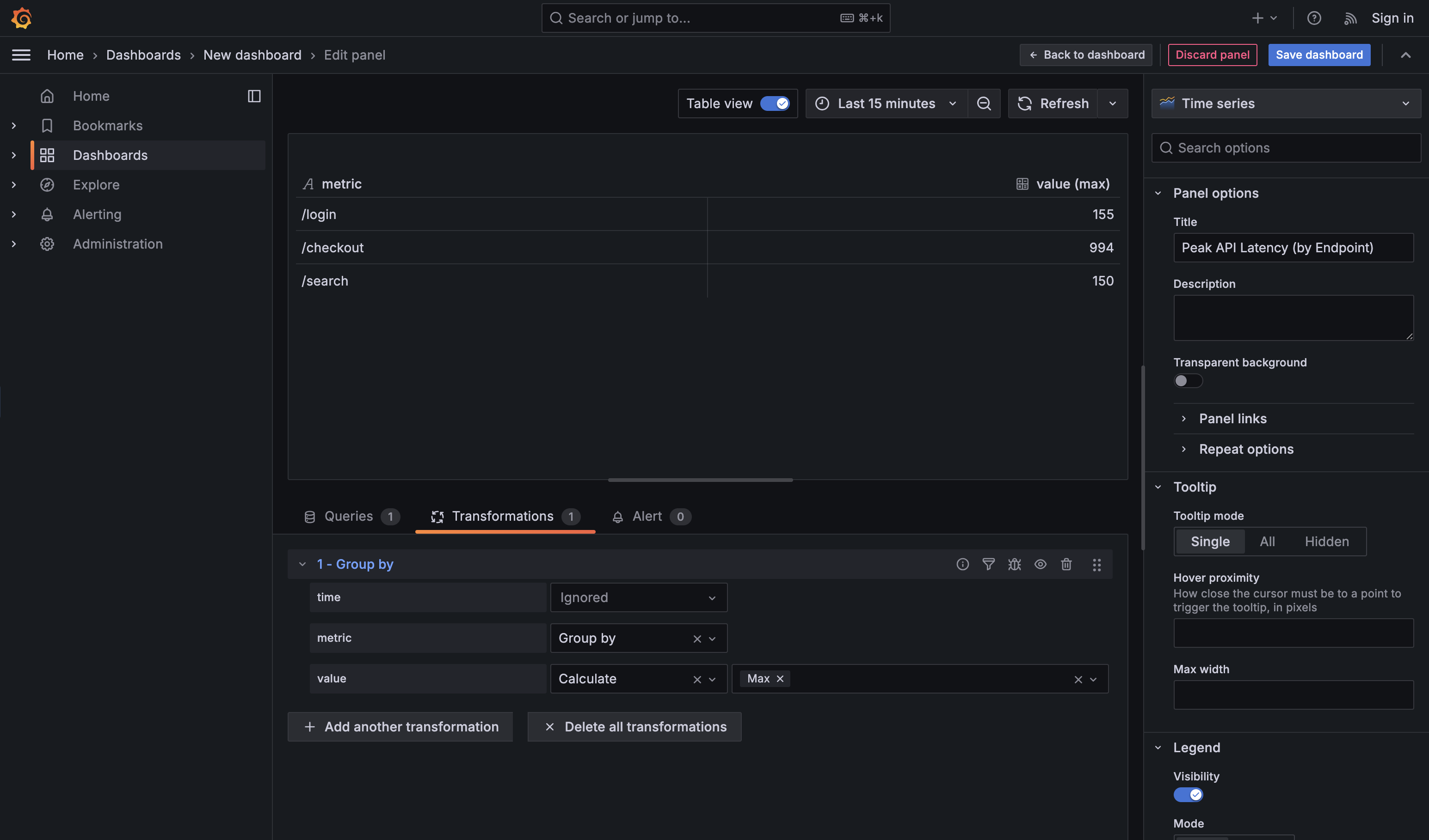
Group by is the transformation you use when raw, detailed data is technically correct but operationally overwhelming. It’s how you move from individual data points to category-level understanding — without touching the original SQL. This is especially useful when someone asks for a summary by a meaningful dimension such as team, service, region, cluster, or endpoint, and you want an answer you can read at a glance.
For example, consider this query, which returns API latency over time for every endpoint:
By default, this produces many rows per endpoint and per timestamp. That’s great for debugging a single endpoint, but noisy when the real question is: “Which endpoint is performing the worst?” Applying a Group by transformation on endpoint and calculating Max for value collapses all those rows into a compact rollup: one row per endpoint, showing its highest observed latency in the selected time range. You get the operational answer without rewriting the query or duplicating logic in SQL.
Two practical guidelines help keep Group by panels clean and useful. First, group on stable, human-recognizable labels (like endpoint, service, or team), not high-cardinality or unique identifiers that explode the table. Second, choose one clear aggregation per numeric field — max when you care about spikes, mean for typical behavior, or last for current state. If you aggregate everything in every possible way, the panel stops being a dashboard and turns into a spreadsheet.
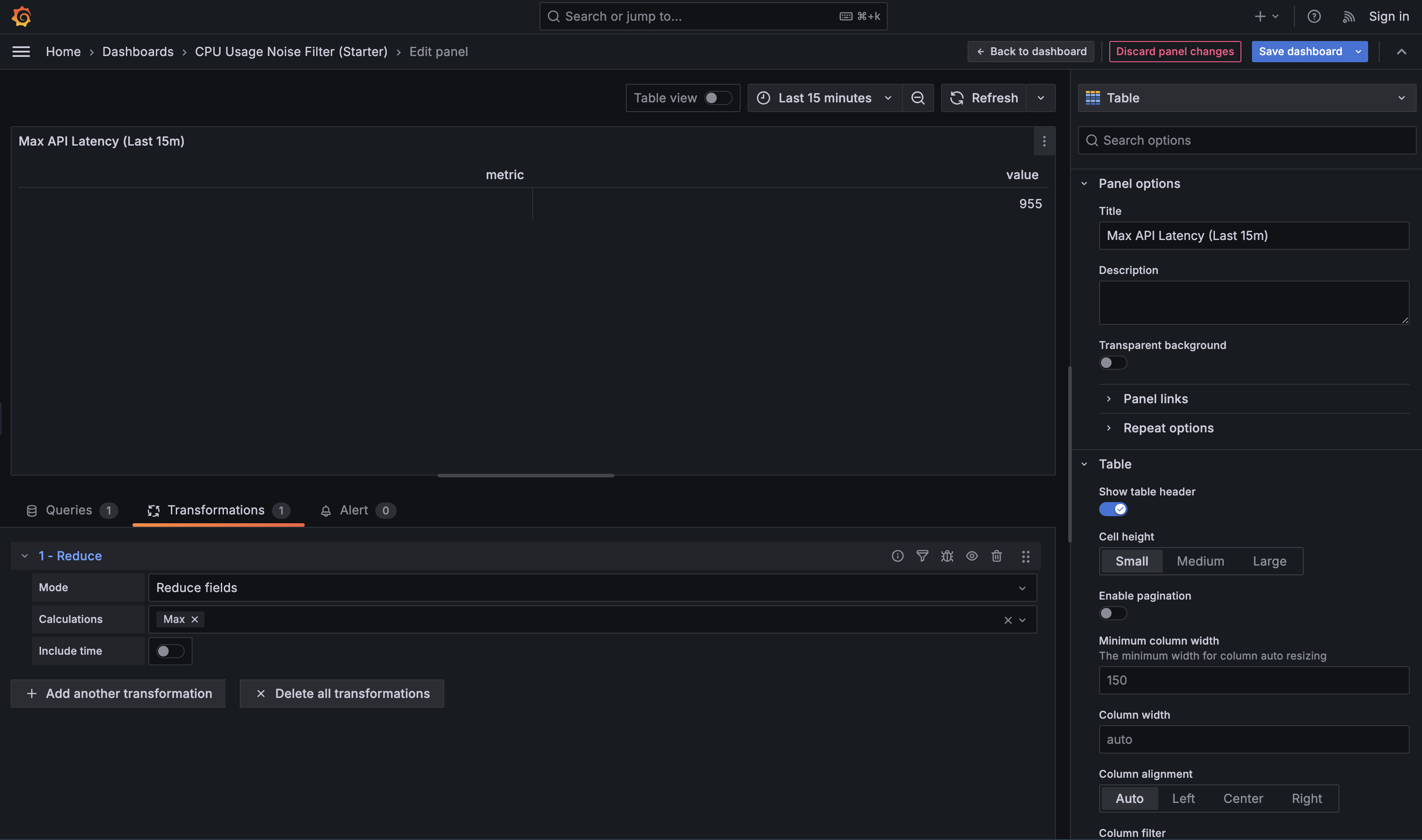
Reduce is the transformation that converts many points over time into one value that represents the selected time range. You use it when a panel should stop telling a story and start answering a question, such as “What’s happening right now?”, “Did we spike during this window?”, or “What was typical behavior recently?”. Different Reduce calculations support different intents: Last is used for current-state panels, Max is useful for incident analysis (“did it spike?”), and Mean helps describe typical behavior over a time window.
For example, consider a query that returns API latency over time per endpoint:
On its own, this is great for a graph, but not for comparison. Applying Reduce with the Max calculation collapses each endpoint’s time series into a single value: the highest latency observed in the selected time range. That makes it easy to identify the slowest endpoint or build a “top offenders” panel.
In practice, you’ll also see Last and Last* used frequently for “right now” views. Last literally returns the final value in the time range — which means if the most recent datapoint is null (for example, due to missing scrapes, delayed ingestion, an endpoint that reports intermittently, or a time bucket with no events), your “current value” will show up as blank even if there was a valid value a minute earlier. Last* skips nulls and returns the most recent non-null value instead. This is usually safer for sparse or event-driven data (like “errors in the last minute” or “jobs completed”) where gaps are normal and you still want a meaningful “latest known value.”
Reduce is foundational because it turns behavior over time into a single, comparable number—exactly what most operational dashboards need.
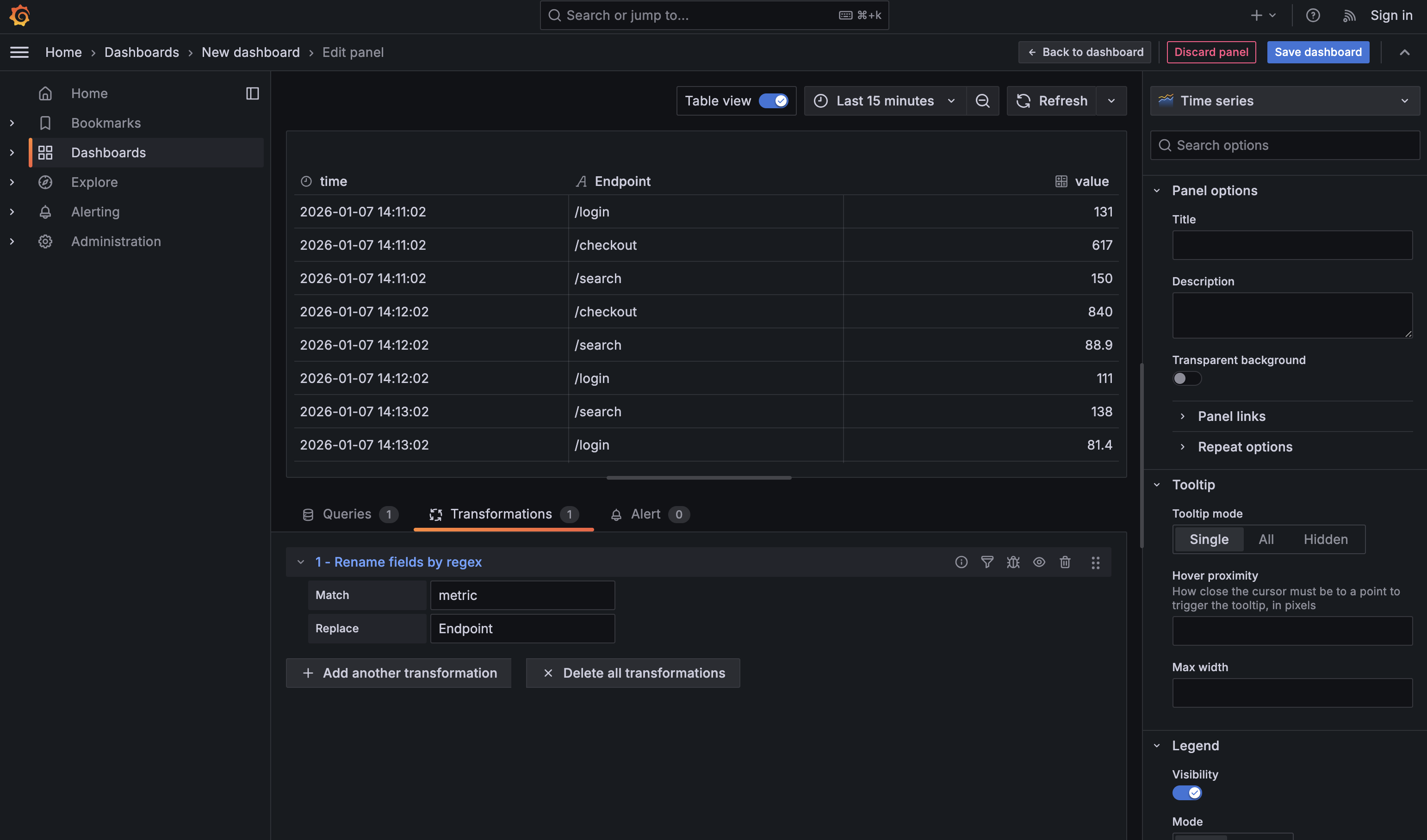
Dashboards feel dramatically more professional when labels are clean and intentional, and Rename by regex is the fastest way to get there. After shaping and reducing data, field names often reflect internal mechanics (metric, Field, exporter prefixes) rather than how humans think about the system. Rename by regex lets you fix that once, with a simple rule, instead of manually renaming columns in every panel. For example, after reducing API latency data to one row per endpoint, renaming metric to Endpoint immediately makes the table readable and presentation-ready. It’s a small transformation, but it has an outsized impact on how polished and trustworthy a dashboard feels.
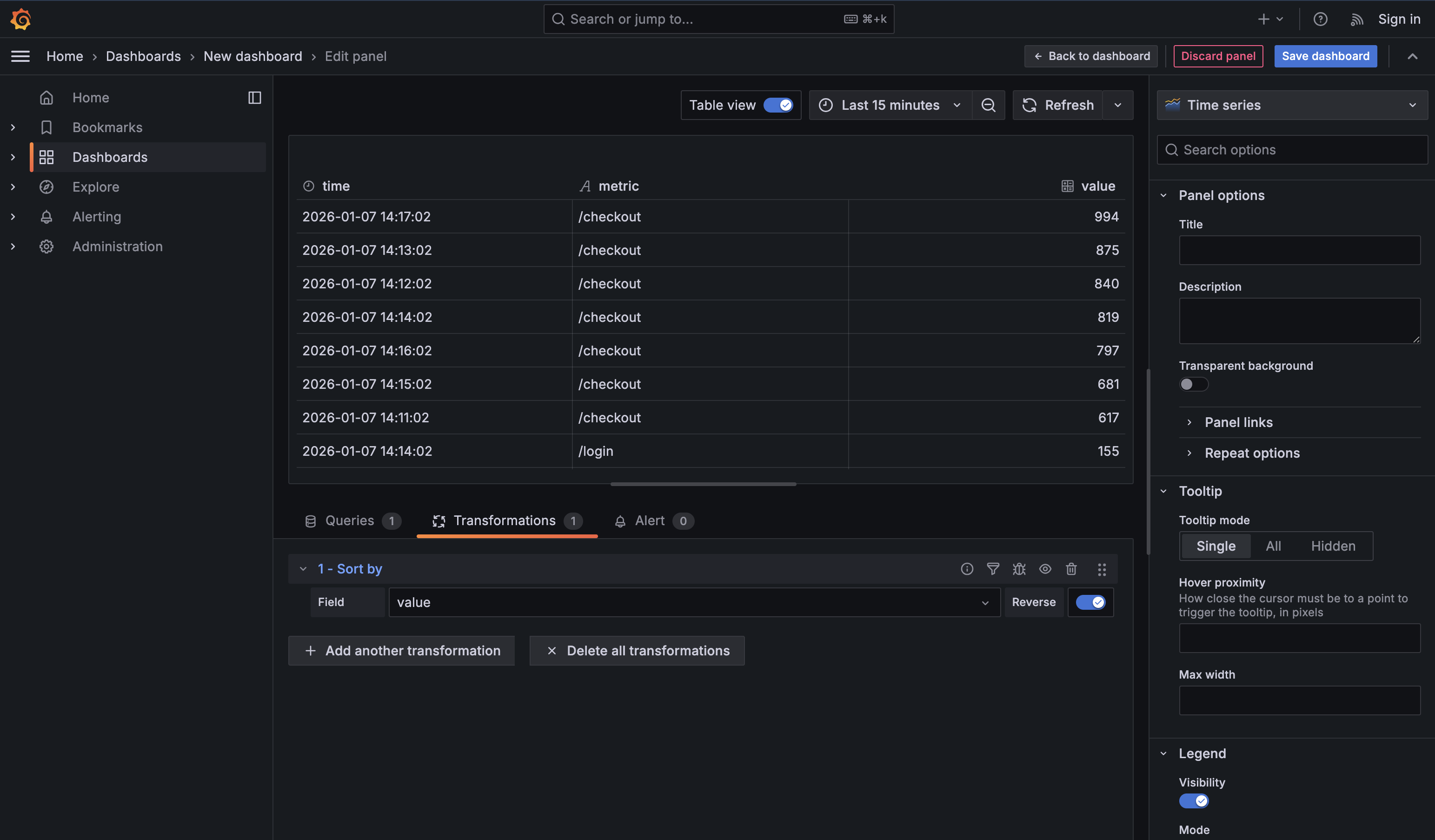
Sort by is the quiet transformation that turns a table into a ranked list. It’s most powerful after Reduce or Group by, when each row already represents a single entity like an endpoint, host, or service. At that point, toggling Reverse instantly answers operational questions such as “Which endpoint is slowest right now?” or “What’s the worst offender?” If you sort too early, you’re just rearranging raw time points. Sorting late—on already-reduced data—is what turns a technical table into a clear operational signal.
In this unit, you learned the transformations that show up in real dashboards every day:
- Filter data by values to cut noise and focus on actionable states
- Group by to build rollups without writing complex SQL
- Reduce to convert time series into a single headline number per entity
- Rename by regex to keep labels clean and scalable
- Sort by to make “Top N” panels feel obvious and useful
With these in your toolkit, you can take a correct dataset and shape it into a panel that tells the story quickly—without constantly rewriting queries.