Comparing Model Predictions
Introduction
Welcome back to Building Probability Models! This is the fifth and final lesson of the course, and you have come a long way. You can now define valid probability models, build both uniform and non-uniform versions, and predict expected frequencies for any number of trials. Those skills let you say what a model expects to happen — but how do you know if the model is actually right?
That is the question we tackle here. In this lesson, you will learn to place model predictions next to real-world data, decide whether the two are close enough to trust the model, and pinpoint why they might disagree. By the end, you will have a complete four-step evaluation workflow — compute, compare, judge, diagnose — that turns a probability model into a genuine decision-making tool.
Why Predictions and Data Will Never Match Exactly
Before we start comparing numbers, it helps to set realistic expectations. Every chance process contains built-in randomness, so observed results will always scatter around the values a model predicts. If you flip a fair coin times, the model says to expect heads — but getting exactly would actually be somewhat unusual. Landing on or is perfectly normal.
The goal of comparing predictions to data is therefore never to demand an exact match. Instead, we ask: "Are the differences small enough to be explained by ordinary randomness, or are they large enough to suggest something is wrong with the model?" Developing good judgment around that question is the central skill of this lesson.
Setting Up the Comparison
To answer that question, we first need both sets of numbers side by side. The setup involves two simple steps:
- Compute expected frequencies for each outcome using , where is the total number of observed trials.
- Place them next to the observed frequencies collected from the actual data.
Let us try this with a quick scenario. A game shop sells three colors of dice — red, blue, and green — and believes customers choose equally among them. That gives a uniform model with . After recording sales, the shop lines up the numbers:
| Outcome | Model Probability | Expected Frequency | Observed Frequency |
|---|---|---|---|
| Red | |||
| Blue | |||
| Green |
With this table in hand, we are ready to move to the next step: judging whether the data fits the model.
Judging Whether the Data Fits the Model
Look at the dice shop table above. The expected frequency for each color is , and the observed values are , , and . None match exactly, but every one is fairly close. A practical first check is to compute the difference for each outcome:
| Outcome | Expected | Observed | Difference |
|---|---|---|---|
| Red | |||
| Blue | |||
| Green |
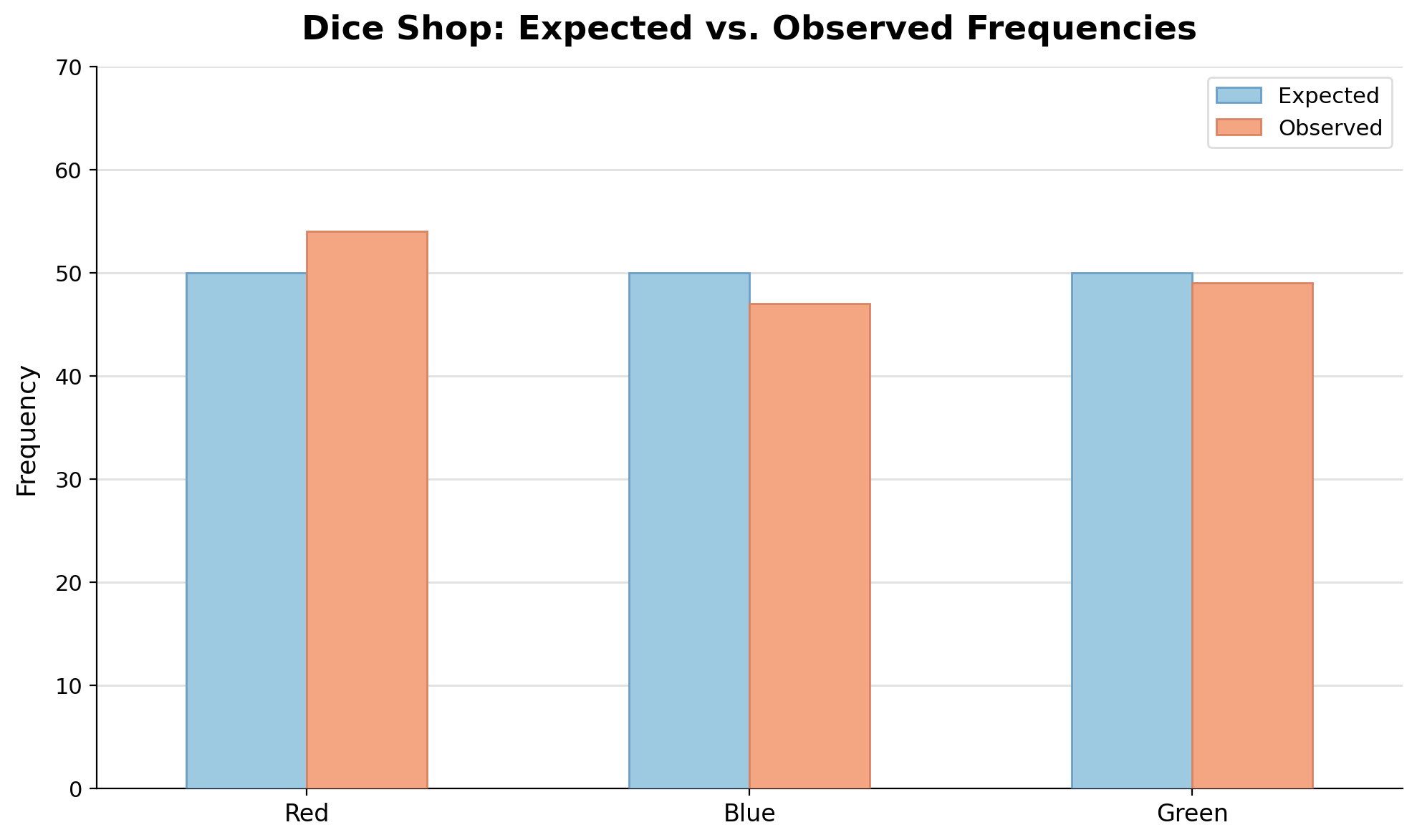
These differences are small compared to , and no single outcome stands out dramatically. This is exactly the kind of scatter we would expect from normal randomness, so the data looks reasonably consistent with the model. As a general guideline: if every difference is modest relative to the expected value and the pattern of deviations does not point in one clear direction, the model is a reasonable fit. This is an informal judgment rule, not a fixed cutoff, so context and sample size still matter.
When Discrepancies Are Large: A Contrasting Example
To sharpen your judgment, let us look at a case where the data clearly does not fit. A snack machine vendor assumes the three product slots are equally popular, assigning . After purchases, the results look very different from what the model predicted:
| Slot | Expected Frequency | Observed Frequency | Difference |
|---|---|---|---|
| Slot A | |||
| Slot B | |||
| Slot C |
Slot A is above its expected count, and Slot C is below. With trials, differences this large are hard to explain by randomness alone. Contrast this with the dice shop, where the biggest gap was just out of . Here, the gaps are roughly a third of the expected value — a much more serious signal. This data strongly suggests the uniform model is not appropriate, and the vendor should investigate further.
Sources of Discrepancy
When predictions and observations disagree, the natural follow-up is: why? There are four common explanations, and learning to distinguish among them is essential for evaluating any model.
- Natural random variation. Even a perfectly accurate model will not predict exact counts. Small differences are expected every time and do not indicate a problem.
- Too few trials. With a small sample, results can swing far from the model's predictions simply because the data has not had enough trials to stabilize. Collecting more data often resolves this kind of gap.
- Outdated or incorrect model assumptions. The model may have been built on old data or assumptions that no longer hold. In the snack machine example, perhaps Slot A was recently restocked with a trendy new item, breaking the "equally likely" assumption.
- Biased data collection. If data is gathered in a way that favors certain outcomes, the observed frequencies will not reflect the true process. For instance, recording snack purchases only during the morning shift might skew results if preferences change throughout the day.
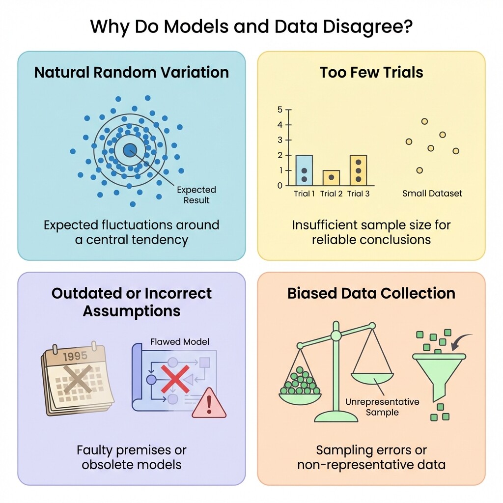
Recognizing which source is most plausible in a given situation is what turns a numerical comparison into a meaningful insight.
Evaluating a Bus Route Model: A Complete Example
Let us bring all four steps together in one walkthrough. A city transit agency models the punctuality of a bus route as follows:
| Outcome | Probability |
|---|---|
| Early | |
| On Time | |
| Late |
This is a valid model: every probability is between and , and . Over the next trips, the agency collects real data. Here is the full comparison:
| Outcome | Probability | Expected Frequency | Observed Frequency | Difference |
|---|---|---|---|---|
| Early | ||||
| On Time | ||||
| Late |
Step 1 — Compute. We multiplied each probability by to fill in the expected frequency column.
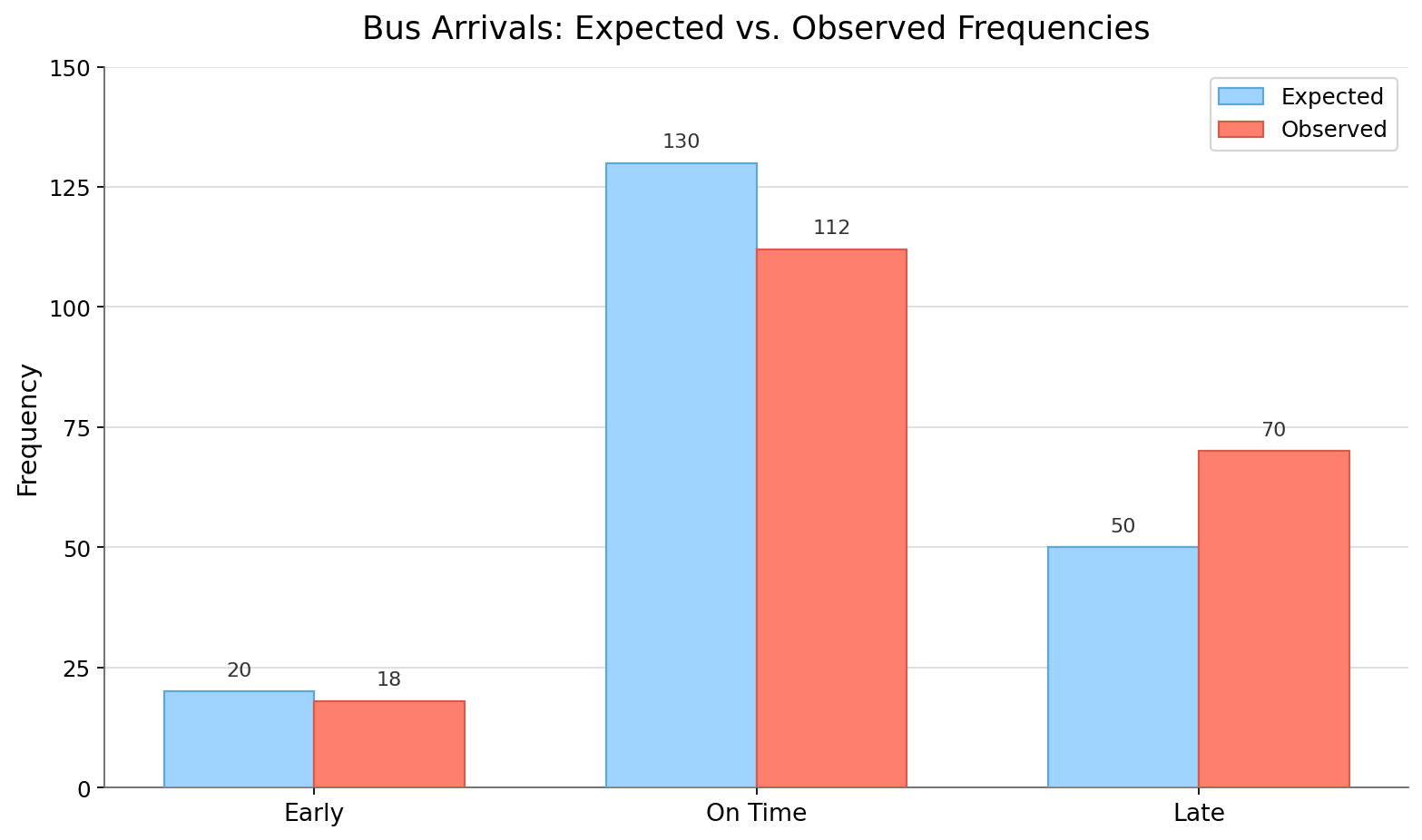
Step 2 — Compare. The "Early" outcome is off by just , which is tiny. However, "On Time" falls short and "Late" exceeds its prediction by .
Step 3 — Judge. With trips, differences of and are notable — especially because they point in a consistent direction (fewer on-time arrivals and more late ones). The data does not appear reasonably consistent with the model.
Step 4 — Diagnose. A plausible explanation is that the model's assumptions are outdated. Perhaps recent road construction has slowed the route, increasing the true probability of late arrivals. The agency should update the model with current data before relying on it for scheduling decisions.
Conclusion and Next Steps
In this final lesson of Building Probability Models, you learned a four-step workflow for evaluating a probability model against real data: compute expected frequencies, compare them to observed counts, judge whether the gaps are small enough to chalk up to randomness, and diagnose the most likely source when they are not. The four common sources of discrepancy — natural random variation, too few trials, flawed model assumptions, and biased data collection — give you a practical toolkit for explaining any mismatch. In more advanced statistics, formal tools such as hypothesis tests and confidence intervals can make these judgments more precise, but in this course we focus on clear comparisons between expected and observed counts.
Up next, the practice exercises will walk you through every stage of this process. You will calculate expected frequencies, judge whether data fits a model, match scenarios to their most plausible source of discrepancy, and write a complete evaluation of a real-world model — so jump in and put your new skills to work!
